
This page is part of © FOTW Flags Of The World website
Hammerfest, Finnmark (Norway)
Last modified: 2025-12-27 by shreyas tallamraju
Keywords: hammerfest |
Links: FOTW homepage |
search |
disclaimer and copyright |
write us |
mirrors
 image by Tomislav Šipek, 4 December 2024
Granted on 16 December 1938.
See also:
The Flag
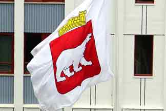
The arms of Hammerfest, a silver polar bear on a red field, were prepared for
the celebration of the 150th anniversary of the town's foundation in 1939. The
arms, which were recently redrawn by heraldic artist Arvid Sveen, were adopted
by Royal resolution of 16 December 1938. However, the image I have made is made
with an older version as the model. According to [cjo87]
the idea of the arms is to show the importance of hunting Arctic resources had
to the town. The flag corresponds to the arms, that is, a white polar bear on
red.
Jan Oskar Engene, 29 April 2002
The flag of Hammerfest is already reported, so here is coat of arms and
better flag.
Source:
http://finnmarkpride.no/wp-content/uploads/2014/08/L1000988.jpg
Tomislav Šipek, 12 February 2016
Official blazon in Norwegian: "I blått tre sølv båter, 2-1."
Blazoned in English: "Azure three boats argent two and one."
English blazon by Joe McMillan, 30 July 2002
Here are pictures of the Hammerfest Municipality flag:
https://www.google.com/maps
https://foto.digitalarkivet.no
Tomislav Šipek, 4 December 2024
Variant of Flag
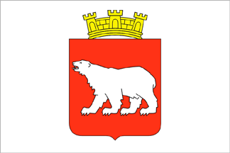 image by
Victor Lomantsov, 07 October 2015
image by
Victor Lomantsov, 07 October 2015
According to
photo at
http://cappadocia-elenatruva.ru/forum?mingleforumaction=viewtopic&t=433.3
they use white flag with crowned coat of arms.
Victor Lomantsov, 07 October 2015
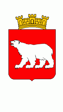 image by Klaus-Michael Schneider, 12 May 2017
![[Rana]](../images/n/no)20-04.gif) image by Tomislav Šipek, 12 February 2016
image by Tomislav Šipek, 12 February 2016
Official blazon in Norwegian: "En hvit isbjørn i rødt."
Blazoned in English: "Gules a polar bear passant argent."
English blazon by Joe McMillan, 30 July 2002
Normally passant means the right forefoot is off the ground; statant would
mean all four feet on the ground with the two front feet together. This bear
(like most polar bears) clearly doesn't care about abiding by such rules.
Joe McMillan, 30 July 2002
The blazon we have above is rather the description of the flag, the heraldic
blazon of the coat of arms is rather: En sølv isbjørn i rødt.
Jan Oskar mentioned that the design is recently redrawn by Arvid Sveen, however,
[c2j87] provides the name of the original 1938 designer as Ole Valle.
The design was adopted for the city's 150th anniversary celebrated in
1939.However, for its 100th anniversary, in 1889 the city got itself a medal
with a naturalistic depiction of Nordkapp, midnight sun and an Arctic ship (ishavsskute).
The design was eventually taken in use as a seal.
A detailed history of the Hammerfest arms if provided
here
by Hans Edv. Bentsen
Here is an attempted translation:
Hammerfest got its city status in 1789, but only in 1939 it got its official
adopted arms. Indeed, it had since 1890 used in the mayor's seal and mark a
design with an Arctic yacht with Nordkapp and the midnight sun and the same
was used by treasurer between the two World Wars. Nobody did anything to solve
the problem until Jørgen Sivertsen took the issue in 1936.
In 1934 he was given task of preparing the city's history for the anniversary
and eventually he took before the administration the idea that arms should be
officially approved.
A teacher Ole Valle, who was among his other qualities, also a successful drawing
teacher in a local school, was given task to redraw the design with the Nordkapp
and yacht used then for past 50 years. His design were sent to the State
Archives for approval.
The answer was negative. The design was not heraldic and besides, too many
cities already had boats in their arms. They proposed a polar bear instead, or
alternatively three walruses.
In the meantime, the administration of the Kjelvik municipality (that is today
the Nordkapp municipality) expressed a loud protest at their 8 April 1938
meeting against Hammerfest using "their" motif in its city arms.
The city administration took the issue on 3 May 1938. The Nordkapp design was
again unanimously adopted and the proposal was again sent to the State Archives
with explanations that it was already in use for more then 50 years, that it
was well designed and well known. The Archives stood on their position and again
refused to approve the design.
The issue was taken in the city administration for the secodn time on 20 June
1938. Valle prepared three proposals. One with a polar bear, one with "Meridianstøtta"
(memorial column in Fuglenes part of Hammerfest commemorating the international
meridian measuring project of 1852) and one with three walruses.
The administration came over and decided - unanimously - for the silver bear in
red.
Valle wrote in a letter to the mayor dated 17 January 1939 "When the choice
fell at the polar bear, it is to remind on the city's long traditions as the
Arctic port. It also reminds that the first living polar bear was captured in
1795 by the Buchs brothers who were at that year hunting at Spitsbergen.”
Valle have prepared more then 40 sketches before he found one that he deemed was
the best.
His proposal was pleasing to the State Archives. Valle was given the task to make it
into a proper heraldic form that could be used both in the city arms, flag, seal
and mark.
In a letter of 16 December 1938 from the Department of Law the minister Trygve
Lie informed the municipality that the royal resolution approved the design
after the State Archives proposal. It was received by the city administration on
25 March 1939.
After a request from the administration Valle prepared an example in plywood
2.5×1.75 m in size. On a cinnabar red background of a golden-foil outlined
shield he set a polar bear of aluminium foil, and over it a crown of aluminium
and black. The woodworks were done by carpenter Andreas Barstad.
The story goes on regarding the unveiling ceremony, and then about the redesign
in 1960's.
In 1960 new prescriptions were set in regarding the local arms. Therefore the
arms was to be changed in accordance with those. Naturally, Ole Valle was again
called to do the corrections, even though he moved to Jessheim, where he was now
a school director.
He delivered new design. Not only that he changed the depiction of the bear from
diagonally walking one to a passing one, he also changed the shield shape and
removed the crown. Accordingly he also changed the city flag, seal and mark.
The city administration adopted the changes on 16 April 1963 and the proposals
were sent to the State Archives for approval.
In the answer of 13 June 1963 the State Archives noted ".. it is accepted custom
in heraldry that four-legged animals are shown with forward leg furthest from
the spectator to be stretched forward and the hind leg that is closest to the
viewer be stretched backwards.
In Valle's drawing it was the other way around giving impression that the bear
is walking backwards. It should be corrected and it may be easily done without
tha drawing looking its rhythm.
The bear should have the same number of claws on each of its four feet. As it is
shown now it is that there is one less in the right forward foot and one less in
the right back foot. It looks like they were kipped off. The bear should have
three claws on each foot.
That the claws ate pointing straight down is acceptable, as this is decorative
justified. But they should be moved somewhat further forward so that the front
claw is in line with the toe. Otherwise it gives an impression of backwards
moved claws.
Otherwise the bear is well suited in line with good heraldic profiling. "
The work stopped and then continued in 1988
However it happened that Ole Valle was tragically lost in 1963 before he
finished the issue. The councillor Olaf Berg-Hansen tried to get the work done
in several occasions, among other asking help from the State Archives, but
without any result. And the issue was left standing for 25 years without anyone
taking up the State Archive's request for changes.
As the city 200th anniversary of was coming closer on 17 July 1989 the issue was
taken up again. The anniversary coordinator Bjørn Paulsen pointed the issue to
the administration. He took upon himself to do the corrections and after
adjustments with the administration, the proposal was sent to the Archives.
The most significant change that Paulsen did was to change the order and make
minor changes to the tongue and claws, so the administration requested. Paulsen
also undertook a minor adjustment of the body shape, and that he also gave
shield the form it originally had with straight sides with crown over. He also
made the matching corrections for the flag, seal and mark.
The design was sent to the State Archives and they approved the design with a
letter of 28 October 1988.
Protest by the Ole Valle's heirs
With the Archives approving of 28 October 1988 the issue should have been ended,
but it did not happen. [... skipping the legal part, in short the heirs
considered the changes to the 1939 design "moral violation of Valles original
drawing"]
Through BONO (Norwegian Visual Artists Copyright Norway) took Ole Valles heirs
up the matter with the Hammerfest municipality in March 1996. After an extended
correspondence between BONO and the municipality, the result was a meeting
between Ole Valles heirs, BONO and the Hammerfest municipality on 13 November
2000. After the copyright claim of the Valles heirs, the municipality dropped
the 1988 changes. The parties agreed that the Hammerfest municipality should
take a photographer and artist Arvid Sveen, from Tromso, to make the changes
which the parties agreed. Sveen was well versed in the current heraldic
regulations and his work resulted in many a municipality arms hanging on the
walls in a number of town halls in northern Norway and the rest of the country,
so he was well qualified to take on the assignment.
In a letter of 27 May 2001 presented Sveen his proposal for the new arms based
on the Ole Valle's original idea and with the Ardchive's requests of 1963
included. He also prepared the flag, seal and mark.
That was proposed to the administration in the meeting of 28 June 2001 where
they were adopted. The culture secretary presented the changes so:
"In conclusion: The polar bear has been given a more resilient and
predator-like character. The coat of arms with crown received a harmonious and
nice overall."
At roughly the same time it came in a letter dated 6 June 2001 from BONO
following confirmation:
"Licensees by Ole Olsen v / BONO approve the design that is now available
(ref. Fax from the municipality 5/30/01) of the modified coat of arms of
Hammerfest Municipality."
In a later letter of 2 November 2001 to the municipality BONO
specifies that Arvid Sveen has acquired the copyright therein in
processed form, ref. Copyright Act § 1, second paragraph, no. 13. But
at the same time emphasized that it is occurring so-called shared
addiction works, ref. Copyright Act § 4. This means that neither Arvid
Sveen or licensees by Ole Valle can dispose of the processed work
alone or make changes without the consent of the other party.
Signatory for the latest changes of the coat of arms has been the
cultural secretary Gerd Hagen.
Thus, a long and time consuming process was finished. The Hammerfest
municipality now has a coat of arms which are formally approved by all
parties. The heraldic requirements are complied with, and Arvid Sveen
in its form solution given the polar bear an expression of strength
and toughness simultaneously has historical roots back to the city's
heyday as a leader in the Arctic Ocean in a perilous industry that
provided work and profits for the city and district.
[poetry skipped]
The changes resulted in huge costs
One of the requirements of Ole Valles heirs was that all existing
objects where the coat of arms have been used, be made in line with
the new visual changes. In short, this means that, among other things
the following should be changed: municipal flag, mayor's chain, seals,
stamps, letterheads and envelopes in the municipal administration, all
signs on municipal buildings, coat of arms badges utilized for
work-wear, municipal vehicles and equipment. Moreover, municipal gifts
of any kind where the coat of arms is part of the decoration, as well
as printed materials and all kinds of information materials from the
municipality.
These changes have resulted in expenses for the municipality,
calculated total to approximately 140 000 crowns.
Besides, the public roads administration must also change their road
signs where the coat of arms are used. Businesses, clubs and
associations who have previously received permission to use the coat
of arms must also visually change their logos in line with the new
decision.
Anyway, thus in practice we should have different flags used since
1938, 1960's, 1988 and 2001. However, it seems that the city made
thorough clean sweep and I can't seem to find a pre-2001 design of the
city arms. Well, actually the Jan Oskar's flag drawing as well as
[c2j87] coat of arms drawing would be the kind of 1960's design...
Anyway, the 2007 regulations on the city arms and flag at
Minicipal website prescribe the flag in the ratio 16:22. (i.e. 8:11, i.e. as the
Norwegian national flag).
Željko Heimer, 20 February 2016
And, after all said and done regarding this - it am a bit confused. The
Norwegian municipal heraldry is otherwise quite flexible regardig the designs
and the whole story seems quite unbelievable. I guess that when issues of
copyright and authorship protection agencies get into the field, the game
becomes rough and no Heraldic authority (if ever was consulted one in the case)
could explain that there is no such thing as copyright of municipal arms and
even worse no such thing only proper heraldic way of emblazoning a blazon (=making
picture from heraldic description).
If I am not much mistaken, many of local regulations in Norway regarding the
municipal heraldry include prescriptions that the arms displayed must conform to
the general contents of a blazon and not to the "original" approved artwork per
se.
Željko Heimer, 21 February 2016
Former Municipalities in Hammerfest
Sørøysund
 image by Tomislav Šipek, 4 December 2024
Granted on 8 June 1979.
"In blue three white boats, two over one." This is the brief, and
it might be added after looking at the drawing, not wery precise blazon of the
flag of Sørøysund municipality in Finnmark County as found in the Royal
resolution dated 8 June 1979. Given the long coast and the maritime traditions
of Norway, the boat is a popular heraldic charge in the country's civic
heraldry. The problem is, naturally, that there are so many different types of
boats and that whereas the official blazons tend to speak only of
"boats" the municipality and the heraldic artist usually have a
specific type of boat in mind. This is also the problem with the arms and flag
of Sørøysund which only speaks of boats. Some more details should perhaps have
been provided in the blazon for the boats to be accurately drawn. In the case of
Sørøysund, according to [cjo87], the charge
was repeated three times to reflect the fact that the municipality is made up of
three islands.
As of 1 January 1992 Sørøysund was merged into Hammerfest municipality.
This is why Sørøysund is not listed in [sga95]. It is found in [cjo87].
Jan Oskar Engene, 27-28 April 2002
Shouldn't the boat at the bottom be as big as the two boats at the top?
Mark Sensen, 27 April 2002
Well, a rule of heraldry is that the charges should fill out the field. That
is why I made the bottom boat bigger, so as to fill some of that blue
"empty" space in the lower part of the flag. The same is done to many
other Norwegian flags and arms.
Jan Oskar Engene, 28 April 2002
While this rule exists, I've noticed in Norway it gets a higher priority than
in the rest of the world. In an example of this, with three equal charges 2:1 :
In Norway first "Filling the field." is applied, saying the bottom
charge should be wider, and then the "Similar charges, similar
shapes." saying the upper two charges should be equal in shape.
Elsewhere one would first apply "Similar charges, similar shapes.",
which would give the bottom charge the same ratio as the upper charges, and then
"Filling the field", which would mostly determine the placement and
size of the charges. Indeed, this order is the reason why "round"
charges are placed 2:1, as this is how three such similar shapes would fill the
field best.
It's this sort of distinction that should warn us not to speak too lightly of
"Heraldry" as if its rules are universal throughout the world. The fact
that in some ways they aren't is what gives each country its own recognizable
heraldic style.
Peter Hans van den Muijzenberg, 1 May 2002
![[Flag of Hammerfest Havn KF]](../images/n/no~20-04.gif) image by Tomislav Šipek,
2 January 2025
image by Tomislav Šipek,
2 January 2025
White flag, in canton a life belt divided per saltire into red (left, right) and
white (top, bottom) with inscription in black capitals “HAMMERFEST”(top) and
“HAVN KF” (bottom). In the life belt a black anchor superimposed by the coat of
arms of Hammerfest, but with a white mural crown. From lower fly an inscription
“HAMMERFEST” in celestial blue capitals and in a 2nd line “Porten til
Barentshavet” (= gateway to the Barents Sea) in black. In the fly end a black
arch superimposed by a celestial blue arch, both symbolizing bridges per sea and
per land.
Source: spotted in Hammerfest on 22 April 2017
Klaus-Michael Schneider,
16 May, 2017
KF: kommunalt foretak (municipal enterprise)
Peter Hans van den
Muijzenberg, 28 April 2019
Triangular flags
![[Flag of Hammerfest Havn KF]](../images/n/no~20-04a.gif)
![[Flag of Hammerfest Havn KF]](../images/n/no~20-04b.gif) images by Tomislav Šipek,
2 January 2025
images by Tomislav Šipek,
2 January 2025
Photos:
https://www.facebook.com/hammerfesthavnkf
https://www.facebook.com/hammerfesthavnkf
Tomislav Šipek,
2 January 2025