
Last modified: 2025-10-11 by rick wyatt
Keywords: microsoft | windows insider | united states |
Links: FOTW homepage |
search |
disclaimer and copyright |
write us |
mirrors
![[MS flag]](../images/u/us$ms2.jpg)
![[MS flag]](../images/u/us$ms3.jpg) images located by William Garrison, 3 September 2025
images located by William Garrison, 3 September 2025 See also:
Microsoft uses white or blue flags with the Windows logo and the Microsoft name in gray or white.
Sources:
https://www.exchangewire.com/blog/2014
https://x.com/JMichaelWaller/status
https://www.ft.com/content
William Garrison, 3 September 2025
![[MS flag]](../images/u/us$msw.gif) image derived from
https://www.cleanpng.com
image derived from
https://www.cleanpng.com
Through the many versions of Microsoft Windows a flag-like logo has been
used. Shown above is the version for Windows 7 through Windows 10.
Editor
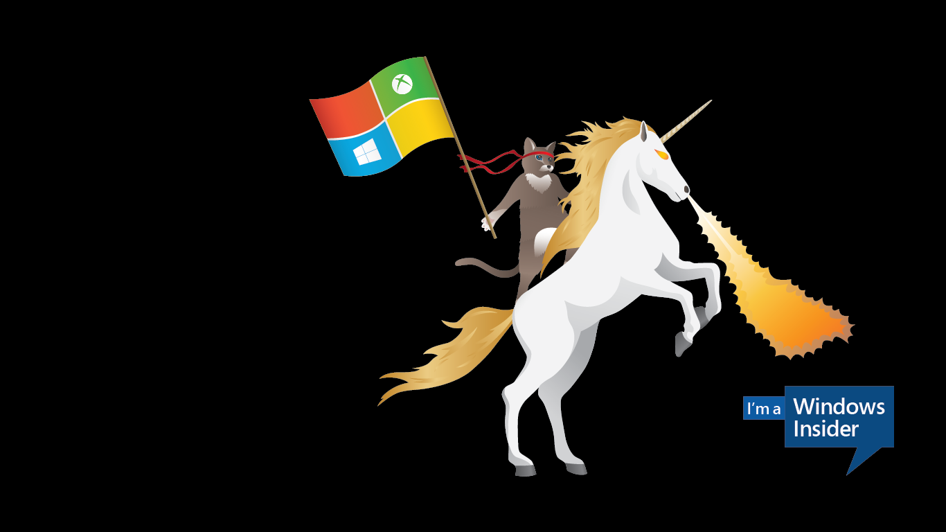
![[MS flag]](../images/u/us$mswi!.gif) image by António Martins-Tuválkin, 11 March 2024
image by António Martins-Tuválkin, 11 March 2024
Windows Insider was launched in 2014 and remains a Microsoft software testing
program that allows licensed users globally access for testing pre-release
builds of Win11, Win10, and Windows Server, something previously only accessible
to software developers. Its current logo is a smart pictograph that combines
three human figures (head and shoulders) to resemble two interlocked hearts and,
as far as I know, has no relation to flags. See
https://en.wikipedia.org/wiki/Windows_Insider for more info.
At
launch, though, the Windows Insider Program was presented and promoted with an
illustration of a cat riding a fire-breathing unicorn and sporting an
inconspicuous flag, losely based on the 4-color window logo of Microsoft
Windows. This logo/mascot was lampooned for being over the top dweeb, and was
soon dropped, being today hard to find online in Microsoft’s own sites [https://www.microsoft.com/LearntoWin].
Here are some examples:
https://www.reddit.com/r/FellowKids/comments/4qc1ev/microsoft_tumblr_ad_a_ninja_cat_riding_a_fire/
https://www.synergy-technical.com/hs-fs/hubfs/ef2337_b1f896fb4c7b409c985cae5c116763d1~mv2.png
The flag itself has a thin white cross overall separating four quadrants
in the four basic colors present in the Windows logo since Win4NT and Win2k, and
harks to the versions of the Windows logo that presented this basic motif as a
flying flag (from then to Win7) — a style not extant in 2014, when the logo had
been simplified to a simpler all blue crossed parallelogram.
It is shown
with the staff at the viewer’s right hand (as the unicorn is shown prancing from
the left side) but the arrangement of the four quadrants is mirror-reversed in
relation to the expected layout, with green (upper right on the official logo)
being at the upper hoist — cp.
https://commons.wikimedia.org/wiki/File:2003_Windows_Server_logo.svg
On the blue quadrant (lower left) there’s a white square bearing itself a
white cross throughout, standing for Windows, while on the green quadrant (upper
hoist) there’s a white disc with an arched and upwards offset tapering saltire,
standing for X-Box.
António Martins-Tuválkin, 11 March 2024
![[MS flag]](../images/u/us$ms50.jpg) images located by William Garrison, 3 September 2025
images located by William Garrison, 3 September 2025
This "Microsoft 50th Anniversary flag" was seen atop the Seattle "Space Needle"
(https://www.instagram.com/p/DICL8DJu58W/).
Logo
![[MS flag]](../images/u/us$ms50-l.gif) images located by William Garrison, 3 September 2025
images located by William Garrison, 3 September 2025
source: https://logos.fandom.com/wiki/Microsoft/Anniversary
![[MS flag]](../images/u/us$ms.gif) image by António Martins-Tuválkin, 26
June 2025
image by António Martins-Tuválkin, 26
June 2025
A ~1:2 plain white flag with the Microsoft lettering logo on it in black is
shown around timestamp 04′13″ of “A Song of Ass and Fire” - episode 8th of
season 17th of noted U.S. adult animated television series
South Park, the 245th overall, first aired on
2013.11.20 (https://en.wikipedia.org/wiki/A_Song_of_Ass_and_Fire
in the English Wikipedia). I don’t know if
this is, or ever was, an/the
actual flag of Microsoft.
António Martins-Tuválkin, 26
June 2025