
Last modified: 2015-02-14 by klaus-michael schneider
Keywords: university | institute |
Links: FOTW homepage |
search |
disclaimer and copyright |
write us |
mirrors
Most flags of universities in Portugal are all logos on plain
background.
João Madureira, 10 Apr 2003
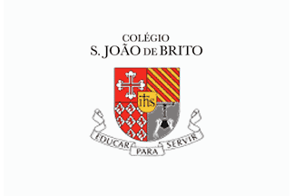
"Colégio São João de Brito" was founded in Lisbon on 28 October 1947 by the Society of Jesus. The college is named after St. John of Brito (1647-1693, canonized on 22 June 1947), known as "The Apostle of Madura" and "The Portuguese Francis-Xavier". "Colégio", a cognate of English "college", means currently and in this case a privately owned school for children between 6 and 17 (or any subset thereof), usually not boarding.
Flag:
The flag of the College, as shown on a photo on the college's website, is white with the arms of the college. The name of the college seems to be written above the arms.
Coat of Arms
The Coat of Arms is quartered and has in the 1st and 2nd the respective quaterings as in the namesake saint's family arms; on the 2nd bendy of Gules and Or, and 4th a non-heraldic representation of the namesake saint's martyrdom tokens. 1st field displays the Pereira family arms and 2nd the Brito family arms. There's also a golden escutcheon over all charged with the Jesuit monogram in black letters ("JHS": jay, haitch with double cross above, ess).
For further information click here
Ivan Sache, 7 Apr 2009 and António Martins-Tuválkin, 9 Apr 2009
![[Uni Lisboa FCUL white flag]](../images/p/pt_fcul_w.gif) 2:3 image by António Martins-Tuválkin, 9 Feb 2006 |
![[Uni Lisboa FCUL blue flag]](../images/p/pt_fcul_b.gif) 2:3 image by António Martins-Tuválkin, 2 Jan 2011 |
It is a white approx. 2:3 flag with a large blue logo overall. The logo consists of
highly stylized lower case "fc" (standing for "Faculdade de Ciências")
connected through the rear stroke of the "f" the University logo. Light blue
stands for Science in this University (and other Portuguese state-owned
Universities -- see below).
The latter is a seal showing a sail ship with two crows on each end (from the
city arms though in a different depiction) in front of two columns;
all around, on a ring, the lettering "Vniuersitas Olisiponesis" (Lisbon
University), above, and "Ad lucem" (towards the light, i.e., the
enlightment), below. I dont know of an university flag, but it almost
certainly exists. The logo seems to have no fixed colour as it can be
differently coloured when used by the University's faculties, e.g.:
- pink - Fine Arts
- light blue - Science
- red - Law
- purple - Pharmacy
- dark blue - Humanities
- golden yellow - Medicine
- yellow - Dental Medicine
A "Faculdade" is, in this context, an autonomous
school within an University; not all Portuguese universities are divided in
such schools, as far as I kinow only the largest state-owned ones are.)
For further information click faculty webpage
António Martins-Tuválkin, 9 Feb 2006
Recently this was replaced with a blue flag with white logo, otherwise
identical, the shade of blue being ambiguously medium (should be
unmitakenly light, as dark blue stands for Humanities).
Concerning the Lisbon University this is a school of, I wrote:
"I dont know of an university flag, but it almost certainly exists."
It does, white with black logo. I will report in detail after I check
locally which versin of the logo is in use.
António Martins-Tuválkin, 2 Jan 2011
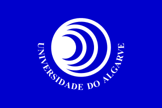
The flag of my university, the University of Algarve is a blue
logo-on-a-bedsheet with the University symbol in white at the centre.
The wording "UNIVERSIDADE DO ALGARVE" is part
of the symbol, so it is a necessary evil, so to speak. If I recall
correctly, the meaning of the eccentric circles is related to the
levels of activity of the institution (itself, the city, the region
and the country) and to the expansion of the knowledge.
Jorge Candeias, 26 Mar 1998
As far as I can remember, the creator of the University symbol was
Gomes Guerreiro [the first Dean of our Uni, JC] and the significance was
rather related with the complexity of Life: cell, tissue, organ, organism
and intelligence.
Frederico Cardigos, 24 Mar 1999
I still don't have enough information to sort out the conflicting
reports about the significance of the symbol. I could add a couple of
things, though:
- the symbol is not "set in stone", meaning that it doesn't have a
design strictly defined. As a consequence, the thickness of the rings
varies from rendition to rendition, which does not damage in any way its
"readability".
- the shade of blue also varies, both in 2-dimensional renditions
(stationery, web graphics, aso) and in the flags themselves. During the
time I studied and worked in the university (10 years), I've seen it
ranging from our B to B++ and occasionally, in print, even lighter
(never quite reaching B-, though). The rendition currently in the
university's website - www.ualg.pt - has a significant green component,
but I suspect that it's more related to the website's design than
enything else - at least I've never seen the symbol being anything but
pure blue.
Jorge Candeias, 12 June 2006

Instituto Politécnico de Lisboa is the joint administration of several state owned higher education schools in Lisbon. It was created in 1958 and currently its integration in the Lisbon University is being planned.
Its flag, in use at least at the Institute's HQ (Estrada de Benfica) and possibly also in the facilities of its constituent schools, is white with the institute's logo in medium blue. This logo shows the letters "IPL" in a very stylized image of a sailship, remotely taken from the city arms.
António Martins-Tuválkin, 25 July 2009

Founded by decree the 16th December 1852 as Instituto Agrícola
de Lisboa (Lisbon Agriculture Institute); after some time in which a
veterinary school was adjoined to it, under the same of Instituto de
Agronomia e Veterinária (Institute of Agronomy and Veterinary); the
two were separated in 12th April 1911, this one moving to its current
location at Tapada da Ajuda (in Lisbon). ISA is currently part of
UTL (Universidade Técnica de Lisboa - Technical University of
Lisbon). As a curiosity ISA is also the home of the oldest student union
in Portugal, founded in 1911 as well.
Website: www.isa.utl.pt/
João Madureira, 10 Apr 2003
A flag flies outside the main building — it is the only one
I’ve seen so far. I don’t believe it has an official status,
but I could be wrong. It consists of the emblem of ISA plus
"Instituto Superior de Agronomia" underneath it. Special attention
should be payed, in my opinion to the emblem, and its strange
bird-tree combination over the national arms.
It’s surely the most curious symbol I’ve seen in portuguese flags
for awhile. Also interesting the motto
"HINC·PATRIAM·SUSTINET".
João Madureira, 10 Apr 2003
The motto «Hinc [facultas agronomica] patriam
sustinet» means «Hence [the Agronomy Faculty] the Fatherland
supports». The last word is stressed on the first syllable:
"sústinet".
António Martins, 28 Sep 2004, quoting Gonçalo Neves
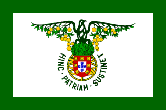
I’ve seen a different flag design with the emblem only (without
"Instituto Superior de Agronomia") on white but with a wide green border
all around.
João Madureira, 21 Jun 2003

Instituto Superior Técnico: (Technical High Institute) is a renowned
engineering school located in Lisbon, Portugal, created in 1911.
Its emblem/logo is an ogival shield stripped vertically in blue, white
and blue, with the white are thickly lined in blue and on it the initials
"IST", the "S" replaced with an integal symbol, standing both for the
letter and for integration, as a hallmark for engineering.
The emblem can be interpreted as a coat of arms, to be blazoned as Azure
on a pale Argent the letters ee-esh-tee Azure.
Although the emblem itself it rather old, having been kept with meager
variation and no alternates across time (more later), the current image
identity guidelines mandate under the shield the name "Instituto Superior
Técnico" spelled out in blue overspaced sans-serif capitals.
However, the plain emblem is immensely more popular among alumni, faculty
and students. In current official use there is a white flag with the emblem centred on it.
![[Instituto Superior Técnico flag (PT) unoff1]](../images/p/pt_ist!1.gif) image by António Martins-Tuválkin, 4 Aug 2009 |
![[Instituto Superior Técnico flag (PT) unoff2]](../images/p/pt_ist!2.gif) image by António Martins-Tuválkin, 4 Aug 2009 |
![[Instituto Superior Técnico flag (PT) unoff3]](../images/p/pt_ist!3.gif) image by António Martins-Tuválkin, 4 Aug 2009 |
Unofficial flags in use were/are mostly blue and white vertical tribands, with the emblem on its centre, (left) either in the current version with lettering, or (centre) the shield only (most usual), or (right) even only the letters "IST", making this a sort of BoA. António Martins-Tuválkin, 4 Aug 2009

Instituto Tecnológico e Nuclear (ITN, or Technological and Nuclear Institute; with website here) in which takes place research and teaching in the field of nuclear energy, and where the only portuguese nuclear reactor (an old heavy water facility) operates. Its headquarters are just outside Lisbon, in the city of Sacavém, Loures municipality.
Recently, this institution made the news due to a EU inspection that detected some flaws in the monitoring of radioactive levels in materials used at the ITN. One of these news items was a newspaper article illustrated with a very light flag with a very dark logo. Since the logo at the site is black, I assumed it to be the colour of the logo in the flag, and as for the background, it’s almost certainly white.
Jorge Candeias, 25 Nov 2004

Universidade Moderna, Modern University, a private university
with its main facilities in Lisbon and a few delegations spread throughout
the country. It came under mediatic attention when a scandal involving its
previous management broke out. Today, most of that management is under
arrest, charged with fraud and several other white collar crimes.
Ever since, this flag has been a constant sighting on the news.
Jorge Candeias, 27 Aug 2003
The flag is red with the symbol in white, consisting of the letters
"UM" next to a stylized portion of a greek temple, over the
full name of the institution and under its motto displayed in arc.
Unfortunately, I was unable to find information about the motto, or images
with a legible motto, so this image is, so far, incomplete.
Jorge Candeias, 27 Aug 2003
The symbol as found today in the university’s website is
somewhat different, so some changes might have happened in the flag in the
meanwhile. If so, however, they do not show up in the news.
Jorge Candeias, 27 Aug 2003

Originally a state service for metallomechanic industrial safety,
Instituto de Soldadura e Qualidade (Welding and Quality Institute) was
privatized and turned into a company providing quality certification according
international norms. Its photo is hoisted at the company's HQ in Porto Salvo,
Oeiras, and shows its dark red logo on white background. The logo shows the
letters "ISQ" set in a specific face within round rim with straight
parallel vertical sides.
For further information click here
António Martins-Tuválkin, 4 Aug 2009

Instituto Superior das Novas Profissões (Superior Institute of
New Professions), or INP, is a private school devoted to the teaching of
«corporate sciences», as they define it.
A curious soundbyte relates to the difference between the logical sigla,
ISNP, and the one actually used: the institution changed its name. It was
originally called simply "Instituto das Novas Profissões",
and only recently added "Superior" to that.
Jorge Candeias, 29 Jul 2003
The flag it’s a white cloth with the logo of the institute in deep blue.
This might be an erroneous depiction, and the flag might contain other
elements, invisible in the photo source I used.
Jorge Candeias, 29 Jul 2003
It has a website at www.inp.pt/
but I was unable to find any reference to the logo, and therefore cannot
explain what it’s meant to stand for, if anything. It’s
pleasing to the eye, made of one large disc and 15 discs half the size
of the big one, but that’s all I can say about it.
Jorge Candeias, 29 Jul 2003

In December 2004 there was a wide mediatic coverage of the efforts of the soon
to be replaced portuguese government to pretend it was obeying the criteria
of the EU stability pact in what concerns state deficit. One of the dumbest
ideas that came up was to get some last minute revenue through the sale of
high-valued governmental buildings that are currently being used as the
headquarters of some public corporations and institutes. One of these is
the institution that works with unemployed people, paying unemployement
subsidies, trying to find them a placement and putting them to study new
competences. This is the Instituto do Emprego e Formação Profissional (IEFP
- Institute of Employment and Apprenticeship)
The sale came to nothing. They ended up balancing the budget by
means of a transfer of the pension fund of the largest portuguese bank,
CGD. The workers of this bank (state-owned) call the move a theft and it
will probably end up in court.
The IEFP was the only institution about
to loose its headquarters whose flag appeared on the TV coverage of the
subject, and quite clearly too. Not surprisingly, it's a white flag with
the IEFP logo in the center. But surprisingly enough it *only* contained
the logo, breaking away from the very vexing "tradition" of adding
additional lettering to it. Good choice!
The logo consists of four thick green elements disposed in such a way as to
suggest the outline of a human figure. The lateral elements look like E's,
and E is the initial of the word "emprego" (employement), the main concern
of the institution.
The logo is quite large in the flag, but the exact proportions are, of
course, conjectural - after all, this came from moving TV images, not from
a still, measurable, medium.
For further information click here!
Jorge Candeias, 30 Jan 2005

Here is another flag info with source in TV images, also broadcast n
December, the flag of the Instituto de Meteorologia (IM - Meteorological
Institute).
This institution is the Portuguese
institution responsible for all that has to do not only with meteorological
studies, but also with seismological and volcanological stuff. That fact
brought several IM people to TV in late December, to try to explain the
Indian ocean tsunami to the people (and to explain what could happen in
Portugal if such a thing happened in the Atlantic, as was the case in
1755). These reports were also illustrated with images of the normal life
of the institute, and one of them showed the flag flying.
Well, no variation and no imagination here. The flag is white with the logo
centered. The logo is an octogonal arrangement of concave triangular
elements, with radial symmetry, alternating the colour between dark and
light blue, the whole suggesting a snow flake. In the center, the initials
IM are dark blue.
All quite basic. Despite of that, the logo is distinctive enough and large
enough in the flag to make it relatively clear. Not so bad.
Jorge Candeias, 30 Jan 2005

ICEP, a government agency which deals with the "image" of Portugal
abroad, especially for turism and foreign investment.
Icep Portugal - Instituto das Empresas para os Mercados Externos (Foreign
Market Company Institute) and I guess I misunderstood its main role, then:
Not about bringing foreign investment to Portugal, but helping Portuguese
companies do business abroad.
This entity (sometimes) uses a flag I used to find very strange: Not itw
own institutional flag, but a LOB of the logo used by them to represent
Portugal itself.
Meanwhile, the said logo is not in use anymore as a symbol for
Portugal, judging from < http://www.portugalinbusiness.com/ >, but still
standing for this entity: see < http://www.icep.pt/images/logo.jpg >.
Anyway, the flag I post separately was seen in use when this logo was
still being used i.e. in tourism brochures and advertisement campaigns
abroad, being logically a flag saying "Portugal" (not "ICEP"), i.e., an
unadvertised alternative design for the national flag.
The said logo consists of two very stylized maps of Portugal side-by-side,
one red and the other green, with a dark yellow sun-disc between and above
them, forming a (very) stylized human figure (!!).
This is probably meant as a counterpart, or is at least something inspired
by, the famous Spain logo devised by painter Joan Mirň -- which is not
used in flag, I think, probably for the best.
António Martins-Tuválkin, 22 Jan 2006

I found in a magazine that was distributed as a supplement by two
newspapers, the Público (edition of 29-10-2006) and the Jornal de Leiria
(edition of 26-10-2006), about the "250 largest companies in the Leiria
district" the small photo, in which two
well-known flags are visible (Portugal and EU), accompanied by a third
one, so far unknown. It's a horizontal bicolour of 4 parts of blue over
1 part of red with a white disc centred on the blue area with something
within. A detail of this flag is attached as pt_islad.jpg. It so happens
that this photo was part of an ad to the Leiria branch of the ISLA -
Instituto Superior de Línguas e Administração (Higher Institute of
Languages and Administration; , a private
institute founded in 1962, which gives degrees in administration,
translation and related subjects (tourism, marketing, etc.).
For further information click here
Source. photos provided by Jorge Candeias
Jorge Candeias, 29 Dec 2006
back to Portugal main page click here