
Last modified: 2026-02-14 by rob raeside
Keywords: rijssen-holten |
Links: FOTW homepage |
search |
disclaimer and copyright |
write us |
mirrors
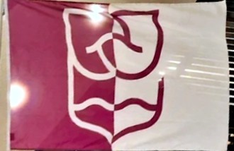 image located by F Smyth, 23 January 2026
With the new logo we show who we are. The new logo connects Rijssen and
Holten. The logo depicts the cores of both towns
together. The shape is based on the old Rijssen-Holten shield. The opening in
the logo represents the openness and accessibility of our organization. The
upper and lower wavy lines refer to the Holterberg and the Regge
rivers – places that make our municipality special and unique. With these
various elements in the new logo, we show where we come from and what we
stand for.
The updated corporate identity
gives us a contemporary and fresh look. This new style is reflected in all
communications, from letters and the website to social media and promotional
materials. With this, the municipality is taking a clear step forward in how
it presents itself to the outside world.
Sources:
https://www.hartvanrijssen.nl/nieuws
https://www.hartvanrijssen.nl/gemeentenieuws
https://www.rijssen-holten.nl
F Smyth, 23 January 2026
![[Rijssen-Holten Coat of Arms]](../images/n/nl-ov)rh.gif) by Jarig Bakker, 19 Oct 2004, after image on the Rijssen-Holten
website.
by Jarig Bakker, 19 Oct 2004, after image on the Rijssen-Holten
website.
Description: Per pale, I. azure a twig or; II. or three pig's heads
gules with tusks argent, per pale; the shield surmounted by a crown or
of five leaves.
The twig on blue is from the Rijssen arms (and flag), while the pig's
heads are from the Holten Coat of Arms with reversed colors.
Jarig Bakker, 19 Oct 2004
 Shipmate Flagchart : http://www.flagchart.net
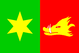
Flag: Two equally long vertical stripes of green and red, with in the
center of green a yellow six-pointed star, and on the center of red a yellow
pig's head.
This flag was adopted 27 Dec 1962 by municipal resolution. The colors
are derived from the municipal arms. The star is the symbol of the Virgin
Mary; the pig's head represents the three pig's heads on the Coat of Arms.
 Shipmate Flagchart : http://www.flagchart.net
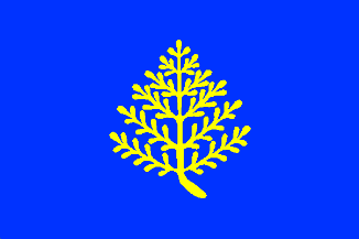
adopted 8 Dec 1951 - a "rijs" is a twig, so the flag is canting.