
Last modified: 2016-03-13 by rob raeside
Keywords: united states shipping lines |
Links: FOTW homepage |
search |
disclaimer and copyright |
write us |
mirrors
See also:
![[Philadelphia and Reading Transportation Line]](../images/u/us~phrdg.gif) by Joe McMillan
by Joe McMillan
Philadelphia & Reading Transportation Line, Philadelphia
(Sources: Lloyds 1912, Wedge (1926)
Established by the Reading Railroad to deliver anthracite coal from northeastern
Pennsylvania to New York and New England via Philadelphia. The flag was red with
a black anchor set diagonally and a black diamond (presumably symbolizing hard
coal) in each corner.
Joe McMillan, 14 November 2001
![[Philadelphia and Southern Mail Steamship Co]](../images/u/us~phiso.gif) by Joe McMillan
by Joe McMillan
Philadelphia & Southern Mail Steamship Co. (Source:
Manning, 1874)
No information on this 19th century company. The flag was red with a white disk.
Joe McMillan, 14 November 2001
![[Philadelphia Transatlantic Line]](../images/u/us~ptl.gif) by Joe McMillan
by Joe McMillan
Philadelphia Transatlantic Line (Charles M. Taylor's Sons), Philadelphia
(Source: 1909 supplement to Flaggenbuch (1905)
No information, but an attractive flag--blue with a red vertical stripe at the
hoist and a white three-leafed clover in the fly bearing the red letters PTL.
Joe McMillan, 14 November 2001
Commonly referred to as PMOLine, in full 'Philippines, Micronesia and Orient Navigation Company', founded 1978 and based in San Francisco. Company history here: http://www.pmoline.com/history.html
The house flag is dark blue with a red central disk bearing what appears to
be a white sail.
Jan Mertens, 2 April 2004
![[Phillips Petroleum Co]](../images/u/us~phl66.gif) by Joe McMillan
by Joe McMillan
Phillips Petroleum Co, Bartlesville, Oklahoma (1917-present) Source:
Styring (1971)
Phillips Petroleum was founded in 1917 by two brothers who had hit their first
oil well in 1905. The "66" brand name came from a quip that a car operating on
the company's fuel wasn't going just 60 miles per hour, but 66. The incident
occurred on the famous U.S. Highway 66, which the company envisioned as the axis
of its gasoline distribution network, so the design of the shield--which is the
shape of the route markers for the U.S. (as opposed to interstate or state)
highway system--has been used by the company since 1927. Phillips currently
operates five tankers to and from Alaska through its Polar Tankers subsidiary.
As of the early 70s, the house flag was light blue with the "66" shield in red,
white, and black.
Joe McMillan, 14 November 2001
![[Pickands Mather Steamship Co]](../images/u/us~pkmth.gif) by Joe McMillan
by Joe McMillan
Pickands Mather Steamship Co, Duluth, Minnesota (Source: www.steamship.net
(no longer available)
Pickands Mather was an iron ore mining and shipping company founded in 1883 by a
group of Cleveland investors. Pickands Mather Steamship
along with several other shipping subsidiaries of the company was merged into
what is now
Interlakes Steamship Co., formed in 1913, and
later into a revamped, enlarged Interlakes in 1966. The parent company survived
into the 1990s when it merged with Cleveland-Cliffs Iron Co.
The flag of Pickands Mather was a red-white-blue vertical tricolor with the
company monogram on the center in red.
Joe McMillan, 14 November 2001
![[Pioneer Line of Australia Packets]](../images/u/us~pionr.gif) by Joe McMillan
by Joe McMillan
Pioneer Line of Australia Packets, New York (later Australia)(1852-present?)
(Source: Chart: Private Signals of the Merchants of New York)
Roderick W. Cameron was a Canadian who came to New York, like many other
Canadians, to enter the shipping business. In 1852, in conjunction with
the shipping broker and agent John Ogden, he opened this line of clippers
to take advantage of the Australian gold rush--the last of the major
clipper companies to be created. The name of the firm was changed to R. W.
Cameron & Co. in 1870. Cameron later settled in Australia, was knighted,
and his company (I believe) still exists, although others may know better
than I whether it is still in the shipping business. The flag was a white
burgee with a red cross, on the center a white lozenge with a blue A for
Australia. Note the similarity to the flags of
David Ogden's Red Cross Line and
John Ogden's Pioneer Line.
Joe McMillan, 14 November 2001
Pioneer Line of Australian Packets. Loughran (1979)
appears to have got misled and shows this flag, though with a black "A", as
being for
John Ogden Pioneer Line.
Neale Rosanoski, 31 March 2004
![[Pittsburgh Steamship Company]](../images/u/us~pghss.gif) by Joe McMillan
by Joe McMillan
Pittsburgh Steamship Company, Cleveland (later Duluth) (1899-1981) (Source:
www.steamship.net (no longer available))
In its prime, by far the largest Great Lakes shipping company company, at
least of those under the American flag, Pittsburgh Steamship was founded by
Andrew Carnegie (and was later a subsidiary of US Steel) to transport iron
ore from the Mesabi Range of Minnesota to the company's mills on the shores
of Lake Michigan and Lake Erie. In the early 20th century it operated well
over 100 ships and barges on the lakes. In 1949, it was operating 62 ships
totalling 700,000 gross tons, a fleet exceeding those of most of the largest
US ocean shipping companies at the time. In 1953 it was renamed the
Pittsburgh Steamship Division of US Steel, and in 1981 it was merged with
other US Steel fleets operating on the Great Lakes to form USS Great Lakes
Fleet, which is still in operation, albeit with far fewer vessels. At
least early on, the Pittsburgh Steamship house flag was an unusual
elongated swallowtailed pennant with a kind of 19th century look, white
with a blue triangle at the hoist bearing a white P, with red stripes along
the upper and lower edges, each charged with 14 white stars.
Joe McMillan, 14 November 2001
See the last picture on
this page,
captioned "Pittsburgh Fleet Flag, 1960". The picture on the site is twice
clickable and shows an additional star next to the 'P'. I cannot quite count the
stars on the border but those in the upper row seem to be upside-down; a pity we
cannot see the flag's tail completely. Lastly the 'P' seems to be on a trapezoid
now rather than on a triangle.
Jan Mertens, 9 December 2005
Pocahontas Steamship Company (pre 1915-post 1961)
This coastwise coal shipping line was a subsidiary of the Pocahontas Fuel
Company and was mainly engaged in routes from Norfolk to New England. Its
homeport is variously given as Salem, Norfolk, or New York. I have found two
flags for this line:
![[Pocahontas Steamship Company]](../images/u/us~poca5.gif)
![[Pocahontas Steamship Company]](../images/u/us~poca6.gif) by Joe McMillan
by Joe McMillan
The first flag from Wedge (1926) is a white
burgee with the initials P.S.Co. and blue edging along the upper, lower, and fly
edges. [wed51] shows this flag with blue strips along the upper and lower edges
only. The second flag is from U.S. Navy -
a white flag with the head of an American Indian woman (obviously if not
convincingly intended to be Pocahontas) above a red geometrical pattern.
Joe McMillan, 14 November 2001
![[Pocahontas Steamship Company]](../images/u/us~p299a.gif)
![[Pocahontas Steamship Company]](../images/u/us~p300a.gif) by Jarig Bakker
by Jarig Bakker
Pocahontas Steamship Co. The 1st flag said to be based on Brown 1951 does not
agree with my copy or with Brown 1958 which both show a tapered swallowtail with
a shallow fork, the top and bottom of the flag edged blue only i.e. not the
fork, and the red letters being larger and in descending scale.
Stewart (1953) and 1957 does however show a version with the fork also edged
blue though again the letters are large and show a slight descending scale. According to Talbot-Booth (1936)
the company originated as the Pocahontas Navigation Co.
Neale Rosanoski, 31 March 2004
![[Allied Towing Corp. houseflag]](../images/u/us~psco.gif) image
by Jan Mertens
image
by Jan Mertens
An uncaptioned photo on
this
page is surely the flag of the Pocahontas Steamship Company
although the picture on the Boatnerd site shows yet a fifth variant!
This last version is a tapering swallowtail, bearing a white descending
diagonal stripe (taking up almost half of the upper hoist, touching the
upper edge, and completely taking up the lower swallowtail tongue; this
leaves two triangles of which the upper one is blue and the lower one, red.
In the white stripe are blue initials ‘P.S. Co.’ without serifs.
The two triangles are unequal in surface or form surely but on the other
hand the tongues are neatly divided blue above white.
Jan Mertens, 20 September 2005
![[Polaris Steamship Company]](../images/u/us~polrs.gif) by Joe McMillan
by Joe McMillan
Polarus Steamship Company (Source: U.S. Navy)
No information on the company. The flag was a white pennant with a
blue-bordered white star surrounded by a blue circle; on the center of the
star a red P.
Joe McMillan, 14 November 2001
![[Pollard Steamship Company]](../images/u/us~polrd.gif) by Joe McMillan
by Joe McMillan
Pollard Steamship Co, San Francisco (early 20th century) (Source: Lloyds
1912)
I have nothing on this company other than that it was in existence in the
1911-1912 period. The flag was a red swallowtail with a white disk bearing
a blue P.
Joe McMillan, 14 November 2001
![[Polish America Navigation Company]](../images/p/pl!1919a.gif) by Grzegorz Skrukwa
by Grzegorz Skrukwa
Polish American Navigation Co, New York (1919-23) (Source: verbal description
in North Atlantic Seaway IV:1557)
This was a line put together after World War I as a surrogate national line as
the newly independent Republic of Poland was getting on its feet. A version of
this flag is one of several proposed designs for a
Polish merchant ensign. The flag was
white with a red lozenge bearing an white eagle. Polish
American was a US-flag carrier during its short existence.
Joe McMillan, 14 November 2001
![[Pope and Talbot Steamship Company]](../images/u/us~pt.gif) by Jarig Bakker,
based on the website of the National
Maritime Museum.
by Jarig Bakker,
based on the website of the National
Maritime Museum.
From the website of the National
Maritime Museum, "the house flag of Pope and Talbot Inc, San Francisco. A
white rectangular flag showing a blue printed star in the centre bearing a white
disc with the red letters 'PT'. There is a blue stitched inscription 'POPE &
TALBOT' below. The flag is made of cotton fabric and is machine sewn. A rope is
attached."
Jarig Bakker, 24 August 2004
![[Pope and Talbot Steamship Company]](../images/u/us~pt0.gif) by Jarig Bakker
by Jarig Bakker
Loughran (1979) has the flag with just the
logo.
Jarig Bakker, 24 August 2004
![[Portland and Steamship Company]](../images/u/us~prtas.gif) by Joe McMillan
by Joe McMillan
Portland & Asiatic Steamship Co, Portland, Oregon (Source: 1909 supplement to
Flaggenbuch (1905))
The Portland & Asiatic was a subsidiary of the Oregon Railroad and
Navigation Company, which was owned in turn by the Oregon Short Line
Railroad, which in its turn was owned by the Union Pacific Railroad. It
ran from Portland to San Francisco and thence to the Far East. A rather
Soviet-looking flag: red with a white inverted star, with a double red and
white border, and a white frame running inside the edges of the flag.
Joe McMillan, 14 November 2001
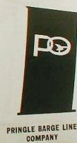
![[Pringle Transit Company]](../images/u/us~hfpgl.gif) image by António Martins-Tuválkin, 17 July 2007
image by António Martins-Tuválkin, 17 July 2007
The flag is a 3' x 5' swallowtail burgee with a red field around a white
diamond, and a blue "P" inside the diamond. Pringle Transit is a subsidiary of Oglebay Norton.
Les Weston, 2 February 2007
I tried to find some information about this bygone firm, keeping in mind that
Pringle's mother company, Oglebay Norton, has also disappeared in the meantime.
Pringle Transit Co. was a subsidiary of Oglebay Norton, dissolved in 1994.
Comment on the
Boatnerd site by Brian Ferguson:
"In 1975 management of the Thayer and Roesch changed hands to the Oglebay Norton
Company. This was no simple task as the unlicensed crewmembers on the two
vessels belonged to the Seafarers International Union. Oglebay Norton's Columbia
Transportation Division houses their employees under Local 5000 of the
Steelworkers. Rather then attempting to merge the unions, a subsidiary was made
to operate the vessels under, and in 1975 the sisters were put under the
management of Pringle Transit, although realistically the same group that
operated Columbia managed them."
On the same issue, following contemporary quote from
on-line Scanner v.8, n.1 (Oct. 1975) – Monthly News Bulletin of the Toronto
Marine Historical Society:
(Pringle Transit Co.) "has been formed especially for the occasion and takes its
name from the former Pringle Barge Line, an Oglebay Norton affiliate which ran
coal from Toledo to Detroit. (…) The (William R., jm) ROESCH and (Paul, jm)
THAYER have been given the traditional Oglebay Norton hull and cabin colours but
the funnels, instead of the Columbia star design, bear the old Pringle
(P-Ring-Gull) insignia in white on a maroon background."
I have been unable to find when the Pringle Barge Line was founded but the
oldest trace I found was 1914; company seat was Cleveland. In 1957 the firm,
with several others, was merged into the newly named
Oglebay Norton Co.:
Jan Mertens, 6 February 2007
Following yesterday’s message (see this image)
showing the funnel marking, the question being of course whether this design was
also used on a house flag – possibly white emblem on maroon ground. The purpose
of this post is to put up the company logo, hoping that it will help identify
Pringle – Barge Line or not – when a flag does show up.
Jan Mertens, 7 February 2007
![[Prudential Steamship Company]](../images/u/us~prud.gif) by Joe McMillan
by Joe McMillan
Prudential Steamship Corp, New York (1933-?) (Source: U.S. Navy)
Prudential Lines, which focused throughout its history on service between
the United States and the Mediterranean,
was founded by Stephan Stephanidis, a Greek immigrant, in 1933 as a tramp
steamer company with one antiquated freighter. During World War II
Prudential was one of the general agents operating ships for the War
Shipping Administration and seemed positioned to become a more major
presence in the industry after the war. But a series of managerial
blunders kept it perpetually on the brink of bankruptcy from the mid-50s to
the late 90s. As far as I can tell, it is no longer is business, but I'm
not sure what happened to it or exactly when. It was apparently teetering
on the edge of extinction in 1998 when Rene de la Pedraja included it in
his Historical Dictionary of the U.S. Merchant Marine. The flag was red
with a white cross, on the center of the cross a white P on a small blue
diamond.
Joe McMillan, 14 November 2001
![[Prudential Steamship Corp]](../images/u/us~p306a.gif)
![[Prudential Steamship Corp]](../images/u/us~p307a.gif) by Jarig Bakker
by Jarig Bakker
Prudential Steamship Corporation. By the early 1960s Lloyds is showing it as
Prudential Lines Inc. and apparently around 1970 it merged with Grace Lines Inc.
to form Prudential-Grace Line Inc. but within a couple of years the name
apparently reverted back to Prudential Lines Inc. Of its last three ships it
sold the barge carrier [lash ship] in 1989 whilst the two general cargo ships
arrived at the shipbreakers in 1991 although by then they were owned by Vessels
Charters Inc. indicating that Prudential had sold them earlier, possibly
chartering them back. Prior to the merger, around 1968, there had been a flag
change to a blue pennant with a large yellow "P"
which was used as the basis for the flag for Prudential-Grace Line Inc. which
saw what is described as a yellow outlinedstar [of 4 points] radiating from the
"P" to the flag edges. These flags are shown by Loughran 1979 whilst Styring in Brown 1978 notes the last changes but describes
the flag "P" as being white, and makes no mention of the earlier 1968 change,
continuing to show the original version as still operating up until the merger.
Neale Rosanoski, 31 March 2004
![[Puerto Rico Towing & Barge Company]](../images/u/us~prt.gif) by Jarig Bakker
by Jarig Bakker
This company is part of Great Lakes Group. The
flag is red charged with a green diamond and white PRT.
Source:
http://www.thegreatlakesgroup.com/puerto.htm
Dov Gutterman, 11 October 2003
![[Puget Sound Freight Line Inc.]](../images/u/us~psfl.gif) image by Jarig Bakker,
5 February 2006
image by Jarig Bakker,
5 February 2006
Puget Sound Freight Line Inc., Seattle, Wa - flag quartered red and white; on
red white "PS"; on white a black truck and tug.
Source:
Loughran (1995)
Jarig Bakker,
5 February 2006
![[Puget Sound Navigation Company]](../images/u/us~pugsd.gif) by Joe McMillan
by Joe McMillan
Puget Sound Navigation Co, Seattle (1913-present) (Source: Stewart, 1953)
The grandson of the original Black Ball Line founder bought this company in 1927
and modified the Black Ball Line flag to a Black Disc on a Red flag. Black Ball Transport
Co. had been created in 1913 by merging several earlier Puget Sound
ferry companies and by 1935 had a virtual monopoly. By 1949, it was operating 23
ships transporting vehicles, freight, and passengers within the Puget Sound. In
1951, the State of Washington bought out the entire Puget Sound route system
except for the line connecting Port Angeles, Washington and Victoria, British
Columbia. The Black Ball Transport still operates a single ship (M.V. Coho)
between Port Angeles and Vancouver. The company is now known as Black Ball Transport Inc. In 2004 Black Ball Transport ownership was transferred to the
University of Oregon Foundation.
Basis/Backup links:
http://cohoferry.com/main
http://en.wikipedia.org/wiki/Black_Ball_Transport
http://www.canada.com/victoriatimescolonist
Ken Bennett, 6
April 2008
At http://cohoferry.com/main, the
history is lacking as it appears to indicate that the company formed in 1928
whereas formation as a subsidiary of Alaska Steamship Co. was made in 1898. The
link
http://www.tacomascene.com/kalakala/black_ball_line/black_ball_line.html
appears to give a reasonable history of the company and about the adoption of
the flag in 1928 by Alexander Peabody who took over control of the company
following the death of his father. As Ken states the ferry operations were sold
in 1951 but this was apart from the Canadian section which continued until 1961
as Black Ball Ferries Ltd. for whom I earlier today forwarded details as they
were the one who continued to use this flag.
The connection with Black Ball Transport Inc.
made here is misleading – again refer to my comments on this company which did
not have a legal connection but can be said to have been inspired thereby. So
whilst the Black Ball name does continue this flag version does not as Black
Ball Transport Inc. adds the white edging to the black ball though I guess it is
thin enough to miss at a distance which may explain why
Brown (1982) shows this flag instead.
Neale Rosanoski, 12 October 2009
![[Pure Oil Company]](../images/u/us~pure1.gif)
![[Pure Oil Company]](../images/u/us~pure6.gif) by Joe McMillan, 14 November 2001
by Joe McMillan, 14 November 2001
Pure Oil Company, Chicago (1895-?)
The Pure Oil Company was originally established in Pennsylvania but later moved
its headquarters to Chicago. Its main marketing area was in the Midwest and its
tanker operations therefore were predominantly on the Great Lakes and the
Midwestern rivers. I have found two flags:
The first image (Source: www.steamship.net (no longer available))
is divided per saltire, red and
white, with a blue rectangle on the center bearing the white initials POC.
The second image (Source: U.S. Navy) is white
with the corporate logo in blue.
Joe McMillan, 14 November 2001
US shipping lines house flags - 'Q, R' continued