
Last modified: 2021-05-29 by rob raeside
Keywords: sheaf steam | shell | silver | map: africa | pg | sally | sfms | ws&co | handshake |
Links: FOTW homepage |
search |
disclaimer and copyright |
write us |
mirrors
![[Shamrock Shipping Company, Ltd. houseflag]](../images/g/gb~shamr.gif) image
by Ivan Sache, 22 April 2021
image
by Ivan Sache, 22 April 2021
Source: Brown's Flags and Funnels [Wedge 1926]
Shamrock Shipping Company, Limited, Larne Harbour - blue burgee, red cross, in
the center white "S". Larne is a town just north of Belfast, Northern Ireland.
Jarig Bakker, 31 January 2005
Shamrock Shipping Co. Ltd. The company traded from 1897 to 1976. A 1967 book
describes a flag of blue with a white "S" so it may have changed towards the end
but it is quite possible that the flag has been assumed on the basis of the
funnel band as sources up to 1966 were still showing the pennant with cross and
"S".
Neale Rosanoski, 17 March 2005
Lloyd's Book of House Flags and Funnels (1912) shows the same house flag (#236,
p. 48).
https://research.mysticseaport.org/item/l011061/l011061-c008/#13
Ivan Sache, 22 April 2021
![[Shan Line houseflag]](../images/g/gb~hfshl.gif) image by Ivan
Sache, 3 April 2008
image by Ivan
Sache, 3 April 2008
Lloyds Book of House Flags and Funnels (1912)
shows the house flag of "Shan Line (T.W. Richardson, London, and Bradley & Co.,
Swatow & Hong Kong)" (#157, p. 44), as quartered red-red-blue-blue by a yellow
cross.
Ivan Sache, 3 April 2008
![[Sharp & Co. houseflag]](../images/g/gb~hfs&c.gif) image by Ivan
Sache, 26 April 2021
image by Ivan
Sache, 26 April 2021
Lloyd's Book of House Flags and Funnels (1912) shows the house flag of
Sharp & Co. (#641, p. 67), a Newcastle-based company, as blue with two thin
horizontal white lines and the white letters "S&C°." in the center.
https://research.mysticseaport.org/item/l011061/l011061-c008/32/
Ivan
Sache, 26 April 2021
 image
by Jarig Bakker,
based on the website of the National
Maritime Museum.
image
by Jarig Bakker,
based on the website of the National
Maritime Museum.
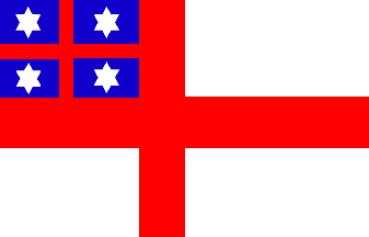
Shaw Savill and Albion Cy.Ld., London. White, a red St George's cross,
a blue canton with another red St George's cross and a white cross in the centre
of each blue field and four six-pointed white stars.
Jan Mertens, 28 May 2004
See also: New Zealand flag of the United Tribes for the influence of this flag on the development of the flag of New Zealand.
There are several differences between the first National flag of New Zealand
and the Shaw, Savill and Albion flag — fimbriation, number of points on stars.
But it does seem likely that the first National flag of NZ was the inspiration
for the Shaw Savill flag, though there are apparently (company histories) no
records about who adopted or adapted the flag for Shaw Savill, or why.
Stuart Park, 1 April 1997
The reason for the adoption of a very similar flag by Shaw Savill is not
clear — presumably they meant to identify with the
1834 flag. Perhaps they just wanted to
simplify it (no fimbriation and the 6 pointed stars of the
Admiralty version).
Stuart Park, 9 November 1996
From the website of the National
Maritime Museum, the house flag of Shaw Savill and Albion Co. Ltd, London. A
rectangular white flag with a red cross. In the canton, there is a red cross on
a blue background with a five-pointed white star in each quarter. The flag is
made of a wool and synthetic fibre bunting. It has a cotton hoist and is machine
sewn. The design is the same as the national flag of the United Tribes of New
Zealand used from 1834 to 1840 (see note).
Robert Shaw and Walter Savill set up office in London in 1858 as Shaw Savill &
Company to participate in the New Zealand trade, primarily as cargo brokers.
However within a year they were carrying their first passengers and became known
as 'The Passengers' Line of Packets'. The discovery of gold in New Zealand in
the 1850s led to a increase in passenger numbers. In 1862 the company sent
forty-five sailing ships, and in 1863 sixty nine. In 1873, the 'Mongol', an iron
screw steamer owned by the company, made the first commercial voyage by a full
powered steamer from London to Otago, in only 58 days (sailing took from 74 -
100 days).
Shaw and Savill had been in competition with Albion of Glasgow since they set up
business, and the two companies had a virtual monopoly on the New Zealand trade.
With the creation of the competitive New Zealand
Shipping Company, and the incentive of a subsidy from the colonial
government for a direct steam service connecting New Zealand to Britain, the two
companies merged to form Shaw Savill and Albion in 1883. In 1884 the White Star
line joined forces with SS&A to run a combined service. White Star ships
wore both house flags. By the time the Panama Canal was fully operational in
1918, passage time had dropped to 30 days. By 1908 all SS&A sailing ships had
been disposed of. SS&A joined the Australia trade from 1905 when they acquired
the Aberdeen Line, and in 1934 purchased White Star interests in the Australia
line.
In the 1939 to 1945 War, over half the fleet was sunk. New ships were built with
the post war compensation so that by 1967 the fleet was at its largest in the
company's history. However by the 1970s the world economic climate was changing
and the company fortune's waned. The last ship was sold in 1986. The company was
eventually taken over by Hamburg Sud, and the UK holding company name is Shaw
Savill Holdings Ltd."
Jarig Bakker, 28 August 2004
Shaw Savill & Albion Co. Ltd. The blue of the canton should be dark but
otherwise this is an accurate portrayal of the flag. The company was based in
London, being formed c. 1882/3 by the amalgamation of Shaw Savill & Co. and the
Albion Line of Patrick Henderson & Co. In 1985 it was fully absorbed into
Furness Withy (Shipping) Ltd. According to "The New Zealand Ensign" (published
by the N.Z. Department of Internal Affairs 1965), the Shaw Savill version of the
1st New Zealand National flag was probably adopted in 1858 (on the formation of
Shaw Savill & Co.) but they do not give any reasons and the date of adoption is
given by another source as 1862. The New Zealand National Flag had since become
the British Union Flag (6.2.1840) so the design did not conflict with any
official British flag though, as stated by Stuart Park, it was not, in any case,
an exact replica. In actual fact a very similar flag to that of Shaw Savill with
stars similar to the FOTW image but with 3 of them angled and only that in the
4th quarter appearing as in the image, was flown by Colonel William Wakefield on
the "Tory" in 1839 with a photo of the actual hand made flag appearing in this
publication (apparently it was made on the basis of an incomplete description
published in the New South Wales Gazette of 19.8.1835) which also depicts the
company provided image as showing a wider main cross and the stars being
squatter with the upper and lower side point sides being on the horizontal line,
compared with the FOTW image. A swallow tailed version was flown by the fleet
commodore.
Neale Rosanoski, 3 October 2002
Book sources are not always accurate with their portrayal of the stars
with some showing 4 or 5 points. Griffin 1895 shows a flag in the name
of Shaw Savill & Co. in which the blue canton bears a narrow white
cross with 4 small white circles grouped around the cross fesse point.
These may be meant to be stars, the image is very small. It is shown
in the sailing ship section and presumably refers to the sailing ships
which Shaw Savill & Co continued to operate as a separate company.
According to
Talbot-Booth (1936) the flag of Shaw Savill & Albion was often
flown by ships at sea, an unusual occurrence with wear and tear
usually being saved for use when in port.
Neale Rosanoski, 17 March 2005
Note Not quite. The Otago Museum has a
handful of shipping flags, one of which is the design as
mentioned here. The flag used by NZ, however, had dimensions much
closer to the current (British) white ensign - I'm sure the red parts
were nowhere near as broad as on the image here. Also, the image sent
seems to have the cross offset towards the hoist - it was centred in
the NZ flag.
James Dignan, 29 August 2004
From a postcard collection:
10.4.4: Shaw Savill & Albion
Postcard #10, 4th row, 4th flag of the
collection reads "Shaw Savill & Albion" and
shows more or less the same flag as above, but with five-pointed stars.
António Martins-Tuválkin, 5 May 2010
The same house flag is shown in Lloyd's Book of House Flags and Funnels (1912)
(#1379, p. 102).
https://research.mysticseaport.org/item/l011061/l011061-c008/#67
Ivan
Sache, 30 April 2021
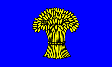 image by António Martins-Tuválkin based on an image by Pascal Gross,
23 January 2006
image by António Martins-Tuválkin based on an image by Pascal Gross,
23 January 2006
The company was founded by W. A. Souter in 1906 and named after the Sheaf River
that ran through his home city of Sheffield, although the company was based in
Newcastle. Starting out in the Baltic, Biscay and Mediterranean trades the
company operated in both deep sea tramping and the North East coal trade between
the wars. The company suffered heavy losses during the Second World War. At the
end of the 1950s it moved out of deep sea tramping and into the iron ore trade,
acquiring bulk carriers from the 1960s. Its subsidiary Bamburgh Shipping Co. Ltd
was sold to Ben Line in 1976. The remaining ship management side of the business
was taken over by Danish shipbuilders Burmeister & Wain and traded as Souter
Hamlet."
Jarig Bakker, 28 August 2004
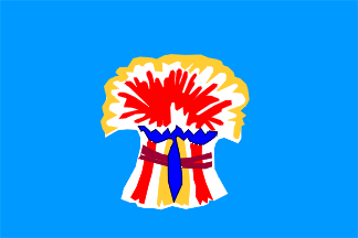 image by Jarig Bakker
This image based on the website of the National Maritime Museum and the Forces War Records shows an example of the house flag of Sheaf Steam Shipping Co. Ltd., Newcastle-on-Tyne. A rectangular pale blue flag with a coloured wheat sheaf in the centre. The flag is made of a wool and synthetic fibre bunting. It has a cotton hoist and is machine sewn. The sheaf is printed. The sheaf is much more colourful than the one reported to be commonly used by Capt. Ken Appleby.
The colouring of the wheat sheaf [on the NMM flag] is unusual seeing
that all the regular sources refer to the emblem as being yellow. Possibly the
fact that the NMM note the emblem as being printed on may mean something.
Neale Rosanoski, 17 March 2005
The image there looks as though it was done with a felt tip pen! I served my
time with W.A. Souter sailing on the Sheaf Field (tramp ship), Sheaf Royal
(tanker), Sheaf Arrow (Collier and Baltic trader) and Sheaf Mount (tramp ship),
and the house flag is definitely light blue with a golden coloured sheaf of
corn, which is always shown as a good bunch with the edges trailing over.
Capt Ken Appleby, 27 December 2005
[Editor's note: the image shown above in fact rather accurately reproduces the
flag shown at
http://collections.rmg.co.uk/collections.htmldisplayRepro.cfm?reproID=F2764&picture=1#content
- however the contributor reports that flag is not typical of the line.]
 image
by Jarig Bakker
image
by Jarig Bakker
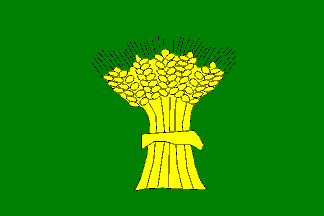
Lloyds (1912) show a green flag with the yellow wheat sheaf under the name of W.A. Souter & Co, with
Talbot-Booth (1936) giving the 1906
formation date for the one ship company Sheaf Steam Shipping Co. which in 1914
was merged with an associate company to form the Sheaf Steam Shipping Co. Ltd.
Brown (Wedge 1926) onwards then show the field as blue with Talbot-Booth stating that
the flag was square. According to Ben Line Steamers website history both Sheaf
and its subsidiary Bamburgh Shipping were sold to them in 1976, the ship
management side which became Souter Hamlet changed in 1981 to Souter Shipping
Ltd. and since 2001 has been OSG Ship Management (UK) Ltd., a subsidiary of the
American company Overseas Shipholding Group Inc.
Neale Rosanoski, 17 March 2005
 image
by Jarig Bakker,
based on the website of the National
Maritime Museum.
image
by Jarig Bakker,
based on the website of the National
Maritime Museum.
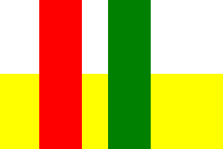
From the website of the National
Maritime Museum, the house flag of Shell Mex and B. P. Ltd., London. A
rectangular flag divided horizontally white over yellow with a red and a green
vertical stripe placed, slightly separated, across the centre. The flag is made
of a wool and synthetic fibre bunting. It has a cotton hoist and is machine
sewn."
Jarig Bakker, 28 August 2004
The red and green vertical stripes on this flag are based in the flag of
Mexico, to which the company name also refers.
António Martins-Tuválkin, 17 March 2005
Loughran (1979) shows an image with yellow
extending from bottom to top between the red and green stripes. I suspect a
printers' error has extended the yellow to the top of the flag. The company was
actually involved in the UK coastal UK oil trade from c.1919 to 1975 as a joint
venture between Shell-Mex and BP so I don't know about involving the Mexican
colours. More likely I imagine it is a combination of the Shell colours with
red-white and yellow with those of BP with green, red, yellow and white.
Neale Rosanoski, 19 March 2005
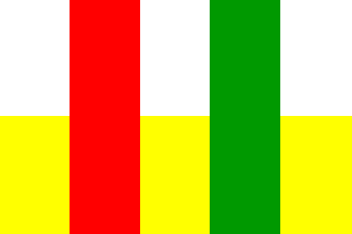 image by António Martins-Tuválkin, 9 May 2010
From a postcard collection: 11.1.4: Shell
Mex & B.P.
Postcard #11, 1st row, 4th flag of the
collection reads "Shell Mex & B.P."
and shows an equal stripes variant, drawn from a real flag at National Maritime
Museum website: I guess that either the author of the image on the
collection simplified the original design, or
the actual flag was carelessly sewn.
António Martins-Tuválkin, 9 May 2010
 image
by Jarig Bakker
image
by Jarig Bakker
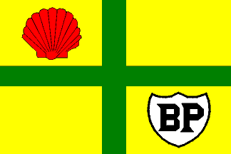
Shell-Mex & B.P. Ltd. Up until 1963 they had a yellow flag with a green
cross, in the canton a red shell and in the 4th quarter a white shield bearing a
black "BP". Loughran (1979) shows a slightly different
version of the next flag which is shown here with the vertical bands becoming a
narrow triband of red-yellow-green placed at the centre, whilst Ridley
Chesterton in his 1967 book Coastal Ships describes a flag of white over yellow
over white bands (see below).
Neale Rosanoski, 17 March 2005
 image
by
António Martins-Tuválkin, 17 March 2005
image
by
António Martins-Tuválkin, 17 March 2005
The Ridley Chesterton flag I have doubts on as it is possible that he has
just assumed that it would be the same as the funnel bands and I would have
thought that if it had existed then Loughran (1979),
with his book of 12 years later, would have noted its existence. But he has
described it so fair enough that it be shown.
Neale Rosanoski, 19 March 2005
What was originally Bowring Petroleum became, or was taken over by,
Anglo-Mexican Petroleum, who sold Mex Motor Spirit. By 1921 Shell had taken over
Anglo-Mexican and become Shellmex. Later the suffix 'mex' was dropped.
David Prothero, 26 March 2005
 image
by Jarig Bakker,
based on the website of the National
Maritime Museum.
image
by Jarig Bakker,
based on the website of the National
Maritime Museum.
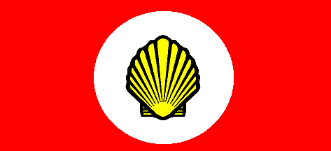
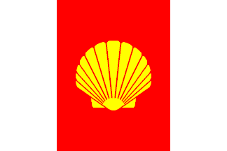
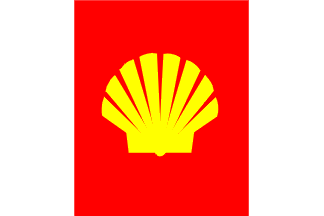
From the website of the National
Maritime Museum, the house flag of Shell Tankers Ltd., London. A red
rectangular flag with a white disc in the centre bearing a gold shell. The flag
is made of a wool and synthetic fibre bunting. It has a cotton hoist and is
machine sewn."
Jarig Bakker, 28 August 2004
 image
by Miles Li,
8 November 2019
image
by Miles Li,
8 November 2019
 images
by Jarig Bakker
images
by Jarig Bakker
Shell Tankers Ltd. The flag was common to members of the international group.
According to Loughran (1979) in 1963 there was
a change to white with a broad red pale bearing the yellow shell followed in 1972 by a change in design of the shell with the
flutings reduced to 7 though he shows 8 in his image and this is confirmed by photos of the shell appearing on
funnels.
Neale Rosanoski, 17 March 2005
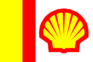
In 1973 the flag was altered to unequal vertical bands of
yellow-red-white with the shell outlined red and placed on the
white.
Neale Rosanoski, 17 March 2005
 image
by Jarig Bakker,
based on the website of the National
Maritime Museum.
image
by Jarig Bakker,
based on the website of the National
Maritime Museum.
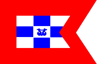
From the website of the National
Maritime Museum, the house flag of Ship Towage (London) Ltd., London. A
swallow-tailed burgee divided into nine blue and white checks. It has a broad
red border and the central white check has a blue motif of two hooks. The flag
is made of a wool and synthetic fibre bunting. It has a cotton hoist and is
machine sewn."
Jarig Bakker, 28 August 2004
 image
by Jarig Bakker,
based on the website of the National
Maritime Museum.
image
by Jarig Bakker,
based on the website of the National
Maritime Museum.
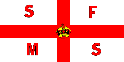
From the website of the National
Maritime Museum, the house flag of the Shipwrecked Fishermen and Mariners
Royal Benevolent Society. A white rectangular flag with a red St George's Cross
with a crown in the centre and the letters 'SFMS' in the quarters. The flag is
made of a wool and synthetic fibre bunting. It has a cotton hoist and is machine
sewn. The design is printed."
Jarig Bakker, 28 August 2004
The image above shows a simple cross at the top, but the photographs at the National Maritime Museum appear to show something more elaborate on the real flag, which I can't quite interpret because I keep seeing it as a bas-relief, which doesn't occur all that often on a flag. Also, while the print has a rather different crown altogether, because of the closer look I'd say the photographs show "jewels" on the band of the crown, which we seem to have missed initially. Whether the differences are significant, I don't know. I do know that nowadays, the SFMS does show a simple crown on again a different type crown, in the flags on their emblem, and such a drawing can also be seen at their website: http://www.shipwreckedmariners.org.uk/Home/MediaCentre.aspx.
The Red Duster site in presenting the Shire Line not only recounts the
history of this company and its ramifications, it also shows the various house
flags. The text is based on a book by Duncan Haws, the cover of which is seen
here (thus neatly showing all the relevant flags at once):
http://www.schiffmini.de/listen/listen/archiv/buch/BL0010.jpg.
The main sources for this entry are the Red Duster pages, the first one of which
is here:
http://www.red-duster.co.uk/SHIRE.htm and The Ships List (warning, quite
correctly, not to confuse the firm in question with the Scottish Shire Line:
http://www.theshipslist.com/ships/lines/shire.htm.
In 1860 David James Jenkins founded his London-based company, D.J. Jenkins &
Co., not without acquiring extensive sailing experience first (SW England,
Baltics). A socially conscious owner with a predilection for Welsh masters,
Jenkins slowly but surely extended his fleet sailing to the West Indies and the
Far East. After the pioneer years, ships were to be called after Welsh counties
hence the commercial name, Shire Line. Further expansion took the firm to India,
Ceylon, and – Jenkins being among the first to do so - Japan. The company
reacted cautiously to new developments such as the opening of the Suez Canal
(1869) and the steamship (his first one was built in 1872).
Sailings to Japan had become so important that four steamships operating that
route were presented as the ‘Shire Line: The Japan Line of Steamers’.
Involvement with other firms – establishing a Far East Conference or cooperation
with the Glen Line - reflected a broad outlook further illustrated by the
phasing out of sailing ships (completed 1888). 1891 saw the demise of David
Jenkins; his son Noble, confronted with a Far East slump, reacted creatively and
expanded the firm’s operations across the Pacific to North America. In 1896 a
new company, David Jenkins & Co. Ltd, was formed.
The Russo-Japanese war (1904-1905) had a negative impact on business as the
Japanese, who had hitherto relied on buying smaller vessels or having them built
abroad – mainly in Great Britain - invested heavily in ships and consequently
became serious competitors. After that war, Jenkins sought cooperation with the
non- conference firm Brocklebank: the result
(1906) was a joint venture whereby Brocklebank became owner of half the Shire
Line operation (not David Jenkins & Co.) and each put five ships at the disposal
of a common service to Japan. This was not to last for long as one year later
Royal Mail bought Jenkins’s half and the new body was to be named Shire Line of
Steamers Ltd while in the background, David Jenkins & Co. went out of business.
Royal Mail became sole owner in 1911 by
taking over Brocklebank’s share, followed one year later by the merging of the
Shire and Glen Lines (which had become a
subsidiary of Elder Dempster and Co. itself under
control of Royal Mail) to profit by advantages of scale and exploit the historic
ties between them. Lastly, the name ‘Glen & Shire Line’ was introduced in 1920.
Now follow the house flags in chronological order.
 located by Jan Mertens
The first one shown resembles that of London – white, a red (St George’s)
cross throughout, a red upright sword in the upper hoist corner and the
firm’s initials, also in red, in the lower hoist corner: ‘J & Co’ (raised
‘o’).
 located by Jan Mertens
The second one is divided vertically, the hoist side taken up by the former
flag without the initials, looking even more London-like; the fly side is a
plain blue field. The flag thus neatly shows Jenkins’s side of the business
but also repeats the white-and-blue pattern of Brocklebank. Captioned
‘Jenkins-Brocklebank’.
 located by Jan Mertens
The third house flag very fittingly replaces the ‘Jenkins’ half of the flag
by a white field bearing a red saltire and a yellow crown in the centre
(i.e.
Royal Mail); captioned 'Shire Line'.
![[Royal Mail Lines houseflag]](../images/g/gb~royml.gif) image
by Ivan Sache, 8 March 2004
image
by Ivan Sache, 8 March 2004
The fourth and last flag is the one we know as that of
Royal Mail
and captioned by the on-line 1912 Lloyds Flags & Funnels as ‘Royal Main
Steam Packet Co., London, also Shire Line, London’. See no. 1188 on this
page:
http://www.mysticseaport.org.
It is interesting to see the shift away from Jenkins and towards Royal Mail in
the various house flags.
Jan Mertens, 6 December 2005