
Last modified: 2024-01-06 by  zachary harden
Keywords: keio university | crossed pen tips |
Links: FOTW homepage |
search |
disclaimer and copyright |
write us |
mirrors
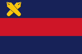
image by Zachary Harden, 22 June 2018
See also:
Keio University is a private institution founded in 1858 by Yukichi Fukuzawa.
The University symbols are explained at Keio University Symbols page
Sanshokuki (Blue-Red-Blue Flag)
The school flag of Keio is called the "Sanshokuki" (means three-colored flag), but unlike the national flag of France, it is actually two colors in three stripes of blue, red and blue. The meaning of these colors are not clear. The exact date of establishment is not clearly known, however, in newspaper "Jiji Shimpo" dated 28 November, 1894, there is an article about Keio University students joining a parade for the first time to celebrate the fall of Ryojun in the Sino-Japanese War, carrying tin can lanterns with the school flag flaunting beside them. In "Fuzoku Gaho" volume 82, published in December of the same year, the same news is shown with a picture of the three striped flag with the Pen Mark on its left shoulder, although the colors cannot be distinguished. The Sanshokuki seems to have appeared around 1895, originally using light blue and red, and around 1898 when Eikichi Kamata became President of Keio University, it seems to have been officially authorized as the school flag. However, the size, shape and colors were not standardized, therefore on 14 February 1964, size and color of the flag and placement of the Pen Mark on the flag was officially standardized.
Both the Pen Mark and Sanshokuki were registered in 1992 as trademarks of Keio University, and are now under the law's protection. Furthermore, in 2005, in preparation for Keio University's 150th anniversary, the Visual Identity Guideline was developed for the Pen Mark, Sanshokuki, etc. The marks have become easier to use as symbols of Keio University.
Jan Mertens, 11 April 2008
The pen-mark symbol that is used on the flag was
officially sanctioned by the school in 1900 according to
the school. The visual identity
manual, as hinted by Jan Mertens on 11 April 2008, shows the pen-mark
symbol was created by a student in 1885 (Meiji 18) because of the
phrase "The pen is mightier than the sword" and how the pen is the
main tool to create and spread learning.
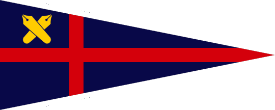
As for the VI manual, I did manage to locate the 2015 update and page 16 of this all Japanese PDF shows the proper portions of the
main university flag but also any club variants. The three main bars,
blue red and blue (Pantone 2758 C and Pantone 7626 C, respectively)
are equidistant in size in this 3x4.5 ratio flag. The yellow pen-mark
symbol (Pantone 7406 C) is 8/10ths of the top blue bar and placed in
the center vertically and placed 0.35 away from the hoist. If text is
desired on the flag for any clubs or organizations associated with
Keio, it is placed on the bottom blue bar and there is a small area it
can go in. It can be no more than 0.5 of the bottom bar of the bottom
bar vertically and can be no more than 4 (out of 4.5) horizontally.
There is a safe zone of 0.25 around all of the text, which can be only
in white.
Zachary Harden, 22 June 2018
It is said that it was first displayed on November 26, 1894, when a lantern procession was held to celebrate the fall of the Port of Lushun at the Sino-Japanese War . It has been used in various celebratory events, and today it is mainly used at sports events and meetings of Keio students and staff. The meaning of the two colors, blue and red, is not specified. The striped flag originated from the idea of replacing the white with azure (blue) , because the red and white drapery was easily soiled.
Since the standards for the flag were not very uniform in terms of shape and color, the dimensions and color of the flag, the shape of the pen, the proportion of the tricolor flag, and the position of the pen were clearly defined as of February 14, 1964, in the "Standards for the Flag of the School".
The pen mark began around 1885, when students of Keio University devised their own cap badge inspired by a passage in a textbook, "The pen has more power than the sword," and was later approved as an official form with the support of many students and faculty members. As seen in the roots of its origin, the pen mark is a symbol that expresses the preciousness of learning, and is positioned not only as a reference to Keio University, but also as a widely recognized social entity.
Nozomi Kariyasu, 15 April 2023
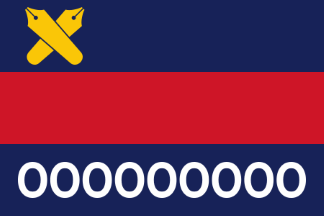
image by Zachary Harden, 22 June 2018
![[Osaka University of Health and Sport Sciences]](../images/j/jp@vc29.gif)
source; image by Shunsuke Omachi, 22 October 2023
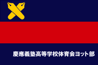
The club flag has blue, red and blue horizontal three stripes with a yellow pen mark at the canton and horizontally written kanji university and club name in white.
Nozomi Kariyasu, 22 October 2023