
Last modified: 2026-06-13 by rob raeside
Keywords: toronto | ontario |
Links: FOTW homepage |
search |
disclaimer and copyright |
write us |
mirrors
 1:2 image by
Eugene Ipavec
1:2 image by
Eugene Ipavec
Source: Canadian City Flags,
Raven 18
See also:
External links
Toronto is the capital city of the province of Ontario and the largest city in Canada by population, with 2,731,571 residents in 2016. Also in 2016, the Toronto census metropolitan area (CMA), the majority of which is within the Greater Toronto Area (GTA), had a population of 5,928,040, making it Canada’s most populous CMA. Toronto is the anchor of an urban agglomeration, known as the Golden Horseshoe, in Southern Ontario on the northwestern shore of Lake Ontario. A global city, Toronto is a centre of business, finance, arts, and culture, and is recognized as one of the most multicultural and cosmopolitan cities in the world.
Text and image(s) from Canadian City Flags, Raven 18 (2011), courtesy of the North American Vexillological Association, which retains copyright. Image(s) by permission of Eugene Ipavec.
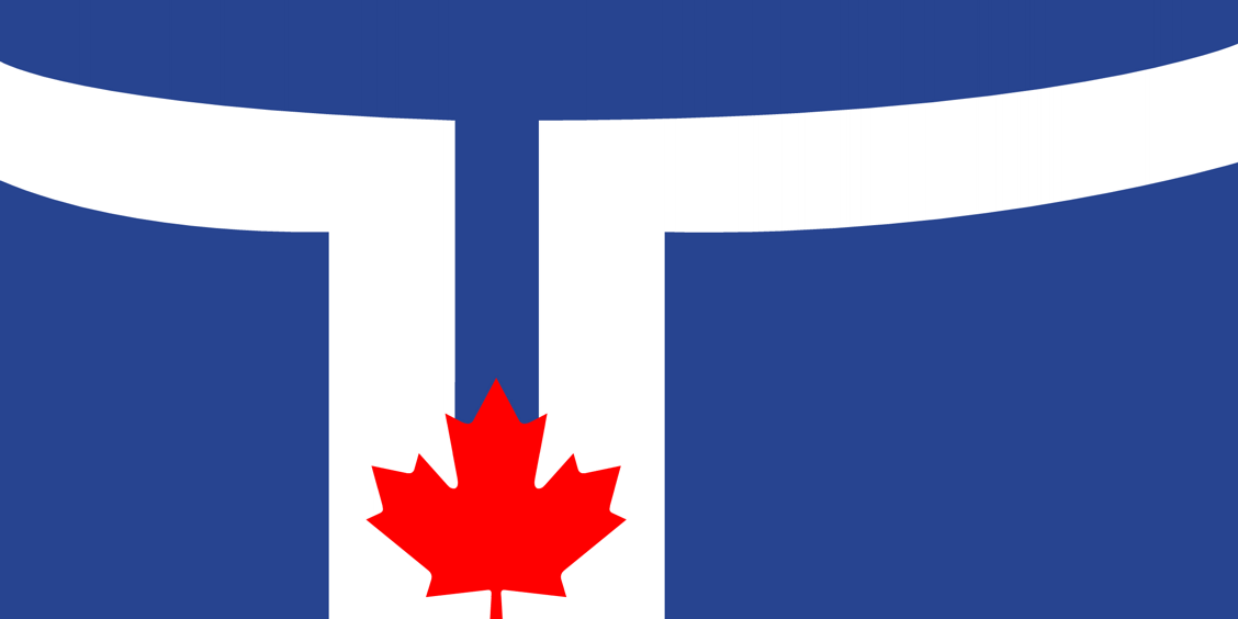
The flag of the City of Toronto has a medium blue field with a “T”
shape in white. The trunk of the “T” is much wider than its crossbar, and is
divided vertically by a blue bar which extends nearly to the base. The “T” is
set toward the hoist, with the right edge of its trunk halfway to the fly. The
crossbar curves upward slightly at both ends. A red Canadian maple leaf one-third
the height of the flag is centred at the base of the “T”. The width of the
trunk is one-fourth the flag’s length.
John M. Purcell, Canadian City Flags,
Raven 18,
2011
The white band is supposed to resemble a T for the city's name, but also recalls
the appearance of the City Hall building. The flag was adopted on the 140th anniversary
of Toronto in 1974.
Mark Brader, 2 July 2016
The white object represents City Hall, one of the landmark
buildings of the city, with its twin towers in silhouette forming a “T” on the
flag for Toronto. The towers themselves curve toward the viewer at their outer
sides, so the object on the flag creates a remarkably recognizable depiction of
them. The maple leaf symbolizes the city council and recalls Toronto’s Canadian
heritage.
John M. Purcell, Canadian City Flags,
Raven 18,
2011
RobeRenato De Santis, a 21-year-old student at George Brown College.
John M. Purcell, Canadian City Flags,
Raven 18,
2011
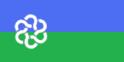 image located by Doug Bloudoff, 2 November 2011
A blue-green horizontal bicolor with a white six-looped design toward the hoist.
The chain-like shape symbolized the six cities/boroughs making up the whole.
Mark Brader, 2 July 2016
 image located by Valentin Poposki, 18 November 2011
A dark blue(?) flag with the arms and a ribbon with the name above.
![[Toronto Police flag]](../images/c/ca-on-to-pol.gif) image by Rob Raeside, 14 December 2014
image by Rob Raeside, 14 December 2014
Badge of the service, on a blue field, with a red border:
http://www.mtppa.com/Images/Kandahar%20Airfield%202011.jpg
http://www.rcmp-grc.gc.ca/po-mp/images/afghan-commr.jpg
http://www.thestar.com/opinion/commentary/2014/12/13/why_is_john_tory_shilling_for_the_police_union_siddiqui.html
Badge:
http://upload.wikimedia.org/wikipedia/en/thumb/1/18/Toronto_Police_Service_Logo.svg/899px-Toronto_Police_Service_Logo.svg.png
Dave Fowler, 14 December 2014
![[Greater Toronto Airports Authority Flag]](../images/c/ca-on-to$air.gif) image by Tomislav Todorovic, 21 December 2021
image by Tomislav Todorovic, 21 December 2021
The GTAA operates both Toronto Pearson International Airport and Billy Bishop
Toronto City Airport. The GTAA flag is the corporate logo on a blue/white/blue
Canadian pale.
Dave Fowler, 20 December
2021
![[PortsToronto Flag]](../images/c/ca-on-to-tpa.gif) image by Dave Fowler, 20 December 2021
image by Dave Fowler, 20 December 2021
The Toronto Port Authority a federally-chartered corporation, known
since 2015 as PortsToronto, has a logo on a light blue flag. The names of the
Toronto Port Authority in French and English, along with the standard Canadian
government logo are placed beneath the main logo.
The blue appears to be
#1397d9, based on an archived website.
![[PortsToronto Flag]](../images/c/ca-on-to-tpa-o.jpg) image by Dave Fowler, 20 December 2021
image by Dave Fowler, 20 December 2021
The pre-2015 flag was dark blue
with the TPA badge in the centre, flanked by "Toronto Port Authority" in English
and French, and the standard Canadian government logo at the bottom.
Rebranding information:
https://www.portstoronto.com/portstoronto/media-room/news/toronto-port-authority-rebrands-as-portstoronto.aspx
Dave Fowler, 20 December
2021
![[Proposal for a flag for Toronto]](../images/c/ca-on-to-ct.gif)
![[Proposal for a flag for Toronto]](../images/c/ca-on-to-c1.gif) images by Ivan Sache, 3 August 2018
images by Ivan Sache, 3 August 2018
Cabbagetown is a lively neighbourhood of Toronto, Canada:
http://www.oldcabbagetown.com,
http://en.wikipedia.org/wiki/Cabbagetown,_Toronto and proudly flies its own
flag:
http://www.oldcabbagetown.com/comm_open.php
http://cabbagetownnews.blogspot.com/2009_02_01_archive.html
Green
field, white Canadian pale, on the pale a green cabbage. More pictures are available
on the internet, the apparent colour differences are not relevant I suppose.
Once seen, never forgotten!
Jan Mertens, 18 August 2010
Two designs of the flag differing by the rendition of the cabbage can be seen
on photos:
First design:
http://cabbagetownnews.blogspot.com/2009_02_01_archive.html
https://www.flickr.com/photos/suebie68/3389160230
http://www.houseoftheorangemonkey.co.uk/monkey/trips/trip55040805.htm
http://www.kikucorner.com/2014/09/24/cabbagetown-arts-and-crafts-neighbourhood-festival
Second design:
https://cabbagetownto.com/cabbagetown-happenings-july-30th/
https://cabbagetownreview.blogspot.com/2014/09/
http://cabbagetownnews.blogspot.com/2009/09/
http://cabbagetownnews.blogspot.com/2011/01/
https://cabbagetownreview.blogspot.com/2015/08
https://sagerealestate.ca/explore-neighborhoods/cabbagetown
https://sagerealestate.ca/wp-content/uploads/2013/10/IMG_9446.jpg
Ivan Sache, 3 August 2018
![[Guildwood Village]](../images/c/ca-ontsg.jpg) image located by Paul Bassinson, 12 May 2019
image located by Paul Bassinson, 12 May 2019
Images of the flag of the village of Guildwood, Scarborough, Toronto, Ontario, Canada were obtained from https://pbs.twimg.com/media/DjOq8eeXgAARg6D.jpg and https://en.wikipedia.org/wiki/Guildwood#/media/File:GuildwoodVillageFlagToryAinslieMason.jpg.
Quartered, red, white, blue, with graphic images in each quarter.
Paul
Bassinson, 12 May 2019
The following is from
https://guildwood.on.ca/flag
The Guildwood Village Flag was
adopted by the Guildwood Village Community Association (GVCA) on June 12, 2018
as the official Flag of Guildwood Village.
The Story in the
Flag
The Guildwood Village Flag has deep meaning. It tells the
story about our neighbourhood using symbols of local features that resonate
with residents. Together, the icons define what makes Guildwood Village so
distinctive. Reading from left to right, top to bottom, the flag sends a clear
and distinctive message: “Guild” “Wood” “Village” “on the Bluffs”.
Interpreting the Four Symbols
Top Left: The four columns
represent the art, architecture and creativity associated with the Guild Park,
site of historic Guild of All Arts. The image is a stylized version of the
Bankers Bond columns, preserved and proudly displayed by the park entrance The
colour red represents the energy, creativity and passion for which Guildwood
Village is known. The red is also the same colour (Pantone 032) used in
Canada’s national flag. This links our community to our country.
Top
Right: The three trees represent our community’s wooded areas, green spaces
and parks. The evergreen silhouettes refer to the tree that appears in the
official crest of Guildwood Village. The colour green represents nature,
renewal and growth. The green used (Pantone 348), is from the official colour
palette of the Government of Canada.
Bottom Left: The bungalow
represents the unique style of homes built throughout the village, known as
“mid-century modern.” The icon is based on plans from one of Guildwood’s
original model homes built along the village’s first residential streets,
Avenue of Homes, (now called Toynbee Trail). The brown colour (Pantone 7603)
is based on a colour used in the original Guildwood Village crest. This colour
represents reliability, elegance, stability and home.
Bottom Right: The
simplified bluffs and shoreline images are inspired by Scarborough’s official
flag, designed by renowned artist, Doris McCarthy. The blue represents the sky
and the lake, and is associated with freedom, imagination, expansiveness and
inspiration. The blue colour (Pantone 287) is the same as in the City of
Toronto’s flag, creating another link — between our community and our city.
Additional Points
The flag’s quadrant layout is a
reminder that Guildwood Village evolved from the original 1957 development and
expanded in sections. Another notable flag that uses four quadrants is the
Royal Standard, the banner long used by Canada’s monarch, Queen Elizabeth II.
The four quadrants and their colours also refer to the four seasons:
The
red maple leaves of autumn;
the white winter snow around our homes;
the
fresh green of spring’s renewal; and
the blue skies and open water of
summer.
The Guildwood Village flag is designed so its length is twice its
width. This size ratio of 2:1 is the same as the Canadian flag.
Guildwood Village Community Association, 6 August 2021
Two Toronto newspapers, "The National Post" and "The Torontoist", have jointly launched the Neighborhood Flags Contest "Flags for All":
"[...] we're urging our combined, talented readers to design Toronto neighbourhood flags, starting with the eclectic Kensington!".
Two flag proposals are shown on the websites of the organizing
newspapers: The National Post
and The Torontoist.
Ivan Sache, 4 October 2007
Having lots of experience with flags and flag design, I see some flaws
in the choice for Kensington. The colours would be well chosen if they
appear in darker tones; light green and light yellow however will fade
in the first sunlight that hits them. The K device is also ill-chosen -
first off all it is readable from only one side of the flag (all words
and letters on flags have this problem!) Secondly what does an 'Olde
English' style of font have to do with the market neighbourhood, apart
from the name of a street 'Kensington' of English origin. Secondly this
particular mixed font is highly suggestive of a Chinese-language
character; this would mislead. I recall in the late 1940s, when we
lived on Spadina, we didn't call it Kensington Market rather it was
known as the Jewish market. Keep, but darken, the colours because they
are representative of baked goods (gold or bright yellow) and vegetables
(greens, fruit) major market staples over many years. Substitute a bagel
for the letter K and you got it.
Kevin Harrington, 2 December 2007
Kevin Harrington's article "Seven Cities in
Search of a Flag" was published in the Communications of the XI International
Congress of Vexillology (Madrid, 1985). The City of Toronto is one of the
seven administrative units making up Toronto. The others are Metropolitan
Toronto (covering the whole of the city - the City of Toronto is only the city
centre) and the boroughs of East York, Etobicoke,
North York, Scarborough and
York. All of them
had flags.
Jan Oskar Engene, July 1996
Effective at the start of 1998, this federated structure was swept away
by the provincial government and since then there has only been a single City of
Toronto covering the whole area that used to be Metropolitan Toronto ("Metro").
Mark Brader, 2 July 2016
![[Toronto]](../images/c/ca-on-to00.jpg) Valentin Poposki, 17 May 2026
Valentin Poposki, 17 May 2026
This photo of the flag of the City of Toronto dates from before the
amalgamations of 1998. Exact date is unknown.
Source:
https://www.historymuseum.ca/collections/artifact/2621778
Valentin Poposki, 17 May 2026