
Last modified: 2023-06-10 by  zachary harden
Keywords: olympic games | tokyo |
Links: FOTW homepage |
search |
disclaimer and copyright |
write us |
mirrors
![[Rio de Janeiro 2016 Summer Olympics]](../images/o/oly@s32.gif) image by Zachary Harden,
30 August 2017
image by Zachary Harden,
30 August 2017
On September 7, 2013, the International Olympic Committee awarded the Games of
the XXXII Olympiad in 2020 to Tokyo, which was chosen over fellow Candidate
Cities Istanbul and Madrid after two rounds of voting during the 125th IOC
Session in Buenos Aires.
Tokyo received 60 votes to Istanbul's 36 in the final round, with Madrid having
been eliminated in the first round after losing a tie-breaker with Istanbul.
Tokyo, which also bid for the 2016 Olympic Games, previously hosted the Games in
1964.
Source: http://www.olympic.org/tokyo-2020-summer-olympics
Zoltan Horvath, 02 February 2014
The Games of the XXXII Olympiad, held in 2020 at Tokyo, has
had an interesting ride when it comes to the symbolism used for the Games.
The bid logo was designed by Ai Shimamine. The bid emblem, along with the emblem flag, can
be seen at
https://www.japantimes.co.jp when Tokyo was announced as the winner to host the 2020 Games on
September 7, 2013.
![[Rio de Janeiro 2016 Summer Olympics]](../images/o/oly@s32e1.gif) image by Zachary Harden,
30 August 2017
image by Zachary Harden,
30 August 2017
The first emblem for the Games was unveiled on 24th
July 2015; according to http://www.bbc.com/news/world-asia-33656579 and
http://designmadeinjapan.com/magazine/graphic-design/the-2020-tokyo-olympic-logo-emblem-designed-by-kenjiro-mr_design-sano/, the T in the logo stands
for three elements: Tokyo, Tomorrow and Team. According to the organizing
committee, "The black colour of the central column represents diversity, the
combination of all colours. The shape of the circle represents an inclusive
world in which everyone accepts each other. The red of the circle represents
the power and strength of every beating heart." The red circle was also
interpreted as evoking the Japanese flag, which was not used in the 1998
Winter Games and made a homage to emblem designed by Yusaku Kamekura for the
1964 Tokyo Games. Discussion ensued about this design
(some talked about the use of the Clarendon font family for the typeface,
some talked about how minimalist it was) resulting in its undoing.
A week after the design by Sano was unveiled to the public, reports began
to surface that it might have copied some other works.
The website at
https://www.theguardian.com/artanddesign/2015/jul/30/tokyo-olympics-logo-plagiarism-row, among others, came out with a story that another graphic
designer, Olivier Debie of Belgium, and pointed out the similarities between
Sano's Olympic emblem and his own logo for the Theatre
de Liege, also in Belgium, which was created in 2011 and put in use
in 2013. While Sano did not comment at the first instance of the claim by
Debie, the Organizing Committee defended the logo choice because of the
checks of any IP rights and designs. However, things went to another level
where Debie contacted lawyers in Belgium to create an injunction to prevent
the usage of this emblem and that of the Paralympic Games, which also used
the block T as the main Olympic Games. As legal proceedings began against the
IOC, the Tokyo Organizing Committee decided on September 1, 2015, to scrap
the emblems designed by Sano after more allegations of plagiarism and
copyright infringement came up.
(https://www.theguardian.com/world/2015/sep/01/tokyo-2020-olympics-logo-scrapped-after-allegations-of-plagiarism
and
https://www.japantimes.co.jp/news/2015/09/01/national/tokyo-2020-olympic-logo-dropped-amid-plagiarism-claim/#.WaaI-9GQy1s)
Some reports suggested
that Sano's emblems were scrapped without any comments from him, Sano offered
to withdraw the emblems voluntarily because he felt the issue was marring the
image of the 2020 Games and wanted an emblem that everyone can use, enjoy and
love.
(https://www.japantimes.co.jp/news/2015/09/02/national/sano-stands-olympics-logo-denies-plagiarism-retracts-design-protect-family-staff/#.WaaJM9GQy1s)
In the same emergency meeting that where Sano's emblems were officially
scrapped, a new contest was set up for a replacement emblem for the Games.
The process, which is detailed at
https://tokyo2020.jp/en/games/emblem/archive/, four designs were shortlisted
from 14,599 entries submitted by the public. The winning design, created by
Asao Tokolo, used elements of the "Cichimatsu moyo"
checked pattern that was made famous in the Edo period and the use of the
indigo blue, a traditional and sporting color of Japan, "expresses a refined
elegance and sophistication that exemplifies Japan" according to a statement
and concept video at https://tokyo2020.jp/en/games/emblem/. This second (and
current)
emblem was published on April 25, 2016, roughly seven months after
the design by Sano was scrapped.
Flags: we discussed the bid flag and
the use of the flag was used for the celebrations and presentations with the
"Candidate City" byline under "Tokyo (Hinomaru) 2020". After the emblem row
with Sano, the bid emblem was revived and the "Candidate City" byline was
dropped from looking at a picture at
http://www.gettyimages.com. I could not find any
picture with the emblem designed from Sano used on a flag, perhaps because it
was scrapped too quickly before it became a flag. Yet, I am going to send an
image with the logo for commentary purposes. For the current emblem, it is
used as a flag as evidenced by a photo from a June 2017 meeting held in Tokyo
regarding cost cutting measures by the
hosts.
http://www.insidethegames.biz/media/image/71295/o/CEnOPtlXskP3g02Z I have not been able to located a graphic manual showing
the flag use or any kind of use of the emblem on flags besides this photo,
but as the Games get closer, it might just happen.
Zachary Harden,
30 August 2017
I discovered a sub-brand usage guidelines describing a co-branding
(sub-brand) protocols and legalities for using the Tokyo 2020 Olympic and
Paralympic emblems. For the color of the emblem, it was listed as Pantone 281 C
(close to the color of the US flag. The Pantone
colors of the Olympic Rings and the Paralympic Agitos are the same as prescribed
by the IOC and IPC, respectively. As for font, it is a part of the FF DIN font
family (according to the document properties of the sub-brand usage guidelines)
and the same font family was used for the bid logo.
Zachary Harden,
11 September 2017
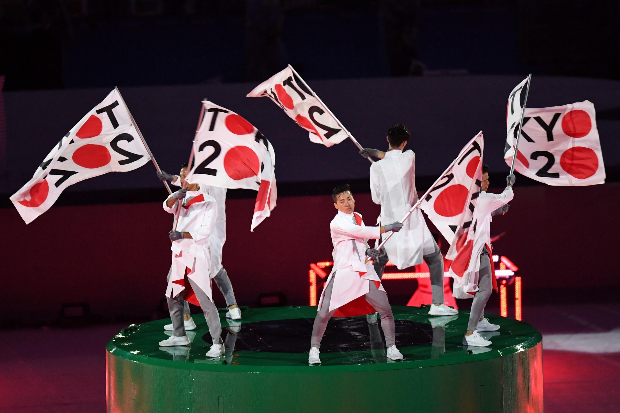
Another flag representing Tokyo 2020 seen by large numbers of people is this
one [used at the closing of the Rio de Janeiro games]:
http://mediad.publicbroadcasting.net/p/shared/npr/styles/x_large/nprshared/201608/490876632.jpg,
at
http://wnpr.org/post/rio-dances-closing-ceremony-2016-summer-olympics. I'm
not sure it's even possible to top that one, even though it's a design with
letters on it.
Peter Hans van den Muijzenberg, 13 October 2017
![[Bid flag Tokyo 2020 Summer Olympics]](../images/o/oly@s32bid.gif) image by Zachary Harden,
30 August 2017
image by Zachary Harden,
30 August 2017
The logo was designed by fourth year student Ai Shimamine, who participated in a
design competition to create a logo for Tokyo's bid. The circular wreath of
cherry blossoms, Japan's most celebrated flower, takes the cake for cultivating
a happy, peaceful, and comforting feeling, setting Tokyo apart from the playing
field. The circular shape symbolizes a sense of eternity; accompanied by the
playful cherry blossoms, it further evolves to express the eternal happiness
which the Games inspire. Each individual petal within the circular wreath shape
of the cherry blossoms represents the interconnectivity and interdependence of
the world.
Zoltan Horvath, 02 February 2014
In
an interview given to Reuters during the big logo unveiling on November 30, 2011., Shimamine stated
that she wanted to design something for Japan to give her a boost
during the recovery efforts from the 2011 East Japan Earthquake and
Tsunami. In her own words, the symbolism of the cherry blossom
“represents friendship and peace, has a softness and also holds a
special place in the hearts of Japanese people.” Like the 1998 Nagano
Games emblem, the bid emblem uses purple instead of black, due to
purple being a traditional color of Japan; purple was prominent in
cultural events in Japan’s Edo period from 1603-1867. The bid emblem,
along with the emblem flag, can be seen when Tokyo was announced as the winner to host the 2020 Games on
September 7, 2013.
Zachary Harden,
30 August 2017
![[ROC flag]](../images/r/ru@noc.gif) ROC flag; image by Tomislav Šipek, 6 February 2018
ROC flag; image by Tomislav Šipek, 6 February 2018
The flag of the Russian Olympic Committee will be used to represent the Russian atheletes and coaches for the next two Olympic games (2020 and 2022); this is due to Russia's ban related to a state-backed program of doping and cover-ups.
Dave Fowler, 20 February 2021
In some photos around Tokyo, the flag used by Russian athletes is that of the Russian Olympic Committee, which is their logo on a white background.
Zachary Harden, 22 July 2021
![[Flag of the East Timor Olympic Committee]](../images/o/oly!ms32.gif)
![[Flag of the East Timor Olympic Committee]](../images/o/oly!is32.jpg)