
Last modified: 2025-11-15 by ian macdonald
Keywords: kirkuk governorate |
Links: FOTW homepage |
search |
disclaimer and copyright |
write us |
mirrors
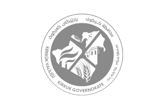 image by Daniel Rentería, 6 July 2025
based on photo
The flag of Kirkuk Governorate is very new, being adopted at the start of
March 2025, first seeing usage on a broadcast on the 6th. It depicts the
governorate logo over a white field; the logo of which is big.
Daniel Rentería, 6 July 2025
.gif) image by Daniel Rentería, 6 July 2025
image by Daniel Rentería, 6 July 2025
According to https://shafaq.com/ar, the logo was adopted through a vote by the
provincial council on 4 March 2025. Governor Rebwar Taha sent an official model
to prepare for its official approval. Earlier on 12 November 2024, the council
postponed voting because some members wished for the inclusion of the language
of the Christian community.
As the government informs, the logo uses gray
to give "the logo a modern and elegant look". Its use is justified as it links
past to present (silver usage), reflects diversity, and ability to adapt. The
outer ring of the logo depicts five different languages of the region, also
reflecting diversity: Arabic, Syriac, English, Turkish, and Kurdish. In the
center, over a gray circle, a simplified shape of Kirkuk Governorate split into
four sections by an "X", forming triangles. The lower triangle depicts two ears
of wheat for agriculture, a main economic source. The left triangle depicts two
factory funnels with smoke emerging for the oil industry, another main economic
source to the region. The right triangle depicts the Kirkuk Citadel, from the
Assyrian era and is believed to house the tomb of the Prophet Daniel. The top
triangle depicts a dove holding an olive branch for peace.
Daniel Rentería, 6 July 2025
.gif) images by Daniel Rentería, 6 July 2025
images by Daniel Rentería, 6 July 2025
based on photo
The old Kirkuk Governorate flag depicted the logo over a white field. The logo
was placed diagonally; I have no images of it being used in a normal format. The
logo placed on the flag is certainly big. I have no further information on its
history, as with the logo.
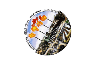
The previous logo was indeed
very oil-centric. Going around a disc with its lower half wider than its upper
half, the Governorate name is read in Turkish, Kurdish, Arabic, and Syriac,
languages of the region. The disc depicts a scene with many houses and some
ruins in the background. But more strikingly, the background also depicts four
stacks emitting flames, representing the oil and gas industry. To the front
(closer to the viewer), many pipes are placed probably representing the same.
Over this, the governorate name is read: "KIRKUK" in English.
Daniel Rentería, 6 July 2025
![[flag]](../images/i/iq-krp.gif) image by Daniel Rentería, 12 October 2025
image by Daniel Rentería, 12 October 2025
based on photo at
https://shafaq.com
Daniel Rentería, 12
October 2025
![[logo]](../images/i/iq-krp).gif) image by Daniel Rentería, 12 October 2025
image by Daniel Rentería, 12 October 2025
From https://www.facebook.com/photo.php
The logo is a gradient of green, yellow, blue, and pink; typically outlined
in black. In the center is an image of the city of Kirkuk with the bridge
crossing over the river. Above is an image of an oil derrick for the industry.
Underneath the scene is "City of Brotherhood" in Turkish; in the upper-left is
City of Brotherhood in Kurdish (Arabic script), upper-right Kirkuk Provincial
Council. Starting from the top: Kirkuk Provincial Council and City of
Brotherhood in Arabic; to the left Kirkuk Provincial Council in Turkish; at the
bottom Kirkuk Provincial Council in Turkmen; and to the right presumably City of
Brotherhood in Turkmen.
Daniel Rentería, 12 October 2025