
Last modified: 2024-03-02 by rob raeside
Keywords: education |
Links: FOTW homepage |
search |
disclaimer and copyright |
write us |
mirrors
See also:
Other Institutions:
 image by Ivan Sache, 27 November 2014
Institución Educativa Técnico Comercial Ana Francisca Lara is located
in Pacho (Cundinamarca Department).
The flag of the institute is horizontally divided orange-white-blue.
Orange is the colour of burning fire and of protection. It can mean
jubilation, feast, elation, pleasure, dawn and presence of the sun,
creativity, interest and unimaginable objective.
White is the diffusing light. It conveys an idea of innocence,
divinity, absolute stability, calm, and harmony of good thoughts and
clear feelings.
Blue is a reserved colour that reflects immensity and deepness. It can
express confidence, reserve, harmony, affect, fidelity and love,
stability, spiritual resources and approach of beliefs.
Source: http://comercialprimariaanafranciscalara.blogspot.fr/
- Institute's
blog
Ivan Sache, 27 November 2014
 image by Ivan Sache, 8 January 2004
Colegio Inglés de los Andes was established in 1987 in Cali (Valle
Department) by the FINDEC foundation, as a Spanish-English bilingual institute.
The management of the institute was transferred in 1990 to the Corporación de
Padres de Familia "Colegio Inglés de Los Andes", set up by the student's
parents.
The flag of the institute is horizontally divided light blue-white-light blue.
Source:
https://web.archive.org/web/20040309123026/http://www.voluntad.com.co/voluntad/colegios/cdd0766/EMBLEMA.htm
Note: Colegio Inglés de los Andes does not seem to be connected with
Liceo de los Andes, also located in Cali, except by the name and flag.
Ivan Sache, 29 July 2014
current flag
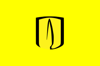 image by Zoltan Horvath, 29 November 2015
old flag
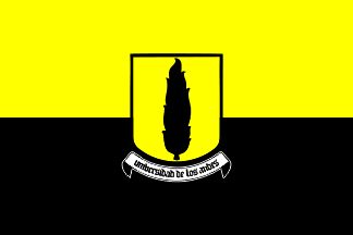 image by Zoltan Horvath, 29 November 2015
"Universidad de los Andes (known alternatively as Uniandes) was established
on November 16, 1948. It was the first Colombian university established as
nonsectarian (independent from any political party or religious institution)."
Sources:
http://www.uniandes.edu.co/institucional/informacion-general/historia and
https://en.wikipedia.org/wiki/University_of_Los_Andes_(Colombia)
The current flag is the
current logo on a yellow horizontal flag, as seen outside the building of
their
alumni main offices in Bogotá (I spotted this flag myself two days ago
while being there). Also, the
flag can bee seen outside one of its
main buildings in the faculty (third flag from left to right).
The old flag was the
old logo displaying the university colors yellow (on top) and black (on
bottom), in an equally horizontally divided flag with the new logo in the middle
as seen
here
(first flag from left to right) (plain yellow with symbol)
Source:
http://aso.uniandinos.org.co/sede_nacional_servicios_detalle.php?id=17
This logo was designed in the 1950's by Sergio Trujillo Magnenat in which the
Coat of Arms has a cypress tree inside, while the current logo is a stylized
version of the old one in which the Coat of Arms merges with the tree.
Source:
http://www.uniandes.edu.co/institucional/informacion-general/identidad-institucional
For additional information on the logo and its use please refer to the corporate
image
manual (page 6 with the explanation of the symbols):
To download current logo go to:
http://www.uniandes.edu.co/institucional/informacion-general/logosimbolos
For additional information please go to:
Universidad de los Andes (official website)
Esteban Rivera, 28 November 2015
Alumni Flags
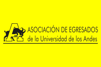 image by Zoltan Horvath, 29 November 2015
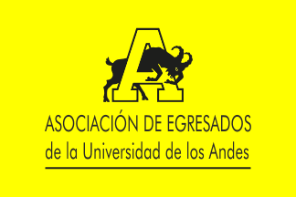 image by Zoltan Horvath, 29 November 2015
The University also has its alumni section, called "Asociación de Egresados de
la Universidad de los Andes" (Association of Universidad de los Andes Alumni),
or more commonly known as "Uniandinos". It was established in 1955 as "Asociación
de Ex Alumnos de la Universidad de los Andes" (Association of former students of
Universidad de los Andes) "Aexandes".
Source:
http://www.uniandinos.org.co/web/guest/inicio/-/journal_content/56/10197/14750
It also has its own flag, and it is a yellow horizontal flag displaying the
University's mascot (a goat called Seneca, in honor of the Roman Stoic
philosopher, which was a goat that used to wander the University campus back in
the 1940s) on the logo
as seen
here (second flag from left to right).
Source:
https://www.facebook.com/uniandinos/photos ).
The flag can also be seen
here (third
flag from left to right, outside their main office).
Source:
http://www.panoramio.com/photo/30253101
To download logos go to:
http://aso.uniandinos.org.co/logo/inicio.html
For additional information on the logo and its use please refer to the corporate
image manual.
For additional information please go to:
Uniandinos (official website)
Esteban Rivera, 28 November 2015
I created two versions of alumni association based on photos available
here.
Zoltan Horvath, 29 November 2015
 image by Ivan Sache, 31 July 2014
"Colegio Andino Bilingüe", located in San José de
Cúcuta, Department of Norte del Santander, was recognized by the
Department of Norte del Santander on 30 November 1998 (Decree No.
2935).
The flag of the
institute, as shown graphically and described on the website
of the institute, is green with the emblem of the institute,
outlined in white and surmonting the white writing ANDINO
BILINGüE / SCHOOL.
Green represents life transmitted by the Andine region.
White represents unity and fraternity.
The emblem of the institute shows in the middle a circle
representing the students, charged with a star representing the
educational values of the institute. The dominant green colour of
the emblem represents the natural environment of the institute.
The upper part of the emblem is made of the upper part of an
ellipse, in yellow, representing the sun, excellence and
knowledge. The two green lateral parts have to be seen jointly,
forming a heart, symbol of the human greatness, a main component
of the philosophy of the institute.
Ivan Sache, 11 January 2004
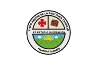 image by Ivan Sache, 13 September 2014
Institución Educativa Liceo Andino de la Santísima Trinidad originates in a
boy's school established in Filandia (Quindío Department) on 24 June 1904 by
Víctor A. Vélez and Ezequiel Patiño. In 1957, the municipal supervisor Manuel
García Cárdenas named the school Escuela Felipe Meléndez, as a tribute to one of
the founders of the municipality. In 1982, the girl's school Escuela Simón
Bolívar, closed after a landslide, was merged with Escuela Felipe Meléndez.
After the earthquake that hit Quindío on 25 January 1999, the school was
transferred in 1999 to Liceo Andino (est. in 1961 by Carlos E. Restrepo,
succeeding Colegio Santísima Trinidad, est. on 7 February 1937 by Father Antonio
José Valencia Murillo); the re-building of the institute, funded by the
Compartir foundation, from Bogotá, was managed by Edilma Inés Aguirre.
Institución Educativa Liceo Andino de la Santísima Trinidad was eventually
established by Decree No. 470 of 8 September 2002 as the merger of Liceo Andino
de la Santísima Trinidad and of Escuela Felipe Meléndez.
Source:
http://www.liceoandinost.edu.co/ - institute's website
The flag of the institute, designed by Father José Valencia Murillo, is white
with the institute' emblem in the middle. White originally meant peace,
transparency of the soul, and search for purity. Today, white means permanent
search for perfection and excellence in all the dimensions of human being, to
establish a better society based on social interaction, which is required to
attain the peace aspired to by the country.
Source:
http://www.liceoandinost.edu.co/index.php?option=com_content&view=article&id=94&Itemid=211
- Institute's website
The emblem of the institute was designed in 1989 by by the students of the 3.A
class, chaired by Luis Orlando López López and Gonzalo Patiño. The emblem is
inscribed with the ideals of the institute, "FE" (faith), "ESTUDIO" (Study), and
SUPERACION (surpassing). In the upper right corner, the red cross is a symbol of
faith; in the upper right corner, the book is a symbol of study and surpassing.
In the lower part, the sun rising represents awakening to knowledge and love for
study; the landscape highlights the majesty of Filandia.
Source:
http://www.liceoandinost.edu.co/index.php?option=com_content&view=article&id=95&Itemid=212
Ivan Sache, 13 September 2014
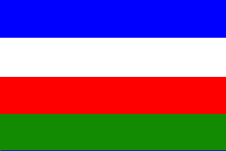 image by Ivan Sache, 14 June 2018
Institución Educativa Andrés Bello was established on 2 January 1998 in Bello
(Antioquia) as the merger of Escuela Andrés Bello (est. 1946) and Liceo Bello
(est. 1981 as Escuela Divina Eucaristía).
The institute is named after the humanist Andrés Bello (1781-1865), also a noted
poet, philologist and lawmaker, credited of the Civic Code of Chile (1852,
adopted in 1855 and subsequently adopted by Colombia and Ecuador), of the
foundation of the University of Chile (1843), and of the first Spanish American
Grammar (1847).
Source: IE Andrés Bello website
The flag of IE André Bello is horizontally divided blue-white-red-green.
Blue is symbol of tranquillity, intense calm and projection to the future.
White is a symbol of peace, honesty, unity, impartiality, freedom of speech and
harmonious personal development.
Red is a symbol of affect, love and sincerity to be expressed by the institute,
and of joy for living together peacefully and respectfully.
Green is a symbol of firm aspiration to the achievements of goals; it is also
the symbol of the greenness of our mountains.
Source: IE Andrés Bello website
Ivan Sache, 14 June 2018
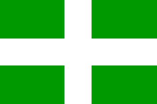 image by Ivan Sache, 8 July 2014
"Institución Educativa Distrital Andrés Bello"
(IEDAB) was founded on 2 July 1953 (Decree No. 1719 of the
Ministry of National Education) as "Colegio Nacional de
Bachillerato Lucio Pabón Núñez". The name of the
institute was changed to "Colegio Nacional de Bachillerato
Sergio Arboleda" in 1957 (Decree No. 1052). "Instituto
Nacional de Bachillerato Andrés Bello" was created on the
same site on 9 February 1960 (Decree No. 437), followed by
"Instituto José María Obando" on 14 June
1973 (Decree No. 1164). On 29 August 1990 (Decree No. 1971), the
three institutes were merged in a new institute, named
"Colegio Nacional Andrés Bello" on 11 March 1991
(Decree No. 668). On 16 September 2002 (Decree No. 2853),
"Colegio Nacional Andrés Bello" was merged with
neighbouring "Centro Educativo Distrital José Joaquín
Castro Martínez" to form "Institución Educativa
Distrital Andrés Bello", eventually renamed
"Institución Educativa Distrital Andrés Bello" on 25
September 2004 (Decree No. 4702).
The institute is named after the humanist Andrés Bello
(1781-1865), also a noted poet, philologist and lawmaker,
credited of the Civic Code of Chile (1852, adopted in 1855 and
subsquently adopted by Colombia and Ecuador), of the foundation
of the University of Chile (1843), and of the first Spanish
American Grammar (1847).
The flag of IEDAB, as shown graphically and described on the website
of the institute, is green with a white cross. The four
quarters of the flag represent:
- the self-confidence of the members of the institute;
- the love for the institute;
- the love for the fatherland;
- the aspiration to knowledge and science.
http://fr.scribd.com/doc/68007668/PEI-ANDRES-BELLO - Institute's
Constitution
Ivan Sache, 11 January 2009
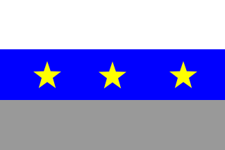 image by Ivan Sache, 13 December 2020
Institución Educativa Técnica Andrés Bello is located in San Alberto (Cesar).
The flag of IET Andrós Bello is horizontally divided white-blue-gray, with
three yellow stars placed in the blue stripe.
White is a symbol of
transparency, truth, simplicity and sincerity. White is associated to light,
kindness, innocence, purity, and is considered as the color of perfection.
Blue is a symbol of loyalty, confidence, knowledge, intelligence, faith and
truth.
The three yellow stars represent the institute's three seats: Central,
Villa Fanny, 1° de Abril.
Gray is a symbol of honor and represents the
ashes of the phoenix bird, symbolizing the rebirth of a new institution.
https://ietab.edu.co/simbolos/
School website
Ivan Sache, 13 December 2020
 image by Ivan Sache, 13 May 2021
Institución Educativa Andrés Rodríguez B. was established in Sahagún (Córdoba) by
Ordinance No. 22 issued in 1954; classes started on 15 March 1956.
The school's namesake, Andrés Rodríguez, born in Tolú (Sucre), settled in Sahagún as a telegraphist; during his free time, he offered home classes to the children of his friends. The school was proclaimed a National Historical, Educative and Cultural Heritage by Law No. 1,499 promulgated on 29 December 2011.
The flag of the institute is in proportions 1:2, horizontally divided wine red-white-wine red.
Sources: school website and this photo
Ivan Sache, 13 May 2021
 image by Ivan Sache, 1
September 2019
image by Ivan Sache, 1
September 2019
Colegio Andrés Rosillo is located in Gualoche, Bosa (Bogotá). The school was
named for Andrés Rosillo (1758-1735), a priest and lawyer who supported the
liberation struggle against the colonial authorities (see
http://www.banrepcultural.org/biblioteca-virtual/credencial-historia/numero-213/andres-rosillo-un-revolucionario-inquietante
for a detailed biography).
The flag of Colegio Andrés Rosillo is
horizontally divided white-blue-steel gray. White is a symbol of purity, peace,
confidence, modesty, sincerity and prosperity of the great men the school will
educate for the village. Blue is a symbol of the infinite fields of knowledge
and commitment to the construction of life quality for the society. Steel gray
is a symbol of force, power, valiance, resistance, courage and justice required
to walk on the harsh way of life.
http://horizonteinstitucionalcolcar.blogspot.com
School blog
Ivan
Sache, 1 September 2019
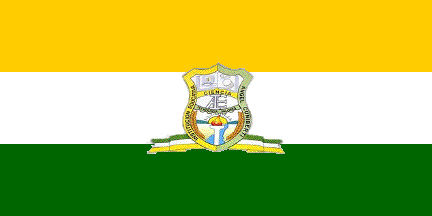 image by Ivan Sache, 05 July 2011
"Institución Educativa Ángel Cuniberti" (IEAC) was founded on 1 July 2003 in
Curillo (Caquetá Department) by Decree No. 252. The institute is named for His
Grace Ángel Cuniberti (b. 1921, Bishop of Florencia, 1961-1978), who visited
Curillo on 2 February 1964 and donated on 28 March 1964 28 zinc sheets for the
building of a new school (today a police station).
The flag of IEAC, as shown on a photo and described in the institute's website,
is horizontally divided yellow-white-green with the emblem of the institute in
the middle. Proportions seem to be 1:2. Yellow represents wealth. White
represents peace, purity, integrity, transcendence and transparency. Green
represents the vegetal resources and highlights our belonging to the Amazonian
region. The flag shall be proudly hoisted together with the municipal and
national tricolors in the national celebrations and in all institutional events,
as a symbol of love and belonging to our institute.
Source:
http://gildardomendozarojas.blogspot.com/2010/09/bandera.html
The emblem of IEAC was designed by teacher Fredy Espinosa Agudelo. The shield is
divided in three parts. On top is shown an open book charged with a computer, a
drum and a pair of maracas, representing technology, computer science and
cultural diversity. In the middle are placed the interlaced letters "IEAC", the
acronym of the institute. In the bottom is depicted a beautiful landscape
crossed by a river symbolizing the water resources available in the municipality
and the services supplied by the rivers. The scene is lit by a radiating sun
symbolizing the horizon guiding our institute. The scene is flanked by two
golden spikes representing the agricultural resources of our region; in the
middle, a torch is the symbol of the sports skills of our students.
The shield is divided by two horizontal stripes, the upper charged with the word
"CIENCIA" (Science) and the lower charged with the words "TECNOLOGÍA - VALORES"
(Technology - Values). These words highlight the aspiration to teach people
useful for the community and prepared to assimilate the scientific and
technological advances required for creative development and fundamental
investigation with respect for human dignity. The shield is placed over a scroll
with the colors of the institute's flag.
Source:
http://gildardomendozarojas.blogspot.com/2010/09/escudo.html>
Ivan Sache, 05 July 2011
 image by Ivan Sache, 3 Jan 2021
Colegio Anglo Americano is located in Alta Gracia, (Córdoba Department)
The flag of Colegio Anglo Americano features a swallow, recalling the strong connection between the school and migrations. The colors of the flag recall that the founders of the school came from the United States.
The red ascending curved stripe represents the school's growth; the blue stripe represents solidity and protection offered to the students.
School webpagee
Ivan Sache, 3 Jan 2021
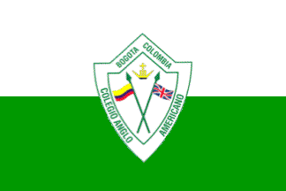 image by Ivan Sache, 17 October 2014
Colegio Anglo Americano was established on 9 February 1965 in Bogotá.
The flag of the institute is presented in the institute's Etiquette
Guidebook as horizontally divided white-green with the institute's
emblem.
White is a symbol of peace and social interaction.
Green is a symbol of spiritual and cultural resources.
The emblem of the institute is a shield charged with the flags of
Colombia and of the United Kingdom, crossed per saltire. The flag of
Colombia represents the Americas, while the flag of the United Kingdom
represents the English language. Above is a crown ensigned with a
cross, meaning that the institute is secular with a Catholic
orientation.
Source:
http://72.167.37.19/comunidadvirtual/mconvivencia/Manual%20de%20Convivencia%202014.pdf
Ivan Sache, 17 October 2014
 image by Ivan Sache, 17 July 2014
Colegio Anglocanadiense is located in Neiva (Huila Department).
The
flag of the institute is made of the Union Jack [erroneous in several details]
superimposed with the Canadian flag.
http://www.colegioanglocanadiense.com/blog/post/98873/simbolos-institucionales.html
- Institute's website
http://www.colegioanglocanadiense.com/galeria/album/album-1.html - Photo
Ivan Sache, 17 July 2014
 image by Ivan Sache, 30 September 2018
Colegio Anglohispano was established in 1991 in Manizales (Caldas
Department).
The flag of Colegio Anglohispano is horizontally divided
blue-red (c. 2:1) by a white line forming a mountain shape.
http://www.anglohispano.edu.co/index.php/news/nuestros-simbolos
School
website
Ivan Sache, 30 September 2018
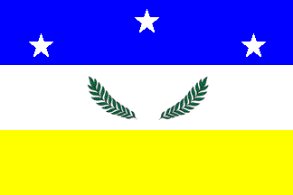 image by Ivan Sache, 27 June 2014
Colegio Ànglo Colombia / Anglo Colombia School was established in 2000 in
Barranquilla (Atlántico Department), succeeding Colegio Villa del Norte,
originally established in February 1984.
The flag of the institute is horizontally divided blue-white-yellow, with three
white stars placed 1 and 2 in the blue stripe and a laurel wreath placed in the
white stripe. The blue stripe is a symbol of personal strength. The three stars
stand for the institute's motto, "Leadership, Love and Excellence". The white
stripe is a symbol of harmony. The laurel wreath stands for peace and triumph.
The yellow stripe is a symbol of knowledge.
Source:
http://www.colegioanglocolombiabarranquilla.com/acerca-de-acs/nuestros-simbolos.html
- Institute's website
Ivan Sache, 27 June 2014
image by Ivan Sache, 3 January 2021
Colegio Anglo Americano is located in Alta Gracia, Córdoba
The flag of
Colegio Anglo Americano features a swallow, recalling the strong connection
between the school and migrations. The colors of the flag recall that the
founders of the school came from the United States.
The red ascending curved
stripe represents the school's growth; the blue stripe represents solidity and
protection offered to the students.
http://angloamericanoag.com/banderaanglo
Ivan Sache, 3 January 2021
#/media/File:University_of_Los_Andes_logo.svg)
#/media/File:Universidad_de_los_Andes_(3326108271).jpg)