
Last modified: 2021-08-26 by  klaus-michael schneider
Keywords: education |
Links: FOTW homepage |
search |
disclaimer and copyright |
write us |
mirrors
See Also:
 image by Ivan Sache, 17 October 2014
Escuela Normal Superior de Piedecuesta (Santander Department) was
established in 1953. Originally open only to boys (Escuela Normal
Superior de Varones), the school was renamed in 1964 Escuela Normal
Nacional Mixta, and, eventually, Escuela Normal Superior de
Piedecuesta by Resolution No. 17,340 of 27 November 2000.
The flag of the institute is horizontally divided green-yellow.
Source:
http://www.normalpiedecuesta.edu.co/index.php?option=com_content&view=article&id=6&Itemid=130
- Institute's website
Ivan Sache, 17 October 2014
"Colegio Gimnasio Piedemonte" is located in
Bucaramanga.
The flag of the institute,
as shown graphically and described on the website
of the institute, is white with two thin diagonal stripes in
the lower left and upper right corners, blue and red,
respectively, and the emblem of the institute in the middle.
White symbolizes truth, justice and respect, as well as a open
mind to new and improved ideals and knowledge.
Blue symbolizes nature, source of life, and the commitment to
protect it through an intimate connivance with it and our
neighbour. Red recalls us love, energy and passion
required to study, teach, live and fulfill our mission in the
service of the society and of our country.
The emblem of the institute is circular and divided into four
equal parts. The upper left part is charged with a representation
of the earth, meaning that we should be prepared to be citizens
both of Colombia and of the world. The upper right part is
charged with the lamp of knowledge. The lower left part is
charged with a landscape, requiring the protection and
preservation of natural environment. The lower right parts is
charged with the five Olympic rings representing permanent
contact with sport.
The border of the emblem is charged with the white lettering
"GIMNASIO PIEDEMONTE / EXCELENTES".
Ivan Sache, 12 December 2009
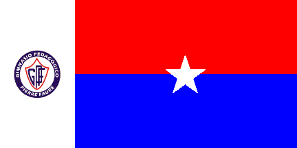 image by Ivan Sache, 08 August 2014
Gimnasio Pedagógico Pierre Faure was established on 10 October 2003 in
Bucaramanga (Santander Department) by Fanny Inés Luna Pico The institute is
named for the French Jesuit priest Pierre Faure (1904-1988), the promoter of
"community and personalized education".
The flag of the institute is horizontally divided blue-red with a white star in
the middle. Along the hoist is placed a vertical white stripe charged with the
institute's emblem. Red is a symbol of leadership and love. Blue is a symbol of
intelligence and responsibility. White is a symbol of purity and innocence. The
star represents the human being at the center of the educational project of the
institute.
Source:
http://sites.amarillasinternet.com/colegiopierrefaure/nuestros_simbolos.html
- Institute's website
Ivan Sache, 08 August 2014
 image by Ivan Sache, 1 January 2021
 image by Jairo Alonso Méndez Méndez, 7 October 2005
Corporación Universidad Piloto de Colombia - my university
(Bogotá, Distrito Capital and Girardot, Cundinamarca).
Jairo Alonso Méndez Méndez, 14 November 2004
I didn't have found any sources that confirms the flag and the
image is only a product of visual research in my university.
Jairo Alonso Méndez Méndez, 7 October 2005
"Instituto Técnico Industrial Piloto" (ITIPI) was
founded in 1939 in Bogotá as "Escuela Complementaria de
Espacializacion Artistica". Renamed "Instituto Popular
de Cultura" in 1949, the institute was given its current
name in 1954.
The flag of ITIPI, as shown graphically on the website
of the institute, is horizontally divided white-green with
the emblem of ITIPI in the middle.
The emblem of ITIPI is a white disk surrounded by a green ring
charged with "I.E.D. INSTITUTO TECNICO INDUSTRIAL PILOTO /
BOGOTA" in white letters and charged with a green device
presumably recalling the acronym of the institute and (my own
interpretation) a caliper rule.
Ivan Sache, 28 January 2009
"Escuela Normal Superior de Pitalito" was founded on
30 April 1950 in Pitalito, Department of Huila, succeeding
"Colegio San Antonio", founded in 1927.
A competition for the flag of the institute was organized in
1975, the year of the silver jubilee of the institute. The winner
was student Fernando Antonio Rincón Trujillo, who proposed a
flag with three equal, green-white-red stripes. Green represents
the valley of Laboyos. White represents the traditional
hospitality, generosity and good customs of the inhabitants of
the region. Red symbolizes the vitality and strength of the youth
studying at the institute. The arrangement of the stripes is,
unfortunately, not given.
Source: <www.colombiauniversal.com>.
Ivan Sache, 14 January 2009
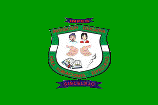 image by Ivan Sache, 22 September 2014
Instituto de Niños Especiales was established in 1978 in Sincelejo (Sucre
Department) for the education of children with Down's syndrome. Instituto
Nacional de Niños Especiales (INNES) was founded in 1983 by Myriam Mercado
Pacheco and Militza Anaya Gómez, on a plot located in the Las Brisas borough,
offered by the local chapter of the Lion's Club. Centro de Educación Integral
para Poblaciones Especiales (CEIPE) was established by Resolution No. 226 of 15
February 2000. Institución Educativa para Poblaciones Especiales was eventually
established by Decree No. 8 of 8 January 2003.
Source:
http://www.iepoblacionespeciales.edu.co/ - Institute's website
The flag is green with the institute's emblem in the middle. The emblem of the
institutes features two children symbolizing the equality of all human beings, a
book representing science and knowledge, two hands representing acceptance,
solidarity, cooperation, and work to develop skills, and a torch symbolizing
triumph and sports achievement.
Source:
http://www.iepoblacionespeciales.edu.co/?page_id=17 - Institute's website
Ivan Sache, 22 September 2014
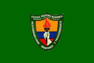 image by Ivan Sache, 08 July 2011
"Colegio Policarpa Salavarrieta" was founded on 11 May 1948 in Bogotá by
Decree No. 1,521 of the Ministry of National Education, as "Instituto Policarpa
Salavarrieta", a girls' college depending on "Colegio Mayor de Cundinamarca". In
1963, the college became autonomous and was renamed "Liceo Nacional Feminino
Policarpa Salavarrieta". Open to boys in 1974, the college was renamed "Liceo
Nacional Policarpa Salavarrieta", subsequently "Institución Educativa Distrital
Colegio Policarpa Salavarrieta". The institute is named for the heroin Policarpa
Salavarrieta (1795-1817), aka La Pola, shot by the Spaniards in Bogotá.
The flag of the institute is shown graphically on the institute's website as
green with the institute's emblem in the middle. Green represents hope in the
future. The emblem of the institute is a shield with the national colors,
charged with a hand holding a flaming torch, issuant from the base, meaning
constant work, energy and viability. The shield is bordered by a green stripe
symbolizing biodiversity and hope in a better future, charged with the name of
the institute and its motto "RESPONSABILIDAD IDENTITAD Y TRANSCENDENCIA"
(Responsibility Identity and Transcendence).
Source:
http://colegio.redp.edu.co/polisalavarrieta/index.php?option=com_content&view=article&id=54:simbolos&catid=39:simbolos&Itemid=39
Ivan Sache, 08 July 2011
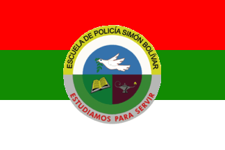 image by Ivan Sache, 25 November 2014
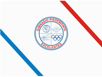
Escuela de Policía "Simón Bolívar" (ESBOL) is located in Tuluá, Valle del
Cauca.
The flag of ESBOL is horizontally divided red-green-white, that
is, the flag of the town of Tuluá, with the school's emblem superimposed.
Red is a symbol of force, triumph, audacity and highness, which are the
virtues used by the police to maintain peace and generate patriotic order
and progress.
Green is the institutional color, as a symbol of faith,
friendship, hope, commitment and respect.
White is a symbol of purity,
loyalty, sincerity, clarity and peace, which are virtues characteristic of
the police.
The emblem of ESBOL is prescribed by Resolution No. 6,710,
adopted on 14 August 1980. The emblem is of round shape (Spanish-Arabic).
The upper quarter, azure, features a dove passant argent beaked and armed
gules, the eye represented as a tortil azure and holding in the beak a bough
of olive with eight leaves nervated sable. The lower left quarter, vert,
features a book or inscribed with 11 lines sable. The lower right quarter,
purpure, features an oil lamp argent with a flame or. The emblem is
surrounded by a ring, in the upper part, or inscribed with the school's name
on letters sable, in the lower part, argent inscribed with the motto
"ESTUDIAMOS PARA SERVIR" (We Study To Serve) in letters gules.
The
circular shape is a symbol of God's infinite perfection.
Argent, a noble
metal in heraldry, is a symbol of integrity, sincerity, obedience, firmness,
vigilance, eloquence and triumph, which are rare virtues to be taught to the
students.
Gules is a symbol of force, triumph, audacity and highness, which
are the virtues used by the police to maintain peace and generate patriotic
order and progress.
Vert is the institutional color, as a symbol of
faith, friendship, hope, commitment and respect.
Or, a noble metal in
heraldry, is a symbol of nobleness, magnanimity and wealth. All our
spiritual and material resources shall be dedicated to the defense of the
law.
Purpure is a symbol of greatness and wisdom, highlighting the fact that the greatness of a people shall be matched by the importance of its police.
https://www.policia.gov.co/escuelas/simon-bolivar/simbolos - ESBOL website
Ivan Sache, 20 August 2017
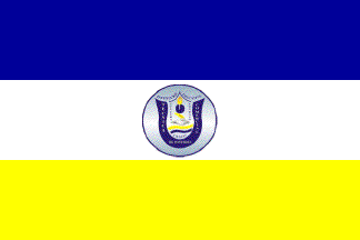 image by Ivan Sache, 25 November 2014
Institución Educativa Técnica Comercial de Ponedera was established in
November 1978 in La Pachita borough (Municipality of Ponedera,
Atlántico Department)
The flag of the institute is presented in the institute's Etiquette
Guidebook as horizontally divided blue-white-yellow with the
institute's emblem in the middle.
Source:
http://www.instecoponedera.edu.co/wp-content/uploads/2014/05/MANUAL_DE_CONVIVENCIA_-COMERCIAL.pdf
Ivan Sache, 25 November 2014
 image by Ivan Sache, 22 October 2014
Escuela Normal Nacional de Popayán (Valle Department) was established in 1934
as Escuela Normal Nacional de Señoritas, and subsequently renamed Escuela Normal
Superior de Popayán.
The flag of the institute is horizontally divided white-green.
Source:
http://www.normalpopayan.edu.co/contenido/contenido.php?id_contenido=7 -
Institute's website
Ivan Sache, 22 October 2014
 image by Ivan Sache, 16 February 2004
The Fundacion Universitaria de Popayan was established in 1982
in Popayan. The grounds of the foundation were destroyed by the
earthquake of 31 March 1983. New grounds were inaugurated on 1
August 1983. The Foundation manages a botanical garden dedicated
to biodiversity preservation, ethnobotany and germplasm
conservation. The garden is a member of the national networks of
botanical gardens, prescribed by law #229 in 1996.
The flag of the FUP is horizontally divided in three equal
stripes, whose colours cannot be ascertained from the source
quoted below. For the attached image, I have selected a
grey-green upper stripe and a dark blue lower stripe, but these
shades need to be confirmed (or corrected).
Source: www.fup.edu.co,
located by Dov Gutterman.
Ivan Sache, 16 February 2004
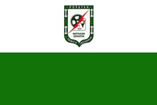 image by Ivan Sache, 6 February 2019
The flag of Institución Técnica Industrial Popayán is horizontally divided
white-green with the school's coat of arms in the white stripe.
http://industrialpp.blogspot.com/2015/08/coro-entonen-hoy-mil-voces-armoniosas.html,
ITI blog
Ivan Sache, 6 February 2019
 image by Ivan Sache, 21 October 2014
Institución Educativa Popular Diocesano was established in Dosquebradas (Risaralda
Department), by Resolution No. 2,517 of 21 November 2002 as the merger of
Colegio Seminario Popular Diocesano (est. 6 March 1972 by His Grace Baltasar
Álvarez Restrepo; Bishop of Pereira from 1952 to 1976), Escuela Jesus Maestro
(est. 23 February 1973 by Sisters Elena Narvaéz and Mariana Salazar), Escuela
Luis Carlos Galán Sarmiento (est. 1990), and Centro Docente Rubén Sanin Mejia
(est. 1999 as Centro Docente La Esneda).
The flag of the institute is described in the institute's Etiquette Guidebook as
horizontally divided red-green with a blue triangle placed along the hoist. Red
is a symbol of sacrifice. Green is symbol of hope. Blue is a symbol of
perseverance and of the sky. The blue triangle represents the sky that always
protects us.
Source:
http://www.colpopulardiocesano.edu.co/manualconvivencia/MANUALDECONVIVENCIA2013VERSION04.pdf
- Institute's website
Ivan Sache, 21 October 2014
 image by Ivan Sache, 1 January 2021
Colegio Portugal is located in Lebrija (Santander).
The symbols of
Colegio Portugal were designed by Zoraida Gualdrón de Vargas and subsequently
modified by Daniel García Archila.
The flag is horizontally divided
blue-white-green.
Blue is a symbol of student's surpassing of oneself,
highness and life perspective. It also represents water of the rivers and
sources, which are hydro resources to be protected.
White is a symbol of
peace and harmony expected to be preserved in the educational community.
Green is the symbol of the pastures, plains and fields sown by students, and of
aspiration to an environmental culture for peace.
http://colportugal.edu.co/index.php/page/item/simbolos1539979730
School
website
Ivan Sache, 1 January 2021