
Last modified: 2024-11-09 by rick wyatt
Keywords: kansas city | missouri | fountain | cass county | clay county | jackson county | platte county |
Links: FOTW homepage |
search |
disclaimer and copyright |
write us |
mirrors
![[flag of Kansas City, Missouri]](../images/u/us-mokss23.gif) image located by Dave Fowler, 10 February 2023
image located by Dave Fowler, 10 February 2023
See also:
A new flag for the City of Kansas City MO will be voted on tomorrow (10
February 2023).
https://www.thepitchkc.com/new-kansas-city-flag-passes-first-vote/
Jared Horman's proposed Kansas City flag passes first vote at City Council
committee
A breakdown of the elements on the new KC flag.// Courtesy of
Kansas City, MO The Kansas City flag may be getting a makeover. City Council
members of the Transportation, Infrastructure, and Operations committee approved
a new version of the city flag Feb. 8. However, nothing is finalized. The full
council will vote on the flag Thursday.
Dave Fowler, 9 February 2023
The new KCMO flag has been adopted.
https://www.kcur.org/arts-life/2023-02-09/kansas-city-new-flag-what-does-it-mean
Kansas City just got a new flag. What does the redesign mean… and is it
any good?
Kansas City Council overwhelmingly voted Thursday to adopt a new
municipal flag. A prominent flag expert agrees that the city's current design
was in need of a reboot, and says the new one is a major improvement.
Dave Fowler, 10 February 2023
From a graphic at https://www.kcur.org/arts-life/2023-02-09/kansas-city-new-flag-what-does-it-mean
The red represents the warm hearts of the people of the Midwest and celebrates Kansas City kindness.
The blue represents the city from river to sky. Blue celebrates the relationship with the Missouri River and the expansive possibility of prosperity.
The fountain shape reads transparently as a heart, symbolizing Kansas City as the Heart of the Nation, and celebrates the city's heritage as the City of Fountains.
The juxtaposition of the red and blue illustrate[sic] Kansas City's welcoming spirit for all.
The three colors combine to create Kansas City's position as the model
American city, where kindness, prosperity, and legacy are part of the landscape.
Dave Fowler, 10 February 2023
![[flag of Kansas City, Missouri]](../images/u/us-mokss-l.gif) 2:3 image(s) by permission of David B. Martucci
2:3 image(s) by permission of David B. Martucci
image(s) from American City Flags,
Raven
9-10 (2002-2003), courtesy of the North American Vexillological Association,
which retains copyright.
Text and image(s) from American City Flags, Raven 9-10 (2002-2003), courtesy of the North American Vexillological Association, which retains copyright. Image(s) from American City Flags by permission of David B. Martucci.
In the flag of Kansas City, the field is divided vertically so that the hoist two-thirds is white, and the remaining third consists of a red bar and a blue bar with a fimbriation of white between them. Centered on the white field is the city seal, composed of a fountain-like symbol whose outline suggests a heart. The symbol is red at the top, gradually fading through a pale purple to blue at the base, each of the colors occupying about one-third of the symbol horizontally.
According to the ordinance of adoption:
The official corporate flag is 135 units in width and 90 units in height with the official corporate seal 60 units in height centered on a white field 90 units square adjacent to the staff. There are vertical red and blue stripes 22 units each in width, with the red stripe located adjacent to the white field and the blue stripe located adjacent to the red stripe. A vertical white stripe one unit in width separates the red and blue vertical stripes.The official corporate seal is further described:
The official corporate seal of the city consists of the corporate symbol — surrounded with a two-line legend above reading CITY OF FOUNTAINS and HEART OF THE NATION, and a two-line legend below reading KANSAS CITY and MISSOURI in goudy old style capital letters, such legend being in black if a white field is used and in white if a black field is used. The seal is rectangular ….The “corporate symbol” alluded to above is described in some detail:
The official corporate symbol of the city is formed within an implied rectangular space proportionately six units wide by eight units high. An imaginary base line drawn horizontally two units below the upper boundary divides the figure into vertical elements below, curved above. Imaginary lines drawn from the two ends of the base line to the center of the lower boundary serve as a cut line for vertical elements in the figure. The figure or symbol itself consists of five vertical lines separated by four vertical spaces, the line and space widths being equal and totaling two units in width, beginning at and centered from the lower border to the center point of the horizontal base line. From a point two units from the left boundary as center of arc, the center and two vertical lines in the right of center are extended in a 180-degree arc to the left, and then in a straight line to the cut line. From a point two units from the right boundary as center of arc, the center (used for both) and two vertical lines to the left of center are extended in a 180-degree arc to the left, and then in a straight line to the cut line. From a point two units from the right boundary as center of arc, the center (used for both) and two vertical lines to the left of center are extended in a 180-degree arc to the right, and then in a straight line to the cut line. The full color version displays the shape formed by the outline described in this subsection with color graduating uniformly from blue at the lowest point or tip of the symbol to red at the uppermost quadrant points of the arcs. Where used, the field is either white or black. When viewed in full color, the symbol appears as a fountain with the graduated color implying upward movement. The overall shape of the symbol reads transparently as a heart, symbolizing ‘Heart of the Nation’.John M. Purcell, American City Flags, Raven 9-10, 2002-2003
By Mayor Emanuel Cleaver II.
Flag adopted: 9 December 1992 (official);
amended 25 May 1995
John M. Purcell, American City Flags, Raven 9-10, 2002-2003
Unknown.
Text
John M. Purcell, American City Flags,
Raven
9-10,
2002-2003
ORDINANCE NO. 921394
Amending Article I of the Administrative Code by repealing Sections A1.3 and A1.4 and enacting in lieu thereof new Sections A1.3 and A1.4, adopting a new corporate symbol and mark for Kansas City, and establishing the use thereof.
BE IT ORDAINED BY THE COUNCIL OF KANSAS CITY:
Section 1. That Section A1.3, "Official Corporate Seal and Flag," of Article I of the Administrative Code is repealed and a new Section A1.3 is enacted in lieu thereof to read as follows:
Section A1.3. Official Corporate Symbol, Seal, Flag and Mark.
An official corporate symbol, an official corporate seal, an official corporate flag and an official corporate mark are hereby adopted for the City, which shall be as follows:
(a) The official corporate symbol of Kansas City shall be formed within an implied rectangular space proportionately 6 units wide by 8 units high. An imaginary base line drawn horizontally 2 units below the upper boundary divides the figure into vertical elements below, curved above. Imaginary lines drawn from the two ends of this base line to the center of the lower boundary serve as a cut line for vertical elements of the figure. The figure or symbol itself shall consist of 5 vertical lines separated by 4 vertical spaces, the line and space widths being equal and totaling 2 units in width, beginning at and centered from the lower border to the center point of the horizontal base line. From a point 2 units from the left boundary as center of arc, the center and two vertical lines to the right of center are extended in a 180 degree arc to the left, and then in a straight line to the cut line. From a point 2 units from the right boundary as center of arc, the center (used for both) and two vertical lines to the left of center are extended in a 180 degree arc to the right, and then in a straight line to the cut line. The full color version shall display the shape formed by the above outline with color graduating uniformly from blue at the lowest point or "tip" of the symbol to red at the uppermost "quadrant" points of the arcs. Where used, the field shall be either white or black.
When viewed in full color, the symbol appears as a fountain with the graduated color implying upward movement. The overall shape of the symbol reads transparently as a heart, symbolizing "Heart of the Nation."
(b) The official corporate seal of Kansas City shall consist of the aforesaid corporate symbol surrounded with a two-line legend above reading "CITY OF FOUNTAINS" and "HEART OF THE NATION," and a two-line legend below reading
"KANSAS CITY" and "MISSOURI" in Goudy Old Style capital letters, said legend being in black if a white field is used and in white if a black field is used. The seal shall be rectangular in form and not more than two and one-half inches in height. Its impression may be embossed without the use of the colors specified above.
(c) The official corporate flag shall be 135 units in height and 90 units in width with the official corporate seal 60 units in height centered on a white field 90 units square adjacent to the staff. There shall be vertical red and blue stripes 22 units each in width, with the red stripe located adjacent to the white field and the blue stripe located adjacent to the red stripe. A vertical white stripe 1 unit in width, will separate the red and blue vertical stripes.
(d) The official corporate symbol, unenclosed or enclosed by a rectangular line, is hereby declared to be the official mark of the City, and may be printed in solid figure, shape or outline, in red, in blue, in black, in graduated screen from black to gray, or in full graduated color, blue to red.
(e) The official corporate symbol, seal, flag and mark of the City adopted under Ordinance No. 40628 shall continue to be recognized as the official corporate symbol, seal, flag and mark, respectively, of Kansas City but may not be newly
affixed or used except as
follows:
(1) On printed matter, souvenir items and ceremonial keys, until existing supplies are used.
(2) On clothing, vehicles, and personal property, until existing supplies are routinely replaced or until the mark can be economically replaced.
Section 2. That Section A1.4, "Official Corporate Mark and Official Corporate Seal-Use Of," of Article I of the Administrative Code is repealed and a new Section A1.4 is enacted in lieu thereof to read as follows:
Section A1.4. Official Corporate Mark and Official Corporate Seal-Use Of.
(a) The official corporate mark of Kansas City shall be used on all City printed matter, on City uniform clothing, and on City vehicles, and may be used on City buildings and other fixed structures, and on souvenir items. The official corporate seal of Kansas City shall be used upon ceremonial keys to the City of Kansas City, and upon ordinances and resolutions enacted by the Council, proclamations used by the Mayor, legal instruments of the City lawfully executed, and certifications made by the City Clerk pursuant to lawful authority. No other mark, symbol, seal, logo or other image or design purporting to represent or denote the City or any of its departments shall be recognized or used.
(b) It shall be unlawful for any person other than the City Clerk or a Deputy City Clerk to attach to or impress the official seal of the City, or any representation thereof, upon any instrument. It shall be unlawful for any person
to attach to or impress the official seal or official mark of the City or any representation of either, upon any item except as herein provided. Any person violating the provisions of this section shall, upon conviction thereof, be
punished by a fine of not less than one dollar ($1.00) nor more than five hundred dollars ($500.00) for each offense.
(c) Nothing in this section shall be construed to make unlawful the use, printing or embossing of the official mark, seal or symbol by City employees or officials authorized by the City Manager.
ORDINANCE NO. 950660
Amending Chapter 2 of the Code of Ordinances, relating to the official City symbol, by repealing Sections 2-2 and 2-3 and enacting in lieu thereof new sections of like number and subject matter.
BE IT ORDAINED BY THE COUNCIL OF KANSAS CITY:
Section A. That Chapter 2, Code of Ordinances, is hereby amended by repealing Sections 2-2 and 2-3 and enacting in lieu thereof new sections of like number and subject, to read as follows:
Sec. 2-2. Adoption of official corporate symbol, seal, flag and mark.
An official corporate symbol, an official corporate seal, an official corporate flag and an official corporate mark are hereby adopted for the city, which is as follows:
(1) The official corporate symbol of the city is formed within an implied rectangular space proportionately six units wide by eight units high. An imaginary base line drawn horizontally two units below the upper boundary divides the figure into vertical elements below, curved above. Imaginary lines drawn from the two ends of this base line to the center of the lower boundary serve as a cut line for vertical elements of the figure. The figure or symbol itself consists of five vertical lines separated by four vertical spaces, the line and space widths being equal and totaling two units in width, beginning at and centered from the lower border to the center point of the horizontal base line. From a point two units from the left boundary as center of arc, the center and two vertical lines to the right of center are extended in a 180-degree arc to the left, and then in a straight line to the cut line. From a point two units from the right boundary as center of arc, the center (used for both) and two vertical lines to the left of center are extended in a 180-degree arc to the right, and then in a straight line to the cut line. The full color version displays the shape formed by the outline described in this subsection with color graduating uniformly from blue at the lowest point or tip of the symbol to red at the uppermost quadrant points of the arcs. Where used, the field is either white or black. When viewed in full color, the symbol appears as a fountain with the graduated color implying upward movement. The overall shape of the symbol reads transparently as a heart, symbolizing "Heart of the Nation."
(2) The official corporate seal of the city consists of the corporate symbol described in subsection (1) of this section surrounded with a two-line legend above reading "CITY OF FOUNTAINS" and "HEART OF THE NATION," and a two-line legend below reading "KANSAS CITY" and "MISSOURI" in goudy old style capital letters, such legend being in black if a white field is used and in white if a black field is used. The seal is rectangular in form and not more than 2 1/2 inches in height. Its impression may be embossed without the use of the colors specified in subsection (1) of this section.
(3) The official corporate flag is 135 units in width and 90 units in height with the official corporate seal 60 units in height centered on a white field 90 units square adjacent to the staff. There are vertical red and blue stripes 22 units each in width, with the red stripe located adjacent to the white field and the blue stripe located adjacent to the red stripe. A vertical white stripe one unit in width separates the red and blue vertical stripes.
(4) The official corporate symbol, unenclosed or enclosed by a rectangular line, is declared to be the official mark of the city, and may be printed in solid figure, shape or outline, in red, in blue, in black, in graduated screen from black to gray, or in full graduated color, blue to red.
(5) The official corporate symbol, seal, flag and mark of the city adopted under Ordinance No. 40628 continues to be recognized as the official corporate symbol, seal, flag and mark, respectively, of the city, but may not be newly affixed or used except as follows:
a. On printed matter, souvenir items and ceremonial keys, until existing supplies are used.
b. On clothing, vehicles and personal property, until existing supplies are routinely replaced or until the mark can be economically replaced.
Sec. 2-3. Use of official corporate mark and seal.
(a) The official corporate mark of the city is to be used on all city printed matter, on city uniform clothing, and on city vehicles, and may be used on city buildings and other fixed structures, and on souvenir items. The official corporate seal of the city may be used upon ceremonial keys to the city, and upon ordinances and resolutions enacted by the council, proclamations issued by the mayor, legal instruments of the city lawfully executed, and certifications made by the director of records pursuant to lawful authority. The city manager may waive the requirement of use of the city mark and authorize the use of a special symbol in lieu of the city mark by the department of convention and entertainment centers for marketing purposes. No other mark, symbol, seal, logo or other image or design purporting to represent or denote the city or any of its departments may be recognized or used. However, the Mayor and City Manager, or their designees, may jointly approve the use of the official city mark, symbol, or seal, in forms varying from those set forth in this ordinance.
(b) It is unlawful for any person other than the director of records or his deputy to attach or impress the official seal of the city, or any representation thereof, to or upon any instrument. It is unlawful for any person to attach or impress the official seal or official mark of the city, or any representation of either, to or upon any item except as provided in this section. Any person violating the provisions of this section, upon conviction thereof, may be punished by a fine of not less than $1.00 and not more than $500.00 for each offense.
(c) Nothing in this section may be construed to make unlawful the use, printing or embossing of the official mark, seal or symbol by city employees or officials authorized by the city manager, or by persons contracting with the city under a
franchise agreement authorizing the creation of city souvenirs, clothing, ceremonial and other items.
Dov Gutterman, 23 November 2002
![[flag of Kansas City, Missouri]](../images/u/us)mokss.gif) image by António Martins-Tuválkin, 13 March 2008
image by António Martins-Tuválkin, 13 March 2008
![[flag of Kansas City, Missouri]](../images/u/us!mokss.gif) image by António Martins-Tuválkin, 17 March 2008
image by António Martins-Tuválkin, 17 March 2008
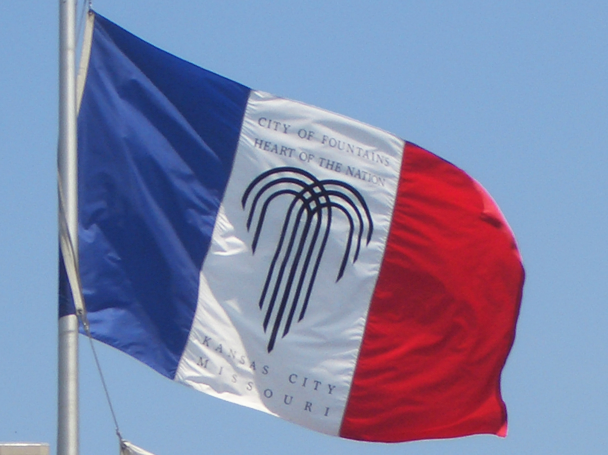
I live in Kansas City and work on the Missouri side. I have never seen the "official" flag that was evidently devised in
2002. It is very common to see a French tricolor with the Kansas City fountain logo in the center on the white
stripe. I think most people would prefer the French-style tricolor.
Ed Friedlander, 17 April 2006
Wikipedia shows a variant of the flag, with the emblem on the centre panel of a red-white-blue vertical tricolour.
André Coutanche, 13 March 2008
![[flag of Kansas City, Missouri]](../images/u/us!moks2.gif) image by António Martins-Tuválkin, 11 September 2009
image by António Martins-Tuválkin, 11 September 2009
Here is a proof that the flag of the City of Kansas City, Missouri, contains lettering. "CITY OF FOUNTAINS" and "HEART OF THE NATION" in two lines above and "KANSAS CITY" and "MISSOURI" below the fountain logo on the white stripe. Here: upload.wikimedia.org/wikipedia/commons/0/02/KCMO_flag_at_City_Hall_17July2008.jpg.
Valentin Poposki, 10 September 2009
The photo in this article from July 2019:
https://www.kshb.com/news/local-news/kcmo-mayor-council-members-approve-own-pay-increases
As well as this one from 2018:
https://pbs.twimg.com/media/Dboj4iKUQAA4VuI?format=jpg&name=4096x4096
...suggests that the flag represented on FOTW is not the current flag in use,
rather the better-known tri-color flag is.
Dave Fowler, 30 November
2019
![[flag of Kansas City, Missouri]](../images/u/us-mokss72-l.gif) 2:3 image(s) by permission of David B. Martucci
2:3 image(s) by permission of David B. Martucci
image(s) from American City Flags,
Raven
9-10 (2002-2003), courtesy of the North American Vexillological Association,
which retains copyright.
The flag in use from 7 January 1972 to 9 December 1992 was identical in form and proportions to the current flag, except that the seal was different, and is described:
The official corporate symbol of Kansas City shall be four double-lined interlocking hearts, forming a single shape with the four extremities congruent to a square, the colors of said symbol being red, white and blue. The official corporate seal of Kansas City shall consist of the aforesaid corporate symbol surrounded by a legend of City of Kansas City, Missouri, in sans serif capital letters, said legend being black.The “interlocking hearts” symbol might be described as two paper clips in the shape of an “X”, forming a diamond-shaped square in their center. The stroke of the “X “from hoist to fly as blue with red eyelets at its top and bottom, and the other stroke of the “X” from fly to hoist as red with blue eyelets, and a blue square in the center, and one has an approximation of the image that does, indeed, form hearts outlined half in blue and red, or red and blue, sequentially clockwise. The legend, in black letters, is circular in form. CITY OF KANSAS CITY is Kansas City, Missouri 177 arched over the upper two-thirds of the circle; MISSOURI is curved and centered below. The “A”s in “KANSAS” lack the cross-stroke, so they appear as inverted “V”s. The entire symbol is on a white field.
![[flag of Kansas City, Missouri]](../images/u/us-mokss44.gif) image by Jaume Olle, 7 January 2011
image by Jaume Olle, 7 January 2011
The city’s previous flag (its third) had been adopted on 26 December 1944, apparently as a result of Mayor Gage’s request to the municipal art commission to design a new flag. The commission’s members were Mrs. R. J. DeLano, Jo Zach Miller III (at that time in the U.S. Army), Alfred L. Benjamin, Harry L. Wagner, Keith Martin, and Mrs. Russell C. Comer. The flag has a blue field with a white horizontal stripe in the center; the top and bottom blue portions are 2.25 units wide and the white stripe is 1.5 units wide. Superimposed and centered on the flag is a large seal-like device (but not the city’s seal of the period) with a white field and the diameter of 4.25 units.
In the circle’s center is a large red heart, 2.5 units high and wide. A silhouette of a Native American on horseback, in blue, overlays most of the heart. The horse is 2 units from tail to nose; the distance from the top of the rider’s head (omitting the feather) to the base of the image is 2 units. The horse and rider face the fly; the rider carries a bow and quiver, shading his eyes with one hand. The right front leg of the horse is raised slightly.
Surrounding the heart and silhouette is a blue ring; its width is 0.375
units and its overall diameter 3.25 units. Surrounding this blue ring is
a white ring of a half unit in width, and an overall diameter of 4 units.
Curved and centered over the top of the white ring is KANSAS CITY,
and curved below, MISSOURI, all in blue in an Arial-like font. One
blue star centered on each side of the ring separates the wording. The
whole is enclosed in another blue ring identical to the first one, except
that its diameter of 4.25 units forms the outer edge of the device. A
very narrow fimbriation of white surrounds the entire circular device
on the blue field. The colors (red and blue) and the proportions of the
flag (10:19) were officially stated as those of the United States flag. The
flag was in use until 7 January 1972.
John M. Purcell, American City Flags,
Raven
9-10,
2002-2003
![[flag of Kansas City, Missouri]](../images/u/us-mokss36.gif) image by Rob Raeside, 31 July 2014
image by Rob Raeside, 31 July 2014
Details of the second city flag's history are very sketchy. The flag was rediscovered in 1942 when Mayor Gage undertook his campaign for a new city flag. Evidently it had been displayed in 1936 at the dedication of the city's new municipal auditorium, and was used from time to time thereafter at that building. In 1942 when the mayor learned of the flag, nobody knew its official status, but he sent it to the municipal art commission for its consideration (The flag apparently did not meet with the members' approval, since the commission came up with a different flag two years later). The 1936 flag is a
horizontal tribar of equal blue, white, and blue stripes, and overall proportions of 2:3. The city's then-current seal appears in
the center in blue.
On the hoist side of the seal is KANSAS, on the fly side, CITY, all in blue. The seal has a white ring bordered in blue around its outside. On the ring, curving from 9 o'clock to 3 o'clock, is SEAL OF KANSAS CITY, and centered below, counterclockwise, is MISSOURI, all in blue. The center of the seal shows a stylized American shield, with its lower sides curved outwards and a narrow white border fimbriated on both edges in blue. The upper part is blue with 11 five-pointed white stars, 5 over 6. The rest of the field is white. Arched across the center of the field in small blue letters is INCORPORATED. Centered immediately below in small blue figures is 1850. Arched immediately above the shield in the crest position is JACKSON, and below the shield, curved to match the curve of the seal, is COUNTY, all in small blue letters.
John M. Purcell, American City Flags,
Raven
9-10,
2002-2003
![[flag of Kansas City, Missouri]](../images/u/us-mokss13.gif) image by Rob Raeside, 31 July 2014
image by Rob Raeside, 31 July 2014
Kansas City must be in the running, at least, for the most US City flag changes. The first flag adopted in 1913 inspired other suggestions, especially a design patented in 1916 (which was not included in American City Flags). The second was used in 1936 and rediscovered in 1942. The third was adopted in 1944, the fourth in 1972, the fifth in 1992 (the first with the fountain symbol), and the sixth in 2002 (which we did not know about when we published ACF in 2003). The 1936 flag may not have been official (but it was in use, at least briefly) but the rest were official. Concord NH has had seven flags, but only three of them were ever officially adopted (I think) and the current
design is at variance with the official design.
Dave Martucci, 11 January 2011
The city's first flag was officially adopted on 17 June 1913, as "the outward manifestation of civic pride due to the building of its new Union Station". The flag has a blue pennant-shaped field, with proportions of 7:18. At the hoist, the city seal in blue on white occupies the entire width of the flag. On the fly side of the seal, KANSAS CITY appears white capitals that grow progressively smaller as they approach the pennant's point. The seal is an earlier version
than on the 1936 flag. In the white ring fimbriated in blue around the outside is A GOOD PLACE TO LIVE arched over the top half, in blue. In the corresponding space below is a pair of laurel branches joined at the center, in white outlined
in blue. The American shield in the center of the seal has five white stars on the blue upper section above INCORPORATED 1850, displayed in the same fashion as the seal on the 1936 flag. However, in place of the county's name on that later
seal, this one has KANSAS arched above and CITY centered below. During Mayor Gage's 1942 effort to develop a new city flag, the city clerk unearthed this flag, which had also been stored away and forgotten. When it was shown to the mayor, he declared the flag "a college boy's pennant", and rejected it out of hand.
John M. Purcell, American City Flags,
Raven
9-10,
2002-2003
For the celebration of the 100th anniversary of the foundation of Kansas City in 1950, a Centennial flag was designed. The flag is mentioned in two documents available at the Kansas City Library:
-- "Photos, illustrations, and
information on the postage stamps and postmark designed specially for Kansas City's centennial in 1950, including the official Kansas City Centennial stamp designed by Louis Dietzel (also designer of "the Centennial seal and the
Centennial flag")"
- "Photos and article about the unveiling of Kansas City's "first centennial flag at ground-breaking in Swope Park for the Starlight Theater." Dated 15 December 1949.
localhistory.kclibrary.org
A photograph of the postmark give some clue on the design of the flag: www.brassdragon.biz/kansas-city-centennial-meter-slogan-close-e3407.jpg
Ivan Sache, 26 March 2008
The U.S. Post Office Department (as it then was) also issued a commemorative postage stamp to mark the centennial of Kansas City, Missouri. It was a dull lilac color; in those days the denominational value of each US stamp was color
coded, with one-cent stamps being in shades of green, two cent stamps in shades of red, three cent stamps in shades of purple, and so on. I have examined this stamp in my collection, and it does not seem to have any of the symbolism of the
centennial flag as described by Ivan.
Ron Lahav, 26 March 2008
A black & white photo from that Kansas City Library website is located at localhistory.kclibrary.org. It shows much clearer detail than the postmark does- revealing that the top and bottom stripes are dark, but not identical, and the center stripe is light. The image of the seal (well at least some kind of circular emblem) is much clearer in places, although obscured at the bottom.
Ned Smith, 27 March 2008