
Last modified: 2020-01-04 by rick wyatt
Keywords: coral springs | florida | broward county |
Links: FOTW homepage |
search |
disclaimer and copyright |
write us |
mirrors
![[Flag of Coral Springs, Florida]](../images/u/us-flcos.gif) image by Randy Young and Tomislav Todorovic, 4 Jul 2017
image by Randy Young and Tomislav Todorovic, 4 Jul 2017
See also:
New flag designed:
coralspringstalk.com.
"Dale Williams' flag, which he calls "Where the Sawgrass Meets the Sky," received the most votes from both the public and the selection committee. The City Commission concurred with the choice."
Dave Fowler, 3 July 2017
The six finalists for the new flag were:
1. coralspringsflag.org/1/: "The flag represents the breathtaking Everglades' sunset that the city is lucky enough to have in its own backyard."
2. coralspringsflag.org/2/: "Where the Sawgrass Meets the
Sky". "Just like the title to the State of Florida's official anthem, Coral Springs is a city that Reflects what is still true to this State. Right on the edge of one of Florida's Natural Gems, The Florida Everglades, this flag reminds us of each level the city has grown into and gazes into the future of greater things to come." (this is the winning proposal)
3. coralspringsflag.org/3/: "From sunrise to sunset….the City of Coral Springs has everything under the sun! The bands of color were inspired by a recent sunset experienced in our city. The bands can also
represent, along with the rays of the sun in the logo, the many amenities we have or the diversity of our city."
4. coralspringsflag.org/4/ : "The sun is actually a "C". The palm tree is an "S" – Coral Springs. The sun and tree represent the perfect day. The Blue background represents the endless possibilities found in our city and the ever-growing city itself. The white circle represents unity."
5. coralspringsflag.org/5/: "The sun in the corner radiates through a light blue sky over our City of Everything, surrounded by a deeper blue band representing beautiful pools, waterways, fountains, and Aquatic Complex, bordered by a curve of green to represent our renown landscaping, parks, and trees. The design proclaims Coral Springs is a beautiful place!"
6. coralspringsflag.org/6/: "When designing the flag: The sun represents the core of Coral Springs. The blue rays represent the extension of family, while keeping the brand of the logo in the flag."
The contest was set up among a rebranding campaign: "Our new brand, "Everything Under the Sun," is a small piece of a much larger marketing effort. This branding initiative was an investment in the future of Coral Springs. Our goal is to have businesses, residents, families, event planners, athletes, and sports promoters re-discover Coral Springs, and the unique experience that Coral Springs offers.
No longer the 'city in the country,' we want residents, businesses and visitors to view the City as it is – the fifth largest city in Broward County, family-oriented, with a focus on developing a vibrant downtown."
Source: coralspringsflag.org/why/
The logo evolution: "Coral Springs was so remote in the early 1960s that all sales literature included a map with directions. James Hunt had a graceful vision for his "City in the Country" and Coral Ridge Properties was the first developer bringing his vision to life. Coral Ridge Property's favorite moniker for Coral Springs at the time was "One of the last pieces of gold on the Gold Coast."
During the 1980s, Coral Springs was one of the fastest growing cities in the nation. A Coral Ridge Properties sales brochure from that time
emphasizes the natural look of the Coral Springs, particularly the "green canopy of tropical plants and trees." The text goes on to point out that "this is not 'by chance'" but rather planned every step of the way. Billboards just outside the city limits proclaimed, "If it Has Everything, It Must Be Coral Springs!"
Then, in the 1990s, the City began using the "Suntree" logo, an abstract representation featuring the outlines of a yellow sun and a green tree. The logo used from 2002 until 2009 was this one: en.wikipedia.org
After receiving the Malcolm Baldrige National Quality Award in 2007, Coral Springs became known as a Community of Excellence. City officials decided that the golden anniversary would be a perfect time to launch a new brand and celebrate the community we have all come to love. Branding a city not only helps to create a sense of pride, but also has a potential impact on the economic stability of the residential and business communities.
After more than a year of research and brainstorming, the City had a new logo and tagline: "Coral Springs: Everything Under the Sun." (coralspringsflag.org) Coral Springs is proactively becoming a destination of choice for businesses, visitors and families. The logo is a fresh take on some of the consistent themes that appeared in our previous brand themes and logos. While the look might be more modern, the concept is tried and true." (the color palette being available here: i2.wp.com/)
The contest was decided among 80 proposals submitted (coralspringsflag.org)
split into three main categories "Elemantary School Division", "Middle/High School Division", "Juried Division" and one final category called "Finalists" following the Flag Design Guidelines: "
1. Be simple: Flags are seen from a distance, rarely up close. A flag on a 1″x 1 1/2″ is what a 3'x5′ flag looks
like from 100 feet away. Keep it so simple that a child can draw it from memory.
2. Use meaningful symbolism: The shapes, colors, and symbols should mean more than what they look like. A blue stripe can represent water, yet still doesn't scream "WATER" at someone viewing the flag.
3. Use basic colors: Flags wear over time, and using basic colors ensures a long lifespan. Limit yourself to 3 colors from a standard
10-pack of markers.
4. Don't use words: Flags are meant to be seen, not read. From far away, lettering will be impossible to read. If the name of a city is
needed to recognize the flag, then the flag isn't distinctive enough.
5. Be distinctive/similar: Only use similar visual elements to another flag if you want to associate with that flag. While a sun may be appropriate for Coral Springs because it's one of the main elements of the City's logo, a beach scene isn't."
Sources: coralspringsflag.org/ and coralspringstalk.com
Esteban Rivera, 4 July 2017
![[Flag of Coral Springs, Florida]](../images/u/us-flcos-o.gif) image by Eugene Ipavec, 1 May 2009
image by Eugene Ipavec, 1 May 2009
Christine Verdi-Sarwar, Director of Communications and Marketing of City of Coral Springs sent me a Press Kit in PDF which shows a small photo of 3 flags - US, Florida and (probably) city flag. I asked if that is their city flag and I
got confirmation that it is. The flag is Florida saltire, but in blue (or light green) cross with city seal in the center. The flag has a double saltire, or two lines. The top two sets (left and right) have the blue line on the top and the green line on the bottom; the bottom two sets (left and right) have the green line on the top and the blue line on the bottom.
Valentin Poposki, 19 March 2009
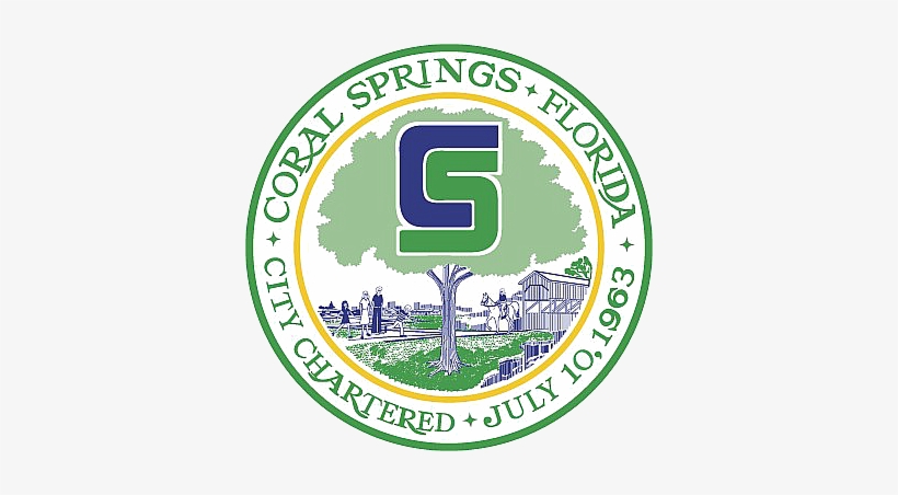
![[City Seal]](../images/u/us-flcos).gif) image located by Paul Bassinson, 24 June 2019
image located by Paul Bassinson, 24 June 2019
Source:
https://www.pngkey.com
Paul Bassinson, 24 June 2019
.png)