
Last modified: 2025-01-18 by rob raeside
Keywords: united kingdom | union jack | gay pride | green britain |
Links: FOTW homepage |
search |
disclaimer and copyright |
write us |
mirrors
![[Flag of the United Kingdom]](../images/g/gb.gif) 1:2 |
1:2 | ![]() image by Clay Moss, 16 December 2006
image by Clay Moss, 16 December 2006
Flag adopted 1 January 1801.
See also:
According to my old stand-by, Colours of the Fleet, the blue was
darkened in 1869 when the Admiralty standardised the naval Union Flag at 1:2,
with a narrower St Patrick's saltire. No explanation is given for the dark blue,
but I'd speculate that the Admiralty chose the darkest possible shade of blue so
that the colour would not fade away before the flag needed replacing.
David Prothero, 23 March 1998
If you look at Perrin's British Flags you will see that the original
1606/1707 flag had a pale blue field while the 1801 flag has a darker blue
field. One of the reasons is probably that the flag is defined as having an
"azure" field and in recent British heraldic tradition this has been interpreted
as a mid to dark blue. In our modern Pantone-regulated world we differentiate
between many different shades of colour, but hundreds of years ago we didn't. I
think there is something in David's idea that a darker blue was chosen so that
the flags had to be replaced for fading less often.
Graham Bartram, 23 March 1998
Naval flags were changed in 1908 when the Admiralty decided that the blue in
Union Flags and Ensigns should be the same shade of blue as that selected by
King Edward VII for the Royal Standard. This was known as pattern 74 'Royal
Blue', and replaced pattern 63 "Dark Blue". Pattern 63 was still used for signal
flags and for the flags of countries such as Russia and Norway. The other two
shades in use were: Pattern 61 'Azure'; Cuba and Ecuador were given as examples,
and Pattern 61A 'Intermediate' which was a bright blue for Italy and Sweden.
Source: Public Records Office ADM 116/1072.
David Prothero, 25 August 1998
The Pantone colours (186 for the red and 280 for blue) are the official
ones for the Union Flag and all UK derivatives (Bartram
2004). I know they are quite dark, but
then so are the Union Flags that follow the official specification. The red also
has quite a large blue component and even has some black. The CMYK values are C0
M91 Y76 K6. The dark blue is C100 M72 Y0 K18.5
Graham Bartram, 19 December 1999
After an intense discussion enlightened mainly by Graham Bartram, we sort of
decided that the best browser-safe approximates for the union jack colors are
RGB:204-0-0 for red and RGB:0-0-102 for blue (plus RGB:255-255-255 for white, of
course!), that is our FOTW equivalences for dark red
(R+) and very very dark blue (B+++).
António Martins, 24 January 2001
The colors aren’t standardized or specified officially.
The Flag
Institute has a Union Flag Specification page, which gives recommendation for
color values:
https://www.flaginstitute.org/wp/uk-flags/union-flag-specification/
Blue: Pantone 280C, CMYK: 100-72-0-18,5, RGB: 0-36-125
Red: Pantone 186C,
CMYK: 0-100-81-4, RGB: 207-20-43
White: Pantone -, CMYK: 0-0-0-0, RGB:
255-255-255
Other sources for colors:
The Flag Manual - Beijing
2008 gives Pantone colors: PMS 032 (red), and PMS 293 (blue).
The Album
des Pavillons 2000 [pay00] (Corr. No. 6.) gives
approximate colors in Pantone and CMYK systems:
Blue: Pantone 280c, CMYK
100-70-0-10
Red: Pantone 186c, CMYK 0-90-80-5
Yellow: CMYK 0-0-100-0
Crimson: Pantone 201c, CMYK 0-100-63-29
Light blue: Pantone 549c, CMYK
52-6-0-25
Blue (St. Andrew): Pantone 300c, CMYK 100-43-0-0
Green: Pantone
354c, CMYK 91-0-83-0
The Flags and Anthems Manual London 2012 [loc12]
gives Pantone colors: PMS 280 (blue), and PMS 186 (red).
The Album des
Pavillons 2023 specifies the colors of the flags in three color systems:
Blue: Pantone 280c, CMYK 100-89-27-8, RGB 0-38-127
Blue: Pantone 300c, CMYK
88-57-0-0, RGB 0-103-198
Blue: Pantone 549c, CMYK 66-27-22-4, RGB 91-151-177
Red: Pantone 186c, CMYK 10-100-74-2, RGB 210-16-52
Crimson: Pantone 201c,
CMYK 100-92-24-7, RGB 158-27-52
Yellow: Pantone Yellow c, CMYK 3-9-92-0, RGB
254-221-0
Green: Pantone 355c, CMYK 84-12-100-1, RGB 0-149-48
Vexilla Mundi gives colors in
Pantone system: PMS 280C (blue), PMS 186C (red), and PMS White.
Wikipedia
illustrates the flag, and construction details, and gives the Flag Institute
colors:
Red:
Pantone 186 C, RGB 207-20-43
Royal blue: Pantone 280 C, RGB 0-36-125
Flag Color Codes gives the
following color values:
White: Hex #FFFFFF, RGB 255-255-255, CMYK 0-0-0-0,
Pantone
N/A, RAL N/A
Red: Hex #C8102E, RGB 200-16-46, CMYK 0-100-80-5, Pantone 186,
RAL 3028
Blue: Hex #012169, RGB 1-33-105, CMYK
100-85-0-39, Pantone 280, RAL
5026
Zoltan Horvath, 7 December 2024
Whilst I accept that the shade of blue on the United Kingdom flag is now
accepted as PMS 280, I recollect that it was not always so.
Until the mid
1990s (I think that is the right timing) the shade of blue was darker, close to
PMS 281. Whitney Smith in The Flag Research Center's 1997 commercial service
specifications listed the colour as PMS 281C. William Crampton’s Flag Institute
Specification Sheets listed the shade of blue for the UK as PMS 286. Album des
Pavillon s 1990 edition original page showed the shade of blue darker than
later, though the PMS were not listed. Correction No. 26 (September 1996)
lightened the shade of blue and added the specification of PMS 287C, though the
CMYK was 100-70-0-10, which is now described as PMS 280C.
I am not aware
of any explicit official government change that implemented this change of
shade. The 1955 edition of BR20 specified colours as pattern numbers of
Admiralty bunting with the UK flag having Royal Blue pattern T814/T1139 and this
was illustrated as a dark shade of blue. The 1989 edition (under Graham
Bartram’s advice) specified colours as “Shades of Naval Bunting” and illustrated
the Royal blue shade 8711D lighter than previously and specified it as PMS280C.
Do any members know more about this?
As a result of this change to
the colour of the Union Jack, the Australian Department of Prime Minister and
Cabinet erroneously changed its description of the Australian flag’s colours.
Ralph Kelly, 7 December 2024
Union Jacks are occasionally sighted in other combinations of colours. The
design is very distinctive and its use in other colour combinations has been
adopted by some football (soccer) team supporters. In particular black and
white union jack flags are used by Newcastle United(?) fans. Black and
yellow might be used by supporters of Wolves (Wolverhampton Wanderers) of
possibly Watford.
James Dignan, 15 April 2004
Such flags are sold online in a variety of color combinations. The ratio is
often 3:5, but 5:8 is also frequently used, which may seem non-standard, but is
sometimes also used for the Union Jack itself. Each of these flags is advertised
as being made for the fans of several different clubs, not only football, but
rugby as well. While some of these designs were indeed invented by the sport
fans, it is also possible that some of them were invented by the manufacturers
wishing to exploit a good market, or at least, that they expanded the list of
targeted clubs.
Tomislav Todorovic, 3 May 2016
![[UKtv advertising flag]](../images/g/gb_owv.gif) image by Tomislav Todorovic, 26 May 2013
image by Tomislav Todorovic, 26 May 2013
An orange-white-green flag was reported, likely
flying on a pole on the River Thames beside the Royal Festival Hall in
Jubilee Gardens. This pole is under the control of the South Bank Centre, who
are the leaseholders of Jubilee Gardens. It was originally erected for the 1951
Festival of Britain as the site for the Hayward [Art Gallery - part of the South
Bank Centre] Flag Project. The flag seen is part of an advertising campaign for
the rebranding of the digital television channel UKtv People as 'Blighty' for
the television company, Uktv, part owned by the BBC. There are multiple colours
of the Union Flag design in this campaign.
Sources:
(1) Walking London, Andrew Duncan, ISBN 9781847730541, 2008
edition
(2) Reuters (Gaumont British), newsreel, Festival Ends,
S24050702 149359, GB 37419 - 4.10.1951, 1951, as consulted ITN web site, 17
March 2009
(3) Regeneration of
Jubilee Gardens, Design Brief, Final Draft Version 9A, South Bank Employers'
Group, 28 January 2005
(4) South
Bank Centre, web site, http://www.southbankcentre.co.uk, as consulted 17 March
2009
Colin Dobson, 17 March 2009
Here is another photo of that flag:
http://www.flickr.com/photos/bababoosky/3518047241. It was taken on
2009-05-03, from the London Eye.
Tomislav Todorovic, 26 May 2013
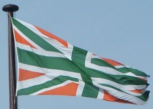
This design has first appeared in 1996, when British artist Mark Wallinger made
a "Union Jack" in colors of Irish national flag, named "Oxymoron" [1, 2]. The
flag ratio was 1:2 [1, 2] and it was hoisted at least once, probably as a
performance [2]. In 2005, Wallinger composed sixteen flags with this design,
together with other three artworks of his, into an installation named "Easter",
which was set inside the Duomo of Milan, Italy, to accompany another
installation, which was set by another artist [3]. The 2005 flags ratio was 3:5
[3]. The "Easter" was also installed in the HangarBicocca art center, Milan [3].
Sources.
[1] Report on Mark Wallinger retrospective in Braunschweig,
Germany:
http://www.shaunbelcher.com/blog/?p=260
[2] Photo of "Oxymoron" flag
hoisting:
http://www.metamute.org/editorial/articles/art-all-administrator-2-administrator
[3] HangarBicocca art center website - report on the installation "Easter":
http://www.hangarbicocca.org/exhibitions/exhibitions/easter
Tomislav
Todorovic, 15 June 2013
![[Agreement flag]](../images/g/gb_vwo.gif) image by Tomislav Todorovic, 27 December 2020
image by Tomislav Todorovic, 27 December 2020
"Agreement" is the name of the flag derived from the Union Jack by repainting
blue and red into green and orange, respectively. It was created in 2003 by the
USA artist Jack Daws and exhibited at the Greg Kucera Gallery, Seattle,
Washington [1, 2]. The colours were chosen as those of the national flag of
Ireland and the flag name clearly alludes to this combination of British design
and Irish colours; the ratio is 2:3 [2]. The flag was hung in the gallery
together with two other flags the artist made [2, 3]: an
all-white version of the US national flag and a
redo of Confederate flag in pan-African colors [see message #5556]. The precise
date of the exhibition was not possible to tell from its presentation at the
gallery website, for Daws has had a number of exhibitions there since 2002: the
earliest one was 2003, when all three flags were completed, and the latest one
was 2017, when he seems to have exhibited there for the last time [1]. The flags
may have actually been exhibited more than once, for there are the photos which
display them being hung in two ways, either from the staffs planted onto the
wall or spread upon the wall like the tapestries [2, 3]. Whichever was the case,
the installation view may have remained unchanged even long after the sale of
any of the flags, for the artist has made 10 copies of each flag, all offered
for sale, so a sold copy may have been replaced with a new one nine times [2].
Sources:
[1] Greg Kucera Gallery website - Jack Daws' resume:
http://www.gregkucera.com/daws_resume.htm
[2] Greg Kucera Gallery
website - photos of Jack Daws' works:
http://www.gregkucera.com/daws_sculpture.htm (WARNING: some works may be
considered obscene)
[3] Greg Kucera Gallery website - photos of Jack Daws'
exhibition, installation view:
http://www.gregkucera.com/daws_install.htm
Tomislav Todorovic,
5 July 2020
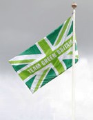
![[Green Britain flag]](../images/g/gb_green.gif) image by Tomislav Todorovic, 14 May 2016
image by Tomislav Todorovic, 14 May 2016
based on
an image located by Colin Dobson, 14 September 2009
The real 'Green Britain' advertising flag has at least two variants:
http://teams.teamgreenbritain.org and this one, with both the Electricity of
France logo and the London 2012 logo:
http://www.ecotricity.co.uk. A number of graphic adaptions of the design
have been made, including as a dress by the marvellous and highly entertaining
Wayne Hemingway and as a guitar, all of which goes to demonstrate the
verstaility of the original design of the Union Flag. See the 'Team Green
Britain' web site here:
http://teams.teamgreenbritain.org/blog/2009/07/10/a-special-message/ for
some more variants.
Sources:
(1) http://www.southbankcentre.co.uk, as consulted 14
September 2009 (2) Électricité de France, web site,
http://teams.teamgreenbritain.org/, as consulted 14 September 2009
(3) SE1, local community based web site,
http://www.london-se1.co.uk, as consulted 14
September 2009
(4) Green is the
new black for Olympian Victoria Pendleton and British designer Wayne Hemingway,
Électricité de France news release, July 2009, as consulted EDF web site, 14
September 2009
(5) London 2012 web
site, http://www.london2012.com, as consulted 14 September 2009
Colin Dobson, 14 September 2009
![[Achrome Union Jack]](../images/g/gb_nwg.gif) image by Tomislav Todorovic, 25 May 2013
image by Tomislav Todorovic, 25 May 2013
In 1993, British artist Jonathan Parsons made a black-white-gray Union Jack.
This artwork, named "Achrome", was exhibited from 11st April to 21st May 1994,
together with works by several other artists, in Edwardes Square Studios,
London, as part of an exhibition named Every Now and Then [1]. The flag was
auctioned at Christie's on 8th December 1998 [2]. In 2005, another such flag was
commissioned from Parsons by Norwich Castle Museum for an exhibition named Art
out of Place, but instead of being flown above Norwich Castle, as originally
intended, it was displayed inside the castle, due to fears that it might be
viewed as offensive [3]. Parsons' comment on the decision was that it is a kind
of censorship, for he did not see why his work would be offensive to anyone [3].
Sources:
[1] Web presentation of the exhibition Every Now and Then:
http://www.rear-window.org.uk/every_now_and_then
[2] Christie's - sale
6120, lot 48 - "Achrome" by Jonathan Parsons:
http://www.christies.com/lotfinder/lot/jonathan-parsons-achrome-1374758-details.aspx?pos=7&intObjectID=1374758&sid=&page=4
[3] BBC News website - report on the Parsons' flag for Norwich Castle
Museum:
http://news.bbc.co.uk/2/hi/uk_news/england/norfolk/4116988.stm
Tomislav Todorovic, 25 May 2013
This reminds me of some of the work done by one of New Zealand's top artists,
Ralph Hotere (who died earlier this year). A Maori artist, his work often
touched on the subject of colonialism and the politics of race. His flag-related
series included the "Black Union Jack" and "Double-cross Jack" series, each of
which used the Union Jack as a basis.
The "Black Union Jack" series
involved the incorporation of the letters "NZ" into the form of the Union Jack,
and were inspired by a controversial New Zealand sports tour to apartheid-era
South Africa. An example of one of the series can be seen here:
http://christchurchartgallery.org.nz/collection/objects/85-01/
The
"Double-cross Jack" series was inspired by the sad state of Middle-eastern
politics, and made use of found postcards of the Union Jack, cut to form a Magen
David form, and often incorporated into larger works. An example can be seen
here:
http://www.sauer-thompson.com/junkforcode/HotereR.jpg
James Dignan,
26 May 2013
This example [Black Union Jack], but also the others found on the Web, look
like like they contain an optical illusion in form of the swastika. Considering
that apartheid-era South Africa was indeed often described as a Fascist state by
anti-apartheid activists, perhaps that is what Hotere meant by this series of
works - that his countrymen gave the support to a Fascist regime. Bearing in
mind that Thatcher-era United Kingdom's policies towards the apartheid regime
were also, to say it the mildest way, ambiguous, the criticism might have been
aimed at those as well, considering that the pictures are not derived from the
whole pattern of the New Zealand flag, but only from that of the canton, which
is actually the national flag of United Kingdom.
Tomislav Todorovic,
26 May 2013
Metallic Gold
![[Gold Union Jack]](../images/g/gb_gold1.gif) image by
Tomislav Todorovic, 13 May 2016
image by
Tomislav Todorovic, 13 May 2016
Old Gold
![[Gold Union Jack]](../images/g/gb_gold2.gif) image by
Tomislav Todorovic, 13 May 2016
image by
Tomislav Todorovic, 13 May 2016
"Gold Union Jack" is more a description than a name, official or unofficial,
for the flag derived from the Union Jack by replacing both red and blue colors
with gold. Such flags have been appearing in the advertising campaigns by
various fashion and cosmetics houses, as the background behind the models. One
of the earliest examples was Burberry's campaign for the spring 2006 collection,
as shown here:
http://www.thefashionisto.com/throwback-thursday-danny-beauchamp-burberry-spring-2006-campaign/
and here:
http://www.fashiongonerogue.com/20-advertisements-last-decade-fashion/. Such
a flag was also used in 2012, in the photos promoting the kit which was to be
worn by the British athletes at the Summer Olympic Games in London later same
year:
http://ftape.com/media/stella-mccartneys-out-of-the-red-team-gb-kit-revealed/.
A flag was also made (date not specified) by the Seasons Textiles Limited for
Rimmel London:
http://www.seasonstextiles.co.uk/sewing-department/516865_union-jack-flag-in-gold-lame-and-cream-silk-for-rimmel-london.html.
In all these examples, the real color is far more brownish than the FOTW color
Au - actually, it looks like the color called "metallic
gold":
https://en.wikipedia.org/wiki/Gold_%28color%29#Metallic_gold although in
some cases it may look more like the color named "old
gold" or even the web color "goldenrod",
all three colors much resembling each other.
Flags employing the color
which is much more similar to the FOTW color Au do exist, though. One such flag
is produced by the Flying Colours Flagmakers company:
http://www.flyingcolours.org/product/unusual-projects/union-jacks-in-different-shades.html.
Note how the flag color is nearly identical to that of the fringes, which may
certainly be described as the "FOTW gold". The file name of the flag photo:
http://www.flyingcolours.org/uploads/jan_2010_todo/National_Lottery_Gold_Ceremonial.jpg
suggests that the flag was made for the National Lottery, although the image
searching of the Web was not able to provide any evidence in
favor of this.
Tomislav Todorovic, 13 May 2016
In its recently introduced photo gallery at
Instagram the manufacturer states that such a flag was also made for the
2014 Tour de France. Although the item shown on the photo lacks the fringes and
the color is called simply "yellow", the design is obviously the same.
Tomislav Todorovic, 11 August 2017
![['Union Black' flag]](../images/g/gb_rvn.gif) image by
Tomislav Todorovic, 10 July 2017
image by
Tomislav Todorovic, 10 July 2017
Chris Ofili agrees to let Union Black fly again after giving flag to the Tate (https://www.theguardian.com/artanddesign/2017/jul/01/chris-ofili-union-black-flag-tate-britain)
A summary of the source article:
"Union Black" is name of the flag
derived from the Union Jack by repainting red, white and blue into black, green
and red, respectively. It was created by Chris Ofili, British artist of Nigerian
origin, and originally displayed in 2003 in the British pavilion at the Venice
Biennale, as part of the selection of Ofili's works which all employed the
Garvey colors. The flag was hoisted over Tate Britain gallery, London in 2010 as
part of the exhibition of Ofili's works. Ofili has recently given "Union Black"
to Tate Britain, the fourth of his works given to the gallery so far, with
permission to fly it over the gallery again, which will be done later this year.
Tomislav Todorovic, 10 July 2017
![[Britain4Palestine]](../images/g/gb}gb4ps.gif) image by Tomislav Todorovic, 6 January 2019
image by Tomislav Todorovic, 6 January 2019