
Last modified: 2012-11-10 by ian macdonald
Keywords: sao paulo | fernão |
Links: FOTW homepage |
search |
disclaimer and copyright |
write us |
mirrors
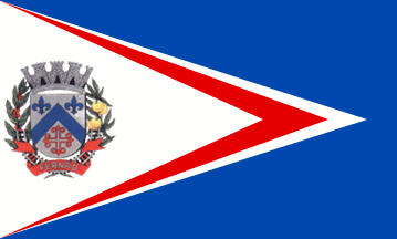 image by Dirk Schönberger,
29 October 2012
image by Dirk Schönberger,
29 October 2012
Source:
http://www.fernao.sp.gov.br
A blue flag, with a white triangle extending from the hoist almost to the fly, and bearing a tapering red chevron on its side and the municipal arms in the resulting inner white triangle.
Official website at
http://www.fernao.sp.gov.br
Dirk Schönberger,
29 October 2012
The symbols of Fernão are prescribed by Municipal Law no. 85 of 8 October 1998.
The flag and its use are prescribed in Articles 14-24 of the Law. The flag, designed by the heraldist and vexillologist Laudo Ribeiro Escobar, is blue with three white, red and white superimposed triangles and the municipal coat of arms placed near the hoist. The flag is in size 14 units x 20 units. The length of the white, red and white triangle triangle is 18, 16, and 14 units, respectively. The length of the coat of arms is 8 units.
The superimposed triangles form arrow heads, symbolizing the aspiration of the municipality to a future made of progress and prosperity. The symbolism of the colours is the same as for the coat of arms [see below], white on the flag matching argent on the arms.
The inauguration of each new copy of the flag shall follow a specific procedure. The flag shall be blessed and then hoisted when playing the municipal anthem. Afterwards, all the attendants shall take the oath: "I swear to honour, love and defend the symbols of Fernão and to fight for the growth of the municipality with loyalty and perseverance".
The flag shown on the municipal website, seemingly as a photo [and used by Dirk for his image] does not match the official specifications.
The coat of arms and its use are prescribed in Articles 9-12 of the Law. The coat of arms, designed by the heraldist and vexillologist Laudo Ribeiro Escobar, is: "Iberic shield agent charged with a chevron azure surrounded in chief with two fleurs-de-lis of the same and in base with a Greek cross flory gules voided throughout. The shield surmounted by a mural crown agent of eight towers port and windows sable. The shield supported dexter by a branch of coffee and sinister by a branch of orange tree, the two leaved and fructed proper. Below the shield rails proper and a scroll gules inscribed with the toponym 'FERNÃO' argent."
The Iberic shield, used in Portugal at the time of the discovery of
Brazil, evokes the first colonists of the country.
Argent means in heraldry happiness, friendship, integrity, purity,
temperance, truth, frankness and beauty, characteristic of the
administrators of the municipality, as well as the resulting
atmosphere of harmony and understanding.
The chevron comes from the arms of the Cavalcanti family, recalling
Captain Manoel Salustiano Cavalcanti, who founded a first settlement
on the today's site of Fernão. The chevron is a charge of first order,
representing the roof of the castles as well as higher feelings.
The fleurs-de-lis, the attributes of the Blessed Virgin, evoke the
patron saint of the municipality, Our Lady of the Apparition, as well
as the religious feelings of the inhabitants of Fernão.
Azure (blue) represents justice, beauty, sweetness, nobleness,
perseverance, zeal, loyalty, incorruptible firmness, glory and virtue,
characteristic of the inhabitants of the municipality, who build and
increase the town through their endless work.
The Greek cross (with equal arms) flory (with the arms ending in
volutes) voided throughout (with the inner part voided and showing the
field), comes from the arms of the Porto family, recalling Coronel
Eduardo de Souza Porto, who acquired in 1895 lands in the "unknown
hinterland" and settled them in 1987; facing the hostility of raw
nature, he planted coffee, built roads and helped the engineers of the
Companhia Paulista de Estradas de Ferro railways. The cross is also
the highest symbol of faith and reflects the feelings of the early
colonizers of the region.
Gules (red) represents audacity, valor, bravery, intrepidity,
magnanimity, nobleness, triumph and honour, referring to the early
pioneers.
The mural crown is the symbol of municipalities. The open gates sable
(black) emphasizes the hospitality of the inhabitants of Fernão.
The coffee branch represents the first crop, the cause of the early
human settlements and a main source of income. The branch of orange
tree represents a new crop, the two plants highlighting the
agricultural potential of the municipality. The rails are definitive
symbols of progress, brought by the Companhia Paulista.
Ivan Sache, 1 November 2012