
Last modified: 2020-07-11 by ian macdonald
Keywords: taiwan | maritime shipping | cnc | wan hai lines | evergreen marine | horng dar marine enterprises | yang ming marine transport |
Links: FOTW homepage |
search |
disclaimer and copyright |
write us |
mirrors
See also:
![[China Merchants Steam Navigation Company]](../images/t/tw~c269a.gif)
image by Eugene Ipavec, 9 May 2009
Source: image contributed by Neale Rosanoski, 9 August 2007
The bulk of the China Merchants
Steam Navigation Co. was seized by Taiwan
in 1949. Thereafter the fleet appeared in Lloyds as China
Merchants Steam Navigation Co. Ltd. based in Taipei.
In 1972 the fleet was placed under the newly formed Yang Ming
Marine Transport Corporation though Lloyds have ever since continued
to show the company as still operating with a certain amount of
obvious confusion with the Hong Kong company of the same name. However
it appears that the company does [at least up until 2005] continue to
exist though its "fleet" now consists of the 109T tender "Tar Shieh".
According to Stewart 1963 [ste63]
its flag after shifting to Taiwan was based on the
Merchant Ensign being red with 4 horizontal wavy yellow bars
but with the canton left clear and on this was placed the yellow disc.
Neale Rosanoski, 9 August 2007
See also:
![[CNC house flag]](../images/t/tw~cul.gif)
image by Miles Li, 08 October 2011
There is the house flag of the China Union Line, a former Taiwanese shipping
line established by C.Y. Tung of OOCL fame.
Source: Colin Stewart & John S. Styring, Flags, Funnels & Hull Colours,
Adlard Coles Ltd. 1963.
Miles Li, 08 October 2011
![[CNC house flag]](../images/t/tw~cnc.gif)
by Antonio Martins
It possibly is, or may only be similar to, the flag of Concord Navigation Co. Ltd. which is shown by Brown 1978 with the diamond being throughout and the letters erect. This company seems to have operated in the late 1960s so depending on whence this version has been sourced, it may only be coincidence.
Neale Rosanoski, 14 December 2003
![[Evergreen Marine Corp]](../images/t/tw~emc.gif) image by Jarig Bakker, 2 December 2005
image by Jarig Bakker, 2 December 2005
Source: Brown's Flags and Funnels of Shipping Companies of the World
[lgr95]
Taipei - white flag, green 8-pointed star (slightly shifted).
Jarig Bakker, 2 December 2005
Container ship company founded in 1969.
Phil Nelson, 28 December 2005
![[Evergreen Marine Corp]](../images/t/tw~e280.gif)
image by Eugene Ipavec, 9 May 2009
Source: image contributed by Neale Rosanoski, 11 January 2006
![[Evergreen Marine Corp]](../images/t/tw~e281.gif)
image by Eugene Ipavec, 9 May 2009
Source: image contributed by Neale Rosanoski, 11 January 2006
company logo
![[Evergreen Marine Corp]](../images/t/tw~evergreen.gif)
image contributed by Neale Rosanoski, 11 January 2006
Using the funnel as a guideline Brown does not correctly portray the star and
the four main points should be longer. There also appears to have been a change
in the design going by a table flag appearing on
Dunelmpr.co.uk
which shows the logo which now appears on the company website being placed on
a white field [see abive]. Whilst not sure that this is also used for a sea flag,
the design has also been photographed on the funnel of the Ever Gaining
in December 2005 suggesting that a change is underway and the flag is for general
use.
Neale Rosanoski, 11 January 2006
![[Horng Dar Marine Enterprises]](../images/t/tw~hdm.gif) image by Jarig Bakker, 2 December 2005
image by Jarig Bakker, 2 December 2005
Source: Brown's Flags and Funnels of Shipping Companies of the World
[lgr95]
Kaohsiung - blue flag, double indented red rectangle
bordered white.
Jarig Bakker, 2 December 2005
![[Nantai Line Co., Ltd.]](../images/t/tw~nanty.gif)
Taipei - green flag, white "N".
Jarig Bakker, 16 February 2006<
![[Ta Cheng Marine Co.]](../images/t/tw~tcm.gif)
Taipei - Israeli-style White-Red-White-Red-White
flag, in center interrupted by the firm's logo.
Jarig Bakker, 16 February 2006<
![[Ta Tong Marine Co., Ltd.]](../images/t/tw~tatma.gif)
Taipei - orange flag; a bastion of five bulwarks,
outlined white, white "T".
Jarig Bakker, 16 February 2006<
![[Taiwan Navigation Co., Ltd.]](../images/t/tw~tnc.gif)
![[Taiwan Navigation Co., Ltd.]](../images/t/tw~tnc2.gif)
located by Jan Mertens, 29 October 2009
Taipei - horizontal Yellow-Red-Yellow flag, in center
the firm's emblem.
Jarig Bakker, 16 February 2006
Apparently this Taipei based firm was founded in 1946, becoming Ltd in 1949, TNC now operates about forty ships,
mainly bulk carriers plus a few container ships, a passenger ferry, various
tugs, and push boats. These are used locally as well as internationally.
The house flag (a drawing) seen flying on the main website is rather striking: I
suppose it is the successor to the previous flag. Vertically divided dark
blue-orange-dark blue, two white bird silhouettes - both oriented towards the
hoist - are placed on the dividing lines.
This page shows the real thing,
photo detail:
http://www.taiwanline.com.tw/NEWS/NEWS950303.htm
Taiwan Navigation Co. English version website is
accessible here:
http://www.taiwanline.com.tw/eng_main.htm
Jan Mertens, 29 October 2009
![[U-Ming Transport Corp.]](../images/t/tw~umtc.gif)
Taipei - horizontal Blue-White-Blue flag; in center
red "U", interrupted by three blue waves outlined white.
Jarig Bakker, 16 February 2006<
![[Wan Hei Lines]](../images/t/tw~wanh.gif) by Ivan Sache
by Ivan Sache
Established: February 1965.
Further evidence that the "W" on the white flag is dark blue and not black
has been obtained from a ship photo on the company website which shows it being
flown as a bow jack. Surprisingly another of their ship photos shows a bow jack
version which has a light blue field bearing the dark blue "W".
Neale Rosanoski, 11 January 2006
![[Yang Ming Marine Transport]](../images/t/tw~ymt.gif) image by Jarig Bakker, 2 December 2005
image by Jarig Bakker, 2 December 2005
Source: Brown's Flags and Funnels of Shipping Companies of the
World [lgr95]
Taipei - horizontal RYR, proportioned c. 1:3:1; in center red square, blue
"Y", white interruped "M".
Jarig Bakker, 2 December 2005
Part of the Yang Ming Group. Founded 1972.
From the company
website
Phil Nelson, 28 December 2005Yang Ming is transliterated from its two Chinese characters. "Yang Ming" refers to the sun and lightness. "Yang" refers to the sun, whereas "Ming" is the combination of the sun and the moon and often denotes "brightness," "clarity" or "enlightenment."
The logo is a square block shape integrated with our initials "YM". The "Y" stretches out from the bottom to the top, which signifies Yang Ming's endeavor for innovation. The "M" stands for grandeur, width and firmness, which implies that Yang Ming's employee teams work honestly and pragmatically for effective results. Our logo also delivers Yang Ming's core values of "Teamwork, Innovation, Honesty and Pragmaticism."
company logo
![]()
image contributed by Neale Rosanoski, 11 January 2006
Source: Yang Ming website
Brown [lgr95] has not got the panel
quite right and going by the funnel bands the yellow is a golden shade.
Neale Rosanoski, 11 January 2006
Ideograph Variant
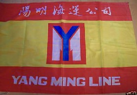 image contributed by Jan Mertens, 8 May 2009
This photo is of a variant with writing in Chinese and Latin
characters, something you would rather expect of a table flag.
This, however, is a life-size item. Added to
the lower red stripe is the name "YANG MING LINE" in white (no serifs) and to
the upper red one the same (I suppose!) in white Chinese ideograms.
Source: German eBay offer no. 360132240198 (end 26 Feb 2009) put up by
"kaethedorsch1" who also provides dimensions: approx. 0.93 m x 1.40 m.
Jan Mertens, 8 May 2009
Variant seen in Hamburg, Germany
 image by Klaus-Michael Schneider, 27 February 2009
A horizontally divided white over pearl grey bicolour . The grey stripe
has a narrow white stripe at its upper end. In the centre of the flag is the
company’s logo: in a red rectangle a blue capital "Y" superimposing two white
halfs of a capital "M".
The grey and white version seen in Hamburg is still in use.
Klaus-Michael Schneider, 27 February 2009, 09 May 2009