
Last modified: 2024-03-02 by rob raeside
Keywords: education |
Links: FOTW homepage |
search |
disclaimer and copyright |
write us |
mirrors
![[Flag of Colombia]](../images/c/co.gif) (2:3)
(2:3)  image by Željko Heimer, 20 May 2001
See also:
 image by Ivan Sache, 19 October 2018
The flag of Institución Educativa Normal Superior de Sincelejo (Sucre
Department) is horizontally divided green-yellow-red. The meaning of the colors
has not been recorded in the school's history.
https://josefrancop7.blogspot.com/2016/01/horizonte-y-simbolos-institucionales.html
Jose Franco's blog
Ivan Sache, 19 October 2018
 image by Ivan Sache, 04 December 2014
Institucion Educativa Técnica Agropecuaria de Sincerin (INETASIN) was
originally established in Sincerin (municipality of Arjona, Bolívar Department)
by Decree No. 453 of 4 March 1971, as Escuela Oficial Rural Mixta de Sincerin.
Colegio Departamental de Bachillerato Mixto de Sincerin (COBASIN) was
established by Ordinance No. 117 of 19 February 1981. Institucion Educativa de
Sincerin (INESIN) was established in 2001 and eventually transformed into
INETASIN in 2003.
The flag of INETASIN is quartered blue-white. The two colours jointly symbolize
the Caribbean joy and the human quality of the population. Blue is a
symbol of water and of the nearby Caribbean Sea. White is a symbol of peace and
altruism.
Source:
http://www.inetasin.edu.co/conceptual/simbolos.html - Institute's website
Ivan Sache, 04 December 2014
"Universidad del Sinú 'Elías Bechara Zainúm'
" (a.k.a UniSinú) was founded in 1974 in
Montería by Dr. Elías Bechara Zainúm. Born in 1920, Bechara
studied chemistry; he founded in 1962 the "Instituto
Agricola de Lorica" and in 1964 the first university in the
region, the "Universidad Nacional de Cordóba". In
1974, he founded the "Corporación Educativa Superior de
Cordóba", renamed in 1980 "Corporación Educativa
Superior del Sinú".
The university has today two campuses, in Montería (Faculties of
Law; Health Sciences; Odontology; Social, Human and Education
Sciences; Economic and Accounting Sciences; Architecture Science
and Engineering) and Cartagena (founded in 1998).
The flag of the university is shown graphically and described on
the university's
website. It is horizontally divided in white and red stripes,
whose number is not clear on the graphic (probably five stripes
starting with a white stripe on top).
Red represents strength and power while white represents peace
and tranquility.
Ivan Sache, 16 December 2008
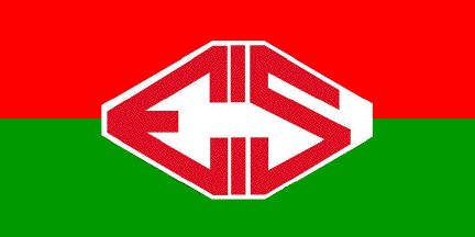 image by Ivan Sache, 11 August 2014
The flag of Institución Educativa integrado de Soacha (IEIS) is horizontally
divided red-green with the institute's emblem in the middle.
The emblem of the institute is white with red stylized letters "EIS".
Source:
http://ieintegradodesoacha.blogspot.fr/2012/09/nuestros-simbolos-escudo-ieis-bandera.html
- Institute's blog
Ivan Sache, 11 August 2014
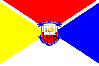 image by Ivan Sache, 11 March 2017
Liceo Mayor de Soacha "Bienestar para todos" (Welfare For All) was
inaugurated on 11 February 2013 in Soacha (Cundinamarca Department), by
Corporación Educativa Minuto de Dios, a corporation founded in 1958 by Father
Rafael García Herreros Unda (1909-1992) , which manages 24 educational
institutes all over Colombia.
The flag of the institute is quartered
yellow-red-blue-white by a white saltire, charged in the center with the
institute's emblem.
The triangles represent the institutional values of the
institute:
- Red is a symbol of love;
- White is a symbol of
justice;
- Yellow is a symbol of commitment;
- Blue is a symbol of
liberty.
Red and white are the colours of the flag of Soacha, while yellow
and blue are the colours of Corporación Educativa Minuto de Dios. The saltire
represents evangelism, purity, and the transversal features of education lit by
the Gospel.
The emblem of the institute is made of a shield horizontally
divided white-red, charged in the upper part with a white open book inscribed
with the golden yellow letters "MD" and a white cross, the whole derived from
the emblem of Corporación Educativa Minuto de Dios, and in the lower part with
the black letters "LMS". The shield surmounted by a blue scroll inscribed with
"FORMACIÓN INTEGRAL" (Integral Education) in white capital letters. Beneath the
shield a blue scroll inscribed with "A LA LUZ DEL EVANGELIO" (Lit by the
Gospel).
http://www.colegiosminutodedios.co/soacha/index.php/quienes-somos/nosotros/simbolos
- Institute's website
Ivan Sache, 11 March 2017
 image by Ivan Sache, 10 September 2014
Escuela Normal Superior is located in Socha (Boyacá Department).
The flag of the institute is horizontally divided dark blue-white-dark blue. The
flag was adopted on 28 January 2003 in a meeting of the parents, students
and teachers.
The upper stripe represents the youth's clear horizon. The central stripe refers
to inner peace, vitality, positive vibrations in spiritual places, as well as
acts open to change and clarity to analyze situations and triumph in difficult
moments. The lower stripe represents the sky, the water resources of the
municipality, sincerity and belonging to the institute.
Source:
http://norsocha.jimdo.com/nuestra-institucion/simbolos/ - Institute's
website
Ivan Sache, 10 September 2014
 image by Ivan Sache, 13 January 2009
Current flag
 image by Ivan Sache, 13 January 2009
Former flag (until 1993)
"Colegio Universitario Socorro" was founded in
Socorro, Department of Santander, on 15 January 1826, as
"Colegio del Socorro", succeeding a primary school
originally founded in 1778. The institute was elevated a
"Colegio Universitario" in 1823. The Department of
Santander merged in 2002 (Decrees No. 12501, 28 October, and No.
13488, 18 November) "Colegio Universitario Socorro"
with "Concentración Escolar Kennedy",
"Concentración Escolar Bicentenario", "Instituto
Cooperativo Cacique Chanchón" and "Concentración
Escolar Comuneros".
The flag of the institute is shown graphically and described on
the website of the institute.
Deploring that the institute had the same flag as most other
educational institutes of Socorro and the national police, the
Arts professors Luis Eduardo Manrique Corzo and Alirio Gómez
Gómez proposed in 1993 to change the flag of the institute,
while keeping its traditional colours, white and green. The board
of the institute agreed and organized a flag competition, whose
winners were the students Leady Selenet Archila and Adriana Maria
Estévez Gerena, from the "7B" class.
The flag is 2.50 m x 1.75 m (proportions 7:10), horizontally
divided white-emerald green-white-emerald green-white
(3:7:15:7:3) with the emblem of the institute in the middle.
White represents purity, virtue and transparency. Green
represents hope in a better future.
The designer of the emblem, used for 50 years, is unknown. The
shield is "Per bend sinister vert a mullet or argent an
eagle gules", with a white scroll charged with
"CUS" sable over the chief, and "SIC ITUR AD
ASTRA" sable in the border of the shield.
Green represents hope and the agronomical resources of the
region.
The yellow star represents the light enlightening and guiding the
students and educators on the right way. "CUS" is the
acronym of "Colegio Universitario Socorro".
White represents purity, clarity, sensibility, virtue and noble
aspirations.
The red eagle spreading wings to fly represents greatness, visual
acuity, liberty, courage, strength and value required to get rid
of the obstacles.
The Latin motto "SIC ITUR AD ASTRA" means "Thus
you shall go to the stars". The original source is in
Virgil's Aeneid (IX, 641), Apollo exhorting young Ascanius:
"Macte, nova virtute, puer, sic itur ad astra"
("Courage, child, thus you shall go to the stars").
Ivan Sache, 13 January 2009
ITSA ("Instituto Tecnólogico de Soledad
Atlántico"), based in Soledad, was recognized by Law 391 on
23 July 1997. The flag of
ITSA is shown graphically and described on the ITSA website. The flag is
horizontally divided blue-yellow-blue with the logo of ITSA in
the middle.
The logo of ITSA is composed of a series of elements graphically
symbolizing the most significant features of the origin of ITSA
and of its institutional mission.
The cogwheel symbolizes industrialization and was inspired by a
similar element from the logo of ITIDA (Instituto Técnico
Industrial del Atlántico), the institute where the creation of
ITSA was decided. The green disk in the middle corresponds to the
universal projection of ITSA. The typography used for
"ITSA" reflects solidity and seriousness, increased
with elements representative of the study areas of the institute.
The name of the institute in a semi-circular pattern stands on an
open book yellow and blue, representing education as the source
of knowledge.
Ivan Sache, 19 December 2008
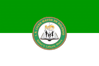 image by Ivan Sache, 11 March 2017
Liceo Mayor de Soledad Rafael U. Lafaurie Rivera (LIMASOL), established in
2009 in the Villaestadio borough, Soledad, Atlántico Department, had its
management granted in 2009, for a period of 12 years, to Corporación Educativa
Minuto de Dios, a corporation founded in 1958 by Father Rafael García Herreros
Unda (1909-1992), which manages 24 educational institutes all over Colombia.
http://www.colegiosminutodedios.co
- institute's website
The flag of the institute is horizontally divided
green-white with the institute's emblem in the middle.
The emblem is made of
a white disk inscribing a white open book, the black silhouette of a couple and
two children, and the golden yellow letters "MD" and a white cross, derived from
the emblem of Corporación Educativa Minuto de Dios. The disk is surrounded by a
green ring inscribed with "LICEO MAYOR DE SOLEDAD" (top) and "Rafael U. Lafaurie
Rivera" (bottom) in golden yellow letters.
http://www.colegiosminutodedios.co/soledad/index.php/quienes-somos/nosotros/simbolos
- Institute's website
Ivan Sache, 11 March 2017
 image by Ivan Sache, 28 March 2009
"Escuela Normal Superior 'Sor Josefa Del Castillo y
Guevara' " was founded in the 1950s at Chiquinquirá,
Department of Boyacá. The institute is named after Venerable
Mother Josefa Del Castillo y Guevara (1671-1742), called
"St. Teresa of America"; her works, eventually
published in 1968, include her autobiography ("Mi
vida" / "My Life") and a mystic treatise
("Afectos espirituales" / "Spiritual
Affections").
The flag of the institute, as shown graphically and described on
the institute's
website, is horizontally divided green-
white-"carmelite" ("carmelito").
"Carmelite" must be here the brown colour of the
Carmelite mantle.
Green represents hope.
White represents purity.
"Carmelite" represents the union of souls with duty,
the commitment of the life to the service of mankind in its most
noble way, education.
Ivan Sache, 28 March 2009
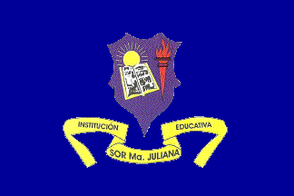 image by Ivan Sache, 06 September 2014
Institución Educativa Sor María Juliana was established in Cartago (Valle
Department) on 25 February 1927 by the noted pedagogue Albertina Hoyos. Aimed
at educating the future mothers of the town, the institute was subsequently
renamed Escuela Complementaria, directed by the teacher Pastora Murillo, who
ended her life as a Franciscan nun. The alumni of the institute were famous for
their calligraphic writing and perfect orthography, as well as for all kinds of
household skills. The institute was renamed in 1958 Liceo Femenino de Comercio
and, in 1965, Instituto Sor María Juliana. The institute was renamed for a
teacher of Colegio María Auxiliadora highly estimated by Ruby Gonzáles, the
director of the institute. The lawyer Leonor García Ramírez, director of the
institute from 1977 to 1997, obtained in 1983 yet another name change, for
Instituto de Bachillerato Técnico Comercial Sor María Juliana. Institución
Educativa Sor María Juliana was eventually established by Law No. 1,667 of 3
September 2002.
The flag of the institute is blue with the institute's emblem in the middle.
Blue, the colour of the immense sky, is a symbol of progress, highest
aspirations, and willingness to learn and to experiment.
Source:
http://iesormariajuliana.edu.co/?page_id=407 - Institute's website
The emblem of the institute, designed by Luis María Franco, is blue, with the
same symbolism as the flag, featuring:
- a sun, meaning the light of truth, science and knowledge:
- an open book, meaning willingness and empowerment for a better future;
- a torch, whose flame means compromise and integrity.
Source:
http://iesormariajuliana.edu.co/?page_id=404 - Institute's website
Ivan Sache, 06 September 2014
 image by Ivan Sache, 16 December 2008
"Colegio Stella Matutina" (in Latin, "Morning
Star", a personification of the Blessed Virgin invoked in
the "Litany of the Blessed Virgin Mary" /
"Litaniae lauretanae") was inaugurated in 1962 by the
Congregation of the Sisters of Bethany ("Congregación
Hermanas de Bethania"). Founded by two nuns, Dolores de
María Zea and María de la Cruz Pinto, born in Guatemala and
Salvador, respectively, the congregation was canonically approved
on 20 January 1928 by His Grace José Alfonso Belloso y Sánchez,
Bishop of San Salvador, on behalf of Pope Pius XI.
The flag of the institute is horizontally divided blue-green,
meaning "from the Earth to Heavens" and symbolizing the
hope in heavens. The flag is hoisted, together with the national
flag of Colombia, in front of the institute.
Source: <www.stellamatutina.edu.co>.
Ivan Sache, 16 December 2008
 image by Ivan Sache, 17 July 2014
current flag
 image by Ivan Sache, 28 March 2009
former flag
"Colegio de Sugamuxi" (COLSUGA) was founded on 12
October 1905 by Dr. Joselyn Parada Leal at sogamoso, the capital
of the Province of Sugamuxi, Department of Boyacá. By Decree No.
17 of the Departmental Assembly, the institute became in 1937 a
Departmental School, whose named was changed in 1939 to
"Academia Militar del Sugamuxi" or "Colegio del
Sugamuxi, Academia Militar". Renamed in 1975 "Colegio
Nacional de Sugamuxi", the institute has always been known
under its historical name, "Colegio de Sugamuxi", even
if its current legal name is "Institución Educativa
Sugamuxi".
The flag of COLSUGA, as described on the institute's
website, is horizontally divided olive greenish
("aceitunado")-white with a yellow-orange
("amarillo-naranja") triangle placed along the hoist.
The triangle was added in 1985 to the former flag, horizontally
divided olive greenish-white, whose adoption date is unknown, to
distinguish the flag of the institute from the flag of other
public and private bodies. Exact proportions and shades not
known.
Ivan Sache, 28 March 2009
The flag in use is charged with the institute's emblem.
http://colegio-sugamuxi.blogspot.fr/2009/11/bandera.html - Photo
The
emblem was adopted in 1953.
http://colegio-sugamuxi.blogspot.fr/2009/11/escudos.html - Institute's
website
Ivan Sache, 17 July 2014
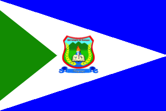 image by Ivan Sache, 12 December 2020
The flag of Institución Educativa Municipal Integral del Sumapaz, a school
located in Fusagasugá (Cundinamarca), is blue with a white triangle spreading
from the hoist to the mid-fly, itself charged with a green triangle placed along
the hoist and with the school's coat of arms.
Blue represents water,
white represents peace, and green represents the natural environment.
The
coat of arms has a green field and mountains, representing the Sumapaz region.
The blue sector represents water flowing down from the mountains.
The golden
yellow spikes represent the region's main source of income.
The open book
represents opening to knowledge.
The gear represents technological knowledge.
The colibri, as a bird representative of the region, represents knowledge and
protection of the natural environment.
The celestial blue sky represents
values as source of transparency.
The flaming torch represents passion and
love.
https://www.insu.edu.co/sitio/index.php/nuestra-institucion/simbolos
INSU website
Ivan Sache, 12 December 2020
 image by Ivan Sache, 12 August 2014
Institución Educativa Supía is established in the municipality of Supía
(Caldas Department).
The flag of the institute is horizontally divided white-green. White is a symbol
of beauty, transparency, responsibility, clarity, and light. Green is a symbol
of vegetation and natural resources.
Source:
http://karenliced5.wix.com/institucion-educativa-supia#!bandera -
Institute's unofficial blog
Ivan Sache, 12 August 2014
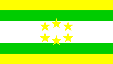 image by Ivan Sache, 29 January 2009
"Institución Educativa Rural del Sur" (of the
South) was founded in the Municipality of Tunja, Department of
Boyacá, on 20 September 2002 (Decree No. 02424).
The flag of the institute, as shown graphically and described on
the
website of the institute, is horizontally divided
yellow-green-white- green-yellow (1:1:2:1:1) with six yellow
stars in the middle. Yellow represents wisdom, maturity, wealth
and generosity, and, on the flag, an allegory of the rural
resources in the municipal context and of the common interests
shared by the whole community. Green represents the agricultural
productivity but also aspirations to a better future supported by
science, technology and technique, expected to provide a better
standard of life to the inhabitants. White represents peace,
balance and sustainable development. The stars are symbols of
light, strength, knowledge and victory, each representing a seat
of the institute and their institutional interactions.
On the emblem of the institute, designed by Dr. Carlos Cuervo
Escobar, the second quarter is yellow with the flag of Tunja
(horizontally divided green-white-green, probably a source for
the flag of the institute) and the flag of the institute crossed
per saltire.
Ivan Sache, 29 January 2009
 image by Ivan Sache, 21 November 2014
Institución Educativa Susana Guillemin was established in Bélen (Boyacá
Department) on 20 February 1965 by a group of ladies of the town and Daughters
of Charity (Vicentians). The institute was named for the Superior of the
community, while Sister Margarita Martínez was appointed its first director. The
institute was placed under departmental management by Decree No. 171 of 7 March
1968.
The flag of the institute is horizontally divided green-golden yellow. Green is
a symbol of hope, good and strength. Golden yellow is a symbol of progress,
justice and union.
Source:
http://investigacionietsusanaguillemin.blogspot.fr/p/nuestra-institucion.html
Ivan Sache, 21 November 2014
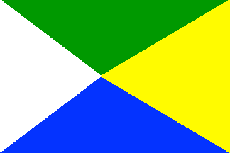 image by Ivan Sache, 10 September 2022
IE Suse is located in Aquitania (Department of Boyacá).
The flag of IE
Suse is composed of four triangles:
- the white triangle placed along the
hoist symbolizes the educational community's peace, purity and fraternity and
the space that remains to be discovered on the way to excellence.
- the
yellow, bigger triangle placed along he hoist represents light guiding on the
way to knowledge and the region's social and cultural resources.
- the upper,
green triangle, represents the environment's resources and fertility, as well as
the students' intelligence, strength and vigor.
- the lower, blue triangle
represents the firmament's immensity and the beauty of majestic lake Tota.
https://sites.google.com/site/colsuse/IESUSE/simbolos - School website
Ivan Sache, 10 September 2022