
Last modified: 2024-03-02 by rob raeside
Keywords: education |
Links: FOTW homepage |
search |
disclaimer and copyright |
write us |
mirrors
See also:
 image by Ivan Sache, 12 September 2014
The Institución Educativa A.S.I.A. Ignaciana is actually a school sponsored
by the Colegio San Ignacio de Loyola. Having
studied there (at Colegio San Ignacio) I have the centennial yearbook of 1985,
where they comment on the establishment of the Institución Educativa A.S.I.A.
Ignaciana.
First, there was the establishment of
A.S.I.A. Ignaciana. A.S.I.A. stands for Antiqui Societatis Iesu Alumni (in
Latin) which means
Antígüos Alumnos de la Compañía de Jesús (Alumni of the Society of Jesus).
Every Jesuit school and university around the world has its own ASIA, being
called Jesuit Alumni and gathered in the WUJA
(World Union of Jesuit Alumni). The WUJA was established on 31st July, 1956 (the
day which is commemorated as the Day of St. Ignatius of Loyola), in
Bilbao in
1956. So for example
the Colegio San Juan Berchmans in Cali has its
ASIA Berchmans, and so on, worldwide. In
fact, the latest WUJA Congress, the
VIII WUJA Congress held in 2013 from August 14 to August 17, was hosted by
ASIA Ignaciana at the Colegio San Ignacio facilities.
So after the establishment of A.S.I.A. Ignaciana, there was the establishment of
Fundación Loyola (Loyola Foundation) in August 4, 1964 by members of the
Class of 1946 (from the Colegio San Ignacio de Loyola) but quickly invited other
alumni to join them. It is a non-profit organization. They first settled where
the current Institución Educativa A.S.I.A. Ignaciana is located, in a plain
between the Municipalities of
Bello and
Medellín,
called Playón de Los Comuneros. First the Fundación Loyola started a
housing project there, but later as they saw the necessity for the
community to have its own school, Fundación Loyola started first the
"Escuela A.S.I.A. Ignaciana para niñas" (A.S.I.A. Ignaciana school for
girls), then the Liceo Femenino A.S.I.A. Ignaciana (A.S.I.A. Ignaciana
Women's Liseum) (granted recognition by the Ordenanza Departamental
No. 30 of December 17, 1967 and given the status of Centro Educativo
(Education Center) by Resolución No. 7481 of October 8, 1974 of the
Secretaría de Educación Departamental (Antioquia's Department
Secretariat of Education) on and then the Centro Asistencial John
Jairo Piedrahíta (Medical Center John Jairo Piedrahita). Fundación
Loyola purchased the land from the
Archdiocese of Medellín and established the "Liceo Centenario Ignaciano" (official name,
although most people know it simply as the
Liceo Centenario) with its official motto of "NOS EDUCARON...EDUQUEMOS" (We were
educated...let's educate).
My father,
Luis Ramiro Rivera, having been a student in Colegio San Ignacio (graduated from
Class of 1963) told me that all of his classmates and all other Alumni
Classes before his' actually donated to the charity of Fundación
Loyola to help build the "Liceo Centenario".
So the story is that the Liceo Centenario was transferred to the
Secretaría de Educación (Education Secretariat) of the Municipality of
Medellín (co-medel.html ) in 1971 and
renamed IE Pbro Antonio José Bernal Londoño SJ (Institución Educativa
Presbítero Antonio José Bernal Londoño, Sacerdote Jesuíta, Educational
Institute Presbiterian Antonio Jose Bernal Londoño, Jesuit Priest in
English) (in honor Presbiterian Antonio Bernal who helped established
the ASIA Berchmans in Cali when he was the Principal of the San Juan
Berchmans), which now operates under the Secretaría de Educación, which is one of the Secretarías of the
Alcaldía de Medellín (the executive official government body of the city of Medellín,
which depends on the Mayor of Medellín). Thus it is a public school
and as such is property of the city of Medellín. So in the land where
the Liceo Centenario stood,
Fundación Loyola with collaboration of the
Secretaría de Educación de Medellín and the
SENA
established a new school called "IE Colegio Loyola para la Ciencia e
Innovación" when it was transferred. It is important to notice that
all public schools have the prefix "I.E." which stands for Institución
Educativa (Educational Institution).
Source:
http://www.asiaignaciana.org.co/index.php?option=com_content&view=article&id=14&Itemid=26
So today's "I.E. A.S.I.A. Ignaciana" was established with the help of
the misioneras Siervas de San José (missionaries Servants of Saint
Joseph) in 1971 and A.S.I.A. and its Alumni helped pay the building
costs through donations gathered by Fundación Loyola. In the beginning
the I.E. A.S.I.A. Ignaciana operated as an annex of the Colegio
Gilberto Alzate Avendaño but in March 1974 the Lice (as it was known
back then) became autonomous, being official on August 26 of that same
year. And in September 1975 the new school campus was inaugurated.
Source:
http://asiaignaciana.freetzi.com/index.php?option=com_content&view=article&id=47&Itemid=53
The flag of I.E. A.S.I.A. Ignaciana can be seen
here
and
here.
For additional information see: A.S.I.A. Ignaciana (official website)
Fundación Loyola (official website)
I.E. (Institución Educativa)"A.S.I.A. Ignaciana" (official website)
I.E. (Institución Educativa) "Pbro. Antonio José Bernal Londoño
S.J." (official website)
Secretaría de Educación de Medellín (official website)
Ivan Sache, 28 September 2014 (based on contribution of Esteban Rivera)
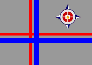 image by Ivan Sache, 28 September 2014
Esteban found an image of the flag of IE Pebro Antonio José Bernal
Londoño SJ (mentioned above).
The flag is grey with an off-centered blue-gray-red cross with the blue
arm broader, and an emblem in the upper right quarter. This emblem
appears to be not strictly equivalent to the institute's emblem.
Source:
http://alfreago11.wordpress.com/fiestas-institucionales/
Ivan Sache, 28 September 2014
 image by Ivan Sache, 22 July 2014
Institución Educativa Distrital Colegio Atabanzha is located in Usme
(Bogotá).
The flag of the institute is diagonally divided
green-white-blue per bend wavy.
http://colegioatabanzha.jimdo.com/orientación/ - Institute's website
Ivan Sache, 22 July 2014
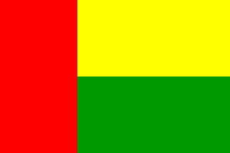 image by Ivan Sache, 10 January 2009
"Colegio Ateneo Autónomo de Colombia" was founded
on 10 November 1995 by "Sociedad para el Desarrollo de la
Cultura, la Educación y el Trabajo" (SODECET), legally
registered the same day in Neiva, Department of Huila. Classes
started on 28 February 1996. Recognized by the Department of
Huila on 13 June 2001 (Decree No. 563), the institute has
sections in the municipalities of Acevedo, Algeciras,
Campoalegre, Garzón, Guadalupe, Palermo, Pitalito, San José de
Isnos, Suaza and Timaná.
The flag of the institute, as shown graphically and described on
the website
of the institute, is horizontally divided yellow-green with a
red stripe placed vertically along the hoist. Red means strength,
valor and courage required to fulfill the life's project and
contribute to the regional and national development. Yellow
represents loyalty in the personal relationships and social
commitment, as well as the joyous atmosphere of fraternity found
in the institution's activities. Green represents growth and
aspiration to promote values and balanced development.
Ivan Sache, 10 January 2009
 image by Ivan Sache, 15 September 2014
Institución Educativa Ateneo, located in Pradera (Valle Department), is
managed by the Little Sisters of the Annunciation, a congregation founded in
1943 by Mother María Berenice (María Ana Julia Duque Henkler; 1898-1993).
The flag of the institute, designed by Hernan Barona Sossa, is horizontally
divided blue-white-red. Blue is a symbol of harmony, peace, and balance. White
is a perfect symbol of purity, pleasure, joy, light, and truth. Blue and white
are the Marian colours. Red is a symbol of personal growth of the students in
the holistic education provided by the institute.
Source:
http://directivosateneo.blogspot.fr/2013/01/simbolos-de-la-institucion-educativa.html
- Institute's blog
Ivan Sache, 15 September 2014
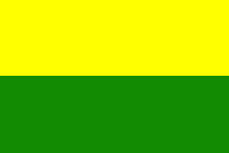 image by Ivan Sache, 12 December 2020
Colegio Ateneo Moderno was established in Santa Marta (Magdalena) by Alfredo
Almen�rez Barros, Mario G�mez G�mez and Pedro Guido Baen, three members of the
Santa Marta Rotary Club.
Classes started in February 1970.
https://ateneomoderno.edu.co/historia/
School website
The flag of Colegio Ateneo Moderno is horizontally
divided golden yellow-olive green.
Yellow represents intellectual resources,
while green represents hope.
https://ateneomoderno.edu.co/simbolos-de-la-institucion/
School website
Ivan Sache, 12 December 2020
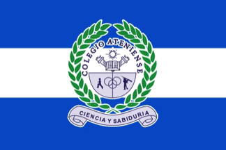 image by Ivan Sache, 21 September 2018
Colegio Ateniense was established in 1966 in Bogot�.
The flag of
Colegio Ateniense is horizontally divided blue-white-blue with the school's coat
of arms in the center. Blue and white are the colors of the Greek flag and of
the traditional Greek costume. Blue is a symbol of the sea, of the waves, and of
the sky. White is a symbol of the sunlight.
http://www.colegioateniense.edu.co/bandera.html
Ivan Sache, 21 September 2018
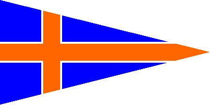 image by Ivan Sache, 14 August 2002
Located in Barranquilla, Atlantico Department. The flag shown on
the website is a blue triangular flag with an orange Scandinavian
cross separated from the blue background by a thin white
fimbriation. Exact proportions cannot be inferred from the
original source. I have used overall 1:2 proportion by default.
Source: www.uniatlantico.edu.co.
Ivan Sache, 14 August 2002
"The Universidad del Atl�ntico (English: Atlantico University) was
established on June 15, 1946 by Ordenanza (English: Ordinace) No. 42 of the
Department Assembly of Atl�ntico by Julio Enrique
Blanco de la Rosa, who started this process in 1941, through the establishment
of the "Instituto de Tecnolog�a" (English: Institute of Technology) by Ordenanza
(English: Ordinance) No. 24 of 1941, and later the "Facultad de Comercio y
Finanzas" (English: Finance and Commerce Faculty) in 1943. By 1945, these
previous institutions, plus two other educational programs (Chemical Engineering
and Chemistry and Pharmacy) were incorporated into the "Instituci�n Polit�cnica
del Caribe" (English: Caribbean Polytechnic Institution), established by
Ordenanza (English: Ordinance) No. 36 of 1945, which evolved into the
Univerisdad del Atl�ntico as it is known today".
Sources:
https://www.uniatlantico.edu.co/uatlantico/info-general/historia
and
https://es.wikipedia.org/wiki/Universidad_del_Atl%C3%A1ntico
The
pennant that we display is actually a triangular flag, as seen in the following
video and pictures:
- Video (https://www.youtube.com/watch?v=AwDuwj2tZ1U):
the flag is seen at 4:08, 5:11 (closeup), 5:12, 5:20, etc.
- (third flag from
left to right):
https://scontent.feoh6-1.fna.fbcdn.net (source:
https://www.facebook.com/udeatlantico)
- (third flag from left to right):
https://scontent.feoh6-1.fna.fbcdn.net/ (source:
https://www.facebook.com/udeatlantico)
-
https://scontent.feoh6-1.fna.fbcdn.net (source:
https://www.facebook.com/udeatlantico)
 image located by Estevan Rivera, 10 October 2018
It features the "Marca
Institucional" (English: Institutional Brand), with the letters UA
interlaced
("U" on top and "A" on the bottom), in typefont Baskerville Regular. Hence its
graphic depiction should be bigger than the one we currently display The
colors are:
Blue: C: 100 M: 90 Y: 0 K: 0
Red: 0 G: 55 B: 137
Pantone:
Reflex Blue
Orange: C: 0 M: 70 Y: 100 K: 0
R: 208 G: 116 B: 0
Pantone:
Orange 021
The description of the flag is as follows (translated from the
original, in Spanish):
"Institutional Flag
In the form of an isosceles
triangle, symbolizing the power of penetration, carrying a Scandinavian cross
that means the diffusion to the four cardinal points, at the intersection of the
cross, the institutional brand, in white color to highlight it, which makes it
possible to maintain graphic coherence between our corporate symbols. The colors
used are the institutional ones already established in the present manual:
orange for the cross and blue background; symbolizing wisdom and science,
pillars for the development of the University".
A version of the flag
is seen here:
https://www.uniatlantico.edu.co/uatlantico/sites/default/files/admin/images/noticias/Bandera_Institucional.png
(source:
https://www.uniatlantico.edu.co/uatlantico/info-general/imagen-institucional)
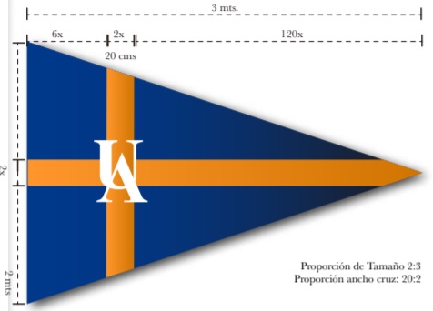 image located by Estevan Rivera, 10 October 2018
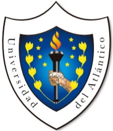 image located by Estevan Rivera, 10 October 2018
The description of the coat
of arms is as follows (translated from the original, in Spanish):
"Institutional coat of arms
The University of the Atlantic is
represented on this shield, which symbolizes with a flame the spirit of
self-improvement and strength that all our students have. That flame is framed
by yellow spikes that collect the sowing of knowledge that is imparted in the
Alma Mater. Each of the stars represents our first eight academic programs,
which started the rich and extensive firmament of knowledge of University. The
blue color that surrounds the whole shield, symbolizes the wisdom that is our
ideal."
The coat of arms is seen here:
https://www.uniatlantico.edu.co/uatlantico/sites/default/files/admin/images/noticias/Escudo_UA.png
(source:
https://www.uniatlantico.edu.co/uatlantico/info-general/imagen-institucional)
Source: Manual de Identidad Corporativa (https://www.uniatlantico.edu.co/)
(English: Corporate Identity Manual) 2015, p.4,7-8, 25-26 and 28-29
Images attached:
- co_uatl1.jpg (Institutional Brand in orange and blue)
(screenshot from the Corporate Identity Manual)
- co_uatl3.jpg (Size
and construction sheet of the flag) (screenshot from the Corporate Identity
Manual)
Esteban Rivera, 10 October 2018
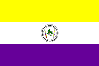 image by Ivan Sache, 15 July 2013
Institucion Educativa Departamental "Liceo Ariguaní" was approved in
November 1982 by Resolution No. 22,683.
The flag of the institute is horizontally divided yellow-white-purple
with the institute's emblem in the middle.
Yellow is a symbol of sincerity, liberty, purity, generosity and piety.
White is a symbol of peace and love.
Purple is a symbol of loyalty, earth, justice, knowledge and wisdom;
purple is also the traditional colour of strength, courage and
dedication.
The emblem of the institute is made of the following elements:
- a sketchy green map of Colombia, representing all the aspects of the
homeland; green is a symbol of hope, youth, force, conscience,
intrepidity, abundance, friendship, production, productivity and
progress
- a broken chain in the national colours, surrounding the map,
representing oppression and vexation caused by ignorance and misery,
suppressed by the pressure of study, science, education and knowledge;
- a flaming torch, symbolizing light and safe guidance and progress in
science, arts, religion, reason, economy and all other human
activities, accomplished through study, application, discipline,
education and wisdom.
- an open book, symbolizing the most universal source of knowledge,
wisdom and equality. (flag) (emblem)
Ivan Sache, 15 July 2013
 image by Ivan Sache, 19 October 2018
Institución Educativa Aures was established in 1969, as Escuela Urbana Aures,
in commune 7 of the municipality of Medellín (Antioquia Department), borough
Robeldo Aures. Incorporated in 2003 to Institución Educativa Bello Horizonte,
the school was separated, as IE Aures, by Resolution No. 4,659, issued on 24
April 2008.
The flag of IE Aures is described in Chapter 1.4.1 of the
Manual para la Convivencia Escolar, as composed of a rectangular panel
horizontally divided into two equal parts, the upper stripe, white, representing
peace and kindness that have to be respected in all kinds of relations within
the school, and the lower, wine red, representing solidarity and respect to be
observed within the school in all circumstances.
https://drive.google.com/file/d/1AvlCotuBzktfTdVqJV3FUGW3tu4RcsVA/view?idmenutipo=3734&tag=
Manual para la Convivnecia Escolar
Ivan Sache, 19 October 2018
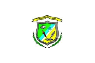 image by Ivan Sache, 05 September 2017
Institución Educativa Avelino Saldarriaga was established on 12 November 2002
in Gaviria (Itagüí) by Departmental Resolution No. 15,486, as the merger of
Liceo Avelino Saldarriaga (est. on 16 December 1974 as Institución Departamental
de Enseñanza Media Itagüí), Escuela Urbana La Unión (est. on 6 February 1976 as
Escuela la Unión) and Escuela Rural Los Olivares.
The institute is named for Dr. Avelino Saldarriaga (1858-1930). Saldarriaga
studied medicine at Universidad Nacional de Bogotá, where he met the lawyer and
politician Rafael Uribe Uribe (1859-1914). Awarded in 1882, a Ph.D. in Medicine
and Surgery, he traveled to Paris to study radiology, tuberculosis and leprosy.
Then he went to Marseilles, where he learned the basis of soap production and
purchased the machinery required to initiate soap industry in his country, which
inaugurated the concept of public health in Colombia. He established a free
clinic and took care of the social re-adaptation of lepers.
Source: Institute's
website
The flag of I.E. Avelino Saldarriaga is white with the institute's emblem in the
center. White is the combination and summary of all natural colors. White also
represents the triple ideal of education for truth, good and beauty.
The coat of arms of I.E. Avelino Saldarriaga is a "collective construction"
designed in 2004.
Green is a symbol of aspiration to a better world, a peaceful municipality and
an educational institute able to build citizen's coexistence. Yellow is a symbol
of the student's joy. White and blue represent the virtues characteristic of all
members of the educational community.
The mask represents the artistic and cultural skills that should guide the
students. The rings represent support to sports. The torch is the light that
enlightens the way to permanent improvement. The book and the quill are used to
write the history of the institute.
The shield is surrounded in base by two green spikes representing the fruit of
knowledge. The shield is surmounted by a yellow scroll inscribed with the
institute's motto "Vive para le verdad, el bien y la belleza" (To live for truth,
good and beauty).
Source:
Institute's website
Ivan Sache, 05 September 2017