
Last modified: 2023-09-02 by rob raeside
Keywords: rivičre-du-loup | ville de rivičre-du-loup | rectangles: (3 | modified by wave) |
Links: FOTW homepage |
search |
disclaimer and copyright |
write us |
mirrors
![[Ville de Rivičre-du-Loup]](../images/c/ca-qc-rl21.gif) image by Masao
Okazaki, 7 February 2022
image by Masao
Okazaki, 7 February 2022See also:
The description of the municipal logo is available on the municipal website:
http://www.ville.riviere-du-loup.qc.ca/index.php?pa=52
Photo:
http://www.sorel-tracyexpress.ca/actualites/sports/292034/le-drapeau-de-riviere-du-loup-flotte-a-lhotel-de-ville-de-sorel-tracy
Ivan Sache 1 April 2017
Rivičre-du-Loup QC adopted a new logo in June 2019, 40 years after its
previous logo, and uses it on a flag.
Photos of this flag were posted by
Luc Vartan Baronian in the FOTW Facebook group page:
https://www.facebook.com/groups/flagsoftheworld/posts/7231736526841007/
The logo is described on this page
https://www.villerdl.ca/fr/ville/decouvrir/identite-visuelle
This is
the English translation by Google:
"The green icon represents the
crossroads that we are, a distinction that has been unique to us since the 19th
century with the rail, road, sea and air transport axes but which, even today,
is largely significant for the city and its population in different aspects of
its development.
Rivičre-du-Loup is a city characterized by its beauty,
both by its landscapes and by its dynamic and creative community. It is
geographically located in a strategic location: whether you come from Gaspésie,
New Brunswick or Quebec City, it is at a crossroads. It is a pioneering city, in
constant evolution.
But beyond this image of a welcoming crossroads,
Rivičre-du-Loup is much more than a place of transit or gathering. It is above
all a unique, enviable, sought-after living environment. A perfect place to put
down your suitcases for good, raise a family, make a career, invest in it.
The logo recalls that Rivičre-du-Loup is the central point of
Bas-Saint-Laurent, a region highly recognized for its tourist value, in
particular. She evokes openness to others, solidarity and the search for
partnerships.
Depending on who looks at it, the icon will take the form
of a "plus", a cross or even a crossroads, therefore a reminder of our heritage.
Others will recognize the fall that still attracts many visitors to the park of
the same name or waves, at the mouth of the river, where fresh water mixes with
salt water.
The icon is created from four semicircles that recall the
beauty of the city in all seasons. These semicircles are also used to create
symbols that can be associated in turn with discovery, the incomparable living
environment we have, innovation, growth and evolution, or citizen participation
and engagement. All this, with a view to creating a full- fledged, coherent and
eloquent visual environment.
In terms of color, green symbolizes nature
in the city, also recalls the peaceful rhythm of life found here. As for black,
a timeless classic, it completes the signature with all its elegance and
simplicity, to let the colorful icon speak.
The chosen typography gives
the visual signature, by its roundness, an inviting and warm character. The
small details in the purpose of the letters add to the uniqueness of this visual
signature, a uniqueness to the image of Rivičre-du-Loup. The hyphens replaced by
dots illustrate individuals in a strong community, which intensifies the link
between the different elements."
Masao Okazaki, 12 August 2023
![[Ville de Rivičre-du-Loup]](../images/c/ca-qc-rl-v.gif) image by Masao
Okazaki, 7 February 2022
image by Masao
Okazaki, 7 February 2022
based on photo
I saw this flag flying in November 2004. Adapting the French text about the logo:
Luc Baronian, 6 May 2005The logo consists of a wave and a set of rectangles forming a dynamic whole. The wave represents the importance of water in the local scenery and the warmth of the city, as well as of its inhabitants, nature and scenery. The penetrating wave symbolizes the seaway and the two central divisions represent the highways of this crossroads city. The three rectangles represent the three parishes with their three churches, the three legends about the origins of the name and the multitude of services found in the city. The green-grey color chosen indicates the main characteristic of Rivičre-du-Loup: a magnificent city, enchanting surroundings, a unique city close to the bigger centers, and where it is pleasant to live, study, develop, invest and build. The three legends about the city's name (literally The Wolf's River) are: a) a French ship called Le Loup was forced to stay at the mouth of the river for a whole winter in 1660; b) Champlain's encounter with an Amerindian tribe called the mahigans (the wolves); c) the most probable is the presence of sea-wolves (seals) at the mouth of the river.
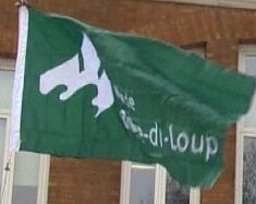
The flag of Rivičre-du-Loup in current use has the logo with the writing
placed at the right of the emblem.
Photos:
http://www.lapresse.ca/le-soleil/actualites/les-regions/201211/01/01-4589518-le-maire-de-riviere-du-loup-se-joint-au-groupe-prelco.php
http://www.infodimanche.com/actualites/actualite/302726/lhotel-de-ville-de-riviere-du-loup-reprend-vie
![[Ville de Rivičre-du-Loup]](../images/c/ca-qc-rl.gif) image by Luc
Baronian
image by Luc
Baronian
The flag is also used with counter-change colours, is white with the municipal logo in green.
![[Ville de Rivičre-du-Loup]](../images/c/ca-qc-af.gif) image by António Martins-Tuválkin, 13 May 2009
image by António Martins-Tuválkin, 13 May 2009
According to the February 2005 city bulletin, there are also two other
flags flown in Rivičre-du-Loup: one is a promotional flag with the city
slogan "Une culture ŕ ciel ouvert" ('An
open-sky culture') and promotional logo; the other was designed by local
resident and artist Pierre Sénéchal and is entitled "Ŕ l'affűt"
(an expression meaning 'waiting to seize the right opportunity'). This latter
flag is blue with three intertwined curvy white stripes. The three stripes
represent once again the three parishes and the crossroads situation of the
city. The design also makes reference to a bird in flight, signifying the
city's economic boom, and an eye can be distinguished between the curves,
reminding the importance for the community to see far ahead, to be vigilant
and "ŕ l'affűt".
Luc Baronian, 6 May 2005