
Last modified: 2017-05-12 by rob raeside
Keywords: canadian centennial flag | maple leaf |
Links: FOTW homepage |
search |
disclaimer and copyright |
write us |
mirrors
See also:
In 1967, Canada celebrated its centennial year. Activities were planned all across the country. Some of the organizers were concerned that centennial festivities would be upstaged by the magnitude of Expo 67, and so the two events were linked. The official Expo 67 guide devoted several pages to the Centennial.
![[Canadian Centennial Flag]](../images/c/ca_100-b.gif) image by Sylvain "Sly" Houde, 16 July 2008
image by Sylvain "Sly" Houde, 16 July 2008
![[Canadian Centennial Flag]](../images/c/ca_100-g.gif) image by Sylvain "Sly" Houde, 16 July 2008
image by Sylvain "Sly" Houde, 16 July 2008
![[Canadian Centennial Flag]](../images/c/ca_100-o.gif) image by Sylvain "Sly" Houde, 16 July 2008
image by Sylvain "Sly" Houde, 16 July 2008
![[Canadian Centennial Flag]](../images/c/ca_100-p.gif) image by Sylvain "Sly" Houde, 16 July 2008
image by Sylvain "Sly" Houde, 16 July 2008
![[Canadian Centennial Flag]](../images/c/ca_100-r.gif) image by Sylvain "Sly" Houde, 16 July 2008
image by Sylvain "Sly" Houde, 16 July 2008
![[Canadian Centennial Flag]](../images/c/ca_100-t.gif) image by Sylvain "Sly" Houde, 16 July 2008
image by Sylvain "Sly" Houde, 16 July 2008
![[Canadian Centennial Flag]](../images/c/ca_100-y.gif) image by Sylvain "Sly" Houde, 16 July 2008
image by Sylvain "Sly" Houde, 16 July 2008
The centennial logo is a stylized maple leaf broken into 11 triangles which is rumoured to represent
the 10 provinces and the territories (2) at the time. I know, the maths don't quite add up. Although
the red flag was the more common, if not the official, version, the flags were made in different
colours to highlight the festive splendour of the occasion. The different colours for the flags
came collectionscanada.gc.ca
I can only assume, since I was a child at the time that these are the colours that they used for them.
Sylvain "Sly" Houde, 16 July 2008
In 1966 Stuart Ash of Gottschalk + Ash designed the keen Canadian
Confederation Centennial logomark, a maple leaf comprised of 11 equilateral
triangles to represent the 10 Canadian provinces and the territories.
Sources:
http://aqua-velvet.com/2010/09/stuart-ash-canadian-centennial-logo-1967/
http://www.canadiandesignresource.ca/officialgallery/logo/centennial-logo/
Gottschalk + Ash International official's website:
http://www.gplusa.com/
The logo
is seen here:
http://aqua-velvet.com/blog/images/2010/09_september/01_stuart_ash1.jpg
Source:
http://aqua-velvet.com/2010/09/stuart-ash-canadian-centennial-logo-1967/
Esteban Rivera, 21 May 2011
![[Canadian Centennial Flag]](../images/c/ca_1967pc.jpg) image contributed by Rudy Mundt, 4 January 2009
image contributed by Rudy Mundt, 4 January 2009
The flags appear to be of
the proper design, but the colours and shades are wrong. I have a
postcard showing the Canadian Parliament buildings and they show all
the proper flag colours. I own all of the flags accept for the orange
one, and the colours of my flags match the postcard.
Rudy Mundt, 4 January 2009
![[Canadian Centennial Flag]](../images/c/ca_ex67.gif) image by Sylvain "Sly" Houde, 16 July 2008
image by Sylvain "Sly" Houde, 16 July 2008
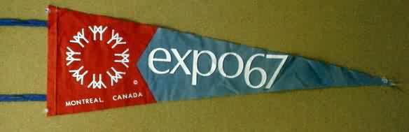
Expo 67 was a universal exposition sanctioned by "Le Bureau International des Expositions", for which the theme
was: "Man and His World". The logo was designed by Montreal artist Julien Hébert. The basic unit of the logo is an
ancient symbol of man. Two of the symbols (pictograms of 'man') are linked as to represent friendship. The icon was
repeated in a circular arrangement to represent 'friendship around the world'. The flag came only in blue to
represent the "Blue Planet".
Sylvain "Sly" Houde, 16 July 2008
The logo "was designed by Montreal artist Julien Hébert. The basic unit
of the logo is an ancient symbol of man. Two of the symbols (pictograms of
'man') are linked as to represent friendship. The icon was repeated in a
circular arrangement to represent 'friendship around the world'. The
logotype is lower-case bold-face, Optima font. It did not enjoy unanimous
support from federal politicians, as some of them tried to kill it with a
motion in the Canadian House of Commons".
"Basic unit of the Expo 67
symbol is an ancient sign representing Man -- vertical line with
outstretched arms -- linked in pairs to represent friendship with the circle
(right) to suggest friendship, around the world."
Sources:
http://en.wikipedia.org/wiki/Expo_67#Logo
http://expo67.morenciel.com/an/man_and_world.php
http://www.canadiandesignresource.ca/officialgallery/category/expo-67/page/6/
http://expo67.ncf.ca/basic_unit_of_the_expo_67_symbol_p1.html
http://www.youtube.com/watch?v=eg7vkQertkk&feature=player_embedded
An image of the logo is seen here:
http://www.canadiandesignresource.ca/officialgallery/wp-content/uploads/2006/10/expo67_logo_canadian_design.jpg
Images of the flag are seen here:
http://randytreadway.com/Expo-Brit2.jpg (Source:
http://www.worldsfaircommunity.org/topic/3183-expo-67-ruins-featured-today-on-scifi-channel/page__st__15)
http://www.worldsfairphotos.com/expo67/broadcasting.htm (second flag
from left to right)
An interview in video (in French) with Julien
Hébert, explaining the logo and the flag. Video dated April 12, 1964:
http://ms.radio-canada.ca/archives_new/2002/fr/wmv/exposition_universelle19640412.wmv
There are also three Pennants seen here:
http://cgi.ebay.com/Montreal-Canada-EXPO-67-1967-Worlds-Fair-Pennant-7-/330514877927?pt=LH_DefaultDomain_0&hash=item4cf438cde7
http://www.gasolinealleyantiques.com/images/Pennants%20Page/expo67-1.JPG
http://expo67.ncf.ca/expo_pennant.html
Esteban Rivera, 21 May
2011
![[Canadian Centennial Flag]](../images/c/ca_expo67_cpp.jpg) image
located by Esteban Rivera, 21 May 2011
image
located by Esteban Rivera, 21 May 2011
Looking for information on this World Expo, on April 25 I encountered the
flag of the Canadian Pulp and Paper (the flag is the Canadian Pulp and Paper
logo which are two tall trees intertwined, in white bold outline, on a green
horizontal background).
Pictures of the flag:
http://expo67.ncf.ca/expo67_pulp_and_paper_pavilion_construction.html
(Canadian Pulp and Paper under construction). Source: Life magazine
-
http://expo67.ncf.ca/expo_pulppaper_p8.html (green flag on the left,
next to Canada's Maple Leaf red-white-red flag)
-
http://expo67.ncf.ca/cdn_pulp_paper_nae000990845.jpg (aerial view of the
pavilion, green flag on the right, next to the Canadian flag). Source:
http://strangeharvest.com/wp11/?p=149
-
http://www.strangeharvest.com/pulppavillion.jpg (Scale model of the
pavilion, green flag on the left, next to the Canadian flag)
-
http://www.flickr.com/photos/hollywoodplace/5434074054/in/pool-worldsfairs
(Postcard of the pavilion, green flag on the left, next to Canada's flag)
-
http://www.flickr.com/photos/hollywoodplace/3750276283/in/pool-worldsfairs
(Pavilion picture, no flag seen here, but one can see the Canadian Pulp and
Paper logo on the entrance to the pavilion).
-
http://www.canadiandesignresource.ca/officialgallery/wp-content/uploads/2008/07/canadian-pulp-and-paper.jpg
(Close-up of the logo of the Canadian Pulp and Paper, which is actually
featured on the flag).
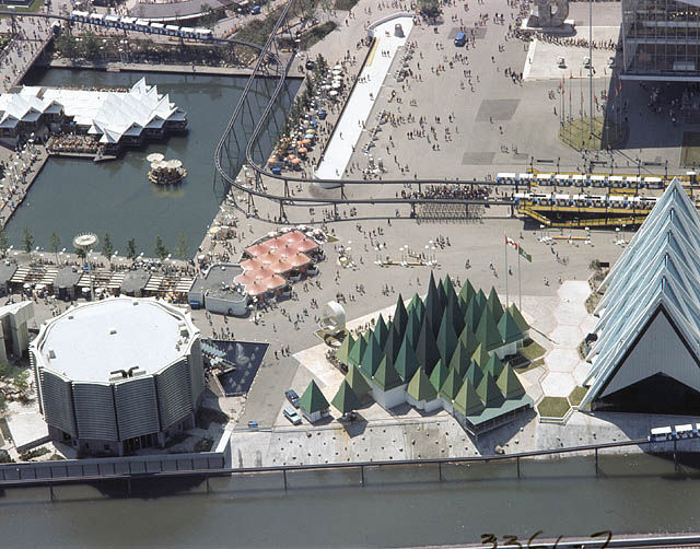
"Forests and trees were the theme of the
Canadian Pulp and Paper Pavilion on Ile Notre-Dame - in which the tallest
trees are as high as an eight story building. The first four main exhibit
areas shows forest legends of the world, combining sound effects and
animation in a whimsical treatment." Source:
http://expo67.ncf.ca/expo_pulppaper_p1.html
Esteban Rivera,
21 May 2011