
Last modified: 2012-08-09 by rob raeside
Keywords: la nation | the nation | ontario |
Links: FOTW homepage |
search |
disclaimer and copyright |
write us |
mirrors
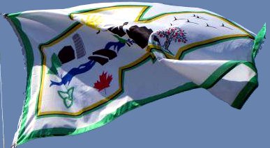 image located by Valentin Poposki, 12 June 2012
See also:
"The Nation Municipality, which is situated in the United Counties of
Prescott and Russell in Eastern Ontario, has an area of 661 square
kilometres and a population of approximately 11,000 [nearly 70% of them being
native French speakers (Franco-Ontarians)]. The Nation was formed on January
1st, 1998, with the amalgamation of the Townships of Cambridge, South
Plantagenet, Caledonia and the Village of St. Isidore. It is comprised of the
communities of Limoges, Cambridge Forest Estates, Forest Park, St. Albert, St.
Isidore, Fournier, St. Bernardin, Riceville, Ste. Rose de Prescott, Caledonia
Springs, McAlpine, Routhier, Ettyville, Pendleton, Westminster, Lemieux,
Séguinbourg and the outskirts of Casselman."
Quote from the municipal
website, English version:
http://www.nationmun.ca/en/about_us.html
Karine Régimbald reports
in "La Nouvelle", 2 June 2010, the inauguration of the new flag of La Nation.
The flag shall fly in front of the Tourist Information Center, flanked by the
Ontario and Franco-Ontarian flags. The flag is white with a green border and
the new municipal logo, designed by André Péloquin, in the middle.
The
logo is made of the map of the municipality bordered in green-yellow and
enclosing iconic symbols of the municipality such as forest Larose, river
Nation - for which the municipality was named - a farm and a silo, as well as
building "summarizing the industrial and commercial development of some
sectors of the municipality, such as St. Isidore". The logo also includes the
arms and emblems of Canada and Ontario - indeed, the photo of the flag shown
the Canadian maple leaf and the Ontarian trillium, but no arms at all.
http://www.journallanouvelle.ca/article-460165-La-Nation-hisse-son-nouveau-drapeau.html
The logo is presented on the municipal website, with significant
differences compared with the version used on the flag. The border is plain
green and there is a scroll. The logo is described as follows:
"The shape
of the logo represents the geographic shape of the four former municipalities
with the colour green being the new colour of The Nation. The logo itself is
made up of the Ontario emblem, the Canadian emblem and other symbols: the
trees represent the forests, the farm and silo represent the agricultural
importance of the area, the river represents the South Nation River which
flows through a large portion of the municipality, the bridge represents the
large number of bridges within the municipality, the buildings represent the
residential, multi-residential and industrial activities and the birds and
ducks represent aquatic fauna found in the bog close to Caledonia Springs."
http://www.nationmun.ca/en/about_us.html
Ivan Sache, 5 June
2010