
Last modified: 2014-06-29 by klaus-michael schneider
Keywords: electricidade de portugal | energias de portugal | edp | whirl | turbine | smile | qbɘ |
Links: FOTW homepage |
search |
disclaimer and copyright |
write us |
mirrors

The company logo was very recently changed: now a red square with a
kind of smile, white, on it. The company name changed to Energias de
Portugal ("energies" replacing "electricity").
António Martins, 02 Aug 2004
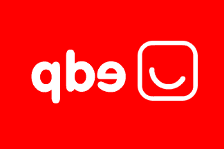
This flag shows an unreadable obverse ("qbɘ"!).
António Martins, 09 Sep 2004

The new logo has been steadily replacing the old one,
incl. on flags, which are white with the logo in orange and lettering in black
(set in something like bold Arial Rounded).
António Martins, 09 Sep 2004
This version of the logo, orange on white with black lettering, was
abbandoned in sometime later (perhaps due to unwanted similarity with
Galp?) and changed to white on
red.
António Martins, 04 Apr 2006

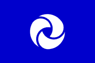
EDP - Electricidade de Portugal (Electricity of Portugal), was
created in the early 1980ies as a state owned company amalgamating
preexisting private and public regional companies. It was recently open to
private share holding and bound to be split in many sectorial private or
semi-private companies. All these operate more or less independently
under the brand "Grupo EDP" (the holding company), which is a
semioticly strong presence and influence for most of them.
(The group as a whole is one of the largest companies in Portugal.)
The main part of this semiotic presence is the EDP logo, recreated some
twelve yars ago, featuring a stylized turbine (a tri-radial,
rotationally symmetrical element) and the lettering
"EDP" in
bold italic capitals of a sans face; the lettering is some times ommited.
Company colors are dark blue on white, or the opposite.
All this shows in flags, used mostely in company facilities, the
official one apparently being the blue logo and lettering on white.
António Martins, 17 Oct 2003
This version was the one chosen for the main entrance of the goup’s
HQ recently (re)inaugurated in a central Lisbon plaza.
António Martins, 16 Mar 2004
I’ve seen also the opposite and also both these
variants without the lettering (and perhaps a slightly
larger logo).
António Martins, 17 Oct 2003


Anything below this line was not added by the editor of this page.