Last modified: 2026-08-29 by zachary harden
Keywords: fukushima | minamisoma |
Links: FOTW homepage |
search |
disclaimer and copyright |
write us |
mirrors
![[flag of Minamisoma]](../images/j/jp-07-ms.gif)
image by Tomislav Šipek, 08 September 2014
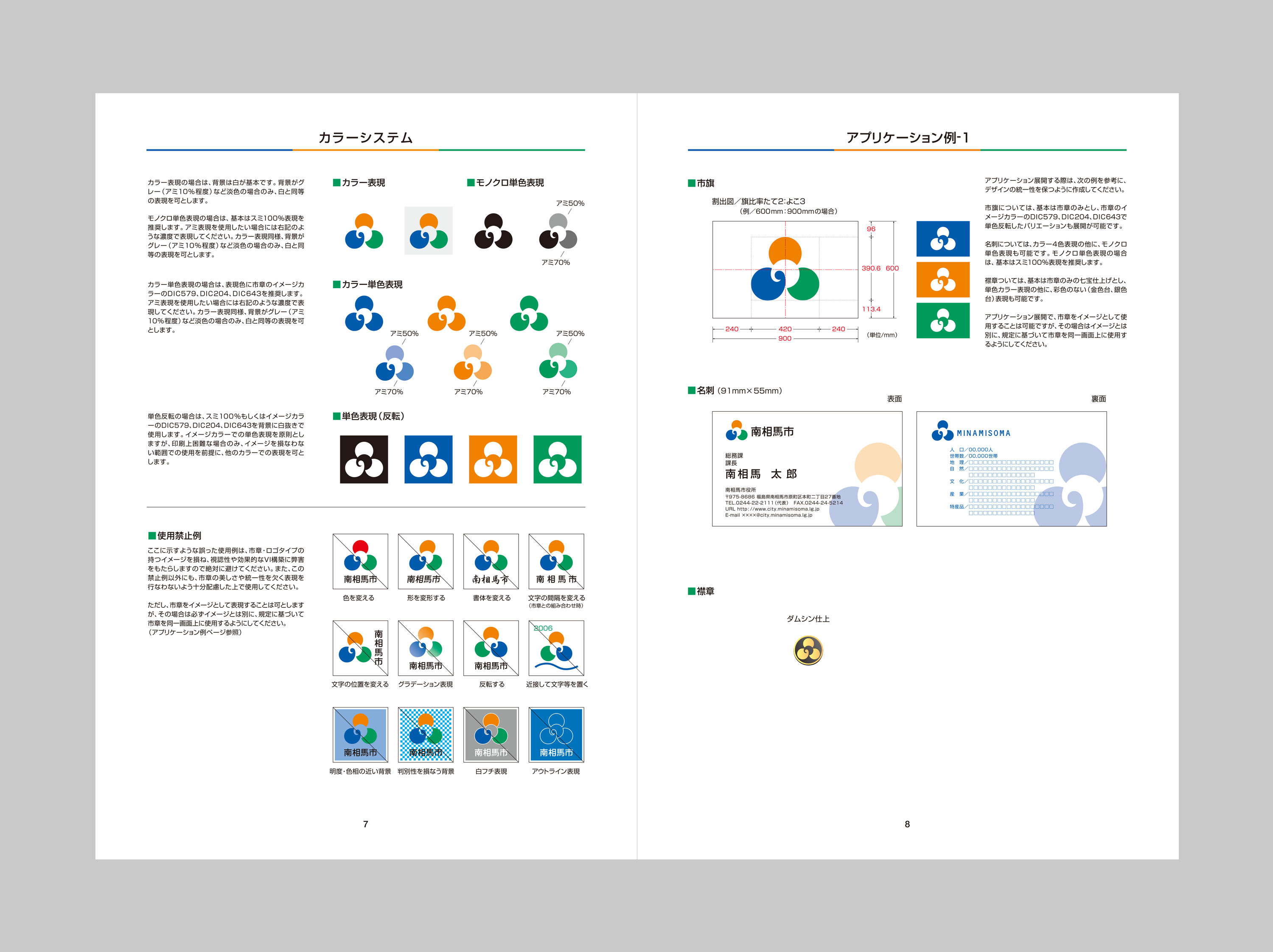
The flag of the city of Minamisoma is white with mark.
Source:
http://www.city.nayoro.lg.jp/www/contents/1360811127585/index.HTML
Tomislav Šipek, 08 September 2014
The city emblem was adopted on Jan 1st 2006 by Notice No 89 but there is no
flag law. The white flag has a green, a blue and an orange three color city
emblem in the center. The green color and the blue color stand for the rich
nature such as mountains,rivers and the sea, the orange color for a brightness
and a vigor of the citizen. The linked three circles symbolize a harmony of the
former one city and two towns.
Nozomi Kariyasu, 08 September 2014
The branding company Orca Graphics worked with the city for their branding manual, published in 2005, which also includes a graphic of their flag. It shows a centered emblem on a white background, 2x3 ratio. There are variants permitted where the emblem is in white and each color used in the emblem serves as the background color.
Zachary Harden, 25 August 2026
![[flag of Minamisoma]](../images/j/jp-07-ms-hm.gif)
image by Tomislav Šipek, 17 September 2014
The flag of the former city of Haramachi was white with mark. The city is
now, from 2006, part of the city of Minamisoma.
Source:
http://www.city.minamisoma.lg.jp/etc/gappei/choin/index.htm
Tomislav Šipek, 17 September 2014
The kanji character "原" (hara) has been stylized to symbolize the development of the former town and four villages.
Nozomi Kariyasu, 28 July 2026
![[flag of Minamisoma]](../images/j/jp-07-ms-ks.gif)
image by Tomislav Šipek, 17 September 2014
The flag of the former town of Kashima was purple with mark. The town is now,
from 2006, part of the city of Minamisoma.
Source:
http://www.city.minamisoma.lg.jp/etc/gappei/choin/index.htm
Tomislav Šipek, 17 September 2014
The design is based on the katakana character カ "Ka," symbolizing a town that is thriving and making strides forward.
Nozomi Kariyasu, 28 July 2026
![[flag of Minamisoma]](../images/j/jp-07-ms-od.gif)
image by Tomislav Šipek, 17 September 2014
The flag of the former town of Odaka was purple with mark. The town is now,
from 2006, part of the city of Minamisoma.
Source:
http://www.city.minamisoma.lg.jp/etc/gappei/choin/index.htm
Tomislav Šipek, 17 September 2014
The kanji character "小" (small) has been stylized into a design, with the larger circle representing industry and the smaller circle representing culture and education.
Nozomi Kariyasu, 29 July 2026