image by António Martins-Tuválkin, 23 February 2012

Last modified: 2023-12-09 by rob raeside
Keywords: puno |
Links: FOTW homepage |
search |
disclaimer and copyright |
write us |
mirrors

image by António Martins-Tuválkin, 23 February 2012
I received from Puno 4 differents communications from three official
services, explaining about three differents patterns of the departamental
flag (one of them posted a information but later posted a new communication
rectifiying the previous).
Jaume Ollé, 01 Sep 2000
According to the Pachamama radio, 19 July 2011, the Puno Regional Government
will organize soon a contest for the design of a flag, "since the Department has
no symbols".
In the "Comments" section, "Adrian" claims that the region already has a flag, a
coat of arms and an anthem, and that every new government wants to create a
logo. "Crispin" says that the name of the Region should first be changed,
because it will soon or late split into two regions.
The creation of "new" symbols seems indeed, as reported by Pachamama, be related
with a threat of modification of the borders of the Region and "invasion" of the
regional territories by other Departments.
Source:
http://www.pachamamaradio.org/19-07-2011/żcomo-seria-la-bandera-y-el-escudo-de-la-region-pun.html
Ivan Sache, 04 August 2011
...and here are the results of the contest for Puno's regional symbols:
http://www.regionpuno.gob.pe/web/archives/3899 and
http://www.regionpuno.gob.pe/web/concurso-regional-de-composicion-del-himno-bandera-y-escudo-de-la-region-puno-bases-generales.
Paraskevas Renesis, 05 Decemberr 2011
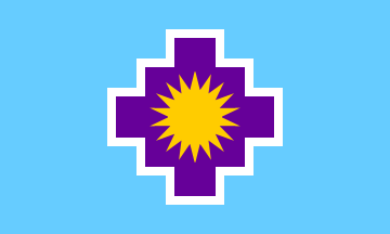
The regional council of Puno has adopted the new regional symbols:
http://www.regionpuno.gob.pe/web/archives/4830
ORDENANZA REGIONALNº 003-2012.
It seems to me that there's at least one difference from the
winning design of the contest. The ordenanza talks about a sun of 13 rays
while the sun in the winning design had 18 if I'm not wrong.
Paraskevas Renesis, 22 February 2012
But in the same thread, another commenter, "Alex", says later that
Puno Region has no symbol(s) yet. Neither gives any further
information, but but make use of vigorous expletives - they must love
flags.
At http://www.regionpuno.gob.pe/web/consejo-regional/miembros,
official photos of provicial representatives of the Regional Council
show with the same background location, draped with indoors ceremonial
versions (with tilted coat of arms) of both the national flag and a pale blue/white
"vertical" diband with the Puno city coat of arms. The
prototype design of this flag (with straight up coat of arms), it is really palest blue, I used B---, and maybe the
other two Puno city flags should be recolored to match.
This must be the putative preexisting regional flag, (a version of)
its capital city flag - to adopt a different design might be a move to
stress that city and region governments, in spite of what seems to be
the tradition in that regard (the regional flag of Loreto, virtually identical it its capital's Iquitos).
In view of this, the two previous reports on this flag need to be
reevaluated: Jaume Ollé’s undetailed mention in 2000, and
Jan-Patrick’s statement that the city flag is also a departmental/regional flag.
It should be noted that the coat of armsthat was chosed by the same contest
seems to be in official use at the regional website.
Also, the chakana (andean sign) is described as being not purple but escalonada (stair-like zigzagged?) of lemon green and "stable water
blue".
Another cleaned-up image was uploaded to the Wikimedia
Commons and is in use by the Spanish Wikipedia, but it shows the unmodified contest proposal (it also tags the
Quechua language description text, including the "purist" spelling variant "wandira", as Karakalpaq language…).
The contest results page gives the name of the winner, Juan Alberto
Saavedra Saavedra, who used the psudonym Beto. The winning design won
with a 96,33 scrore, closely followed by the 2nd with 94,67 — the 3rd
lagged behind with 87,00. The
three runners-up all show a sun and both
1st and 3rd show it on a chakana.
That’s maybe why the number of sunrays was changed to 13 from the
original proposal, as there are 13 provinces in Puno. This however is
IMO too subtle for a "pre-irredentist" flag — a map would do the job
better. (However maps on flags are a non-no, so I’m much happier with
this.)
António Martins-Tuválkin, 23 February 2012
There were respectively made as 2:3 and 3:5, beased on shaky heuristics, and
may be found out incorrect upon more detailed research. According to ch.9
art.25th of the competition
regulation the «shape» of the flag should be «3×2 (three perfect squares
long by two wide)» (my translation from Spanish), but the
image online is closer to 3:5 than to 2:3.
António Martins-Tuválkin, 23 February 2012
In the upper left part of the web
site of the regional government of Puno we can now see the recently adopted
flag. If we click on the flag we get a rar file that contains the flag in "various"
sizes. As it has been already translated-noted by António the chacana is green
and blue.
Paris Renesis, 09 March 2012