 christopher oehler
Keywords: re | escarbuncle | ramnes | vale |
Links: FOTW homepage | search | disclaimer and copyright | write us | mirrors

Last modified: 2021-08-25 by  christopher oehler
Keywords: re | escarbuncle | ramnes | vale |
Links: FOTW homepage |
search |
disclaimer and copyright |
write us |
mirrors

image by Tomislav Šipek, 12 February 2016
Approved on 31 August 2001
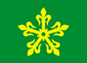
An escarbuncle normally has eight rays instead of the five rays shown on the image.
Mark Sensen, 20 April 2002
Unfortunately the blazon, which is the only official description of the arms and flag, says just 'escarbuncle',
which would imply eight rays, while the model drawings, which are only examples of how the arms and flag may be
correctly drawn, shows just five rays. In my opinion there is a mismatch between blazon and artistic execution
in this case. As the number of rays is intentionally set to five, this should have been reflected in the blazon in my opinion.
I wrote an article about the flag of Re kommune for Nordisk Flaggkontakt [nfs],
the periodical of the Nordic Flag Society, so I can provide some more details about
the flags of Re kommune and the two municipalities that joined to form it.
Re kommune is a newly established Norwegian municipality, dating from 1 January 2002, and being formed by
the merger of the municipalities of Ramnes kommune and Våle kommune. The arms and flag of Re kommune is
the result of a public competition and a public vote on alternatives among inhabitants, the decision being
finalized by a Royal resolution dated 31 August 2001. As mentioned the blazon is rather brief and not matched
to the intended artistic execution of the arms and flag. The Royal resolution states that
"The arms of Re municipality will be: In green a gold escarbuncle. The flag of Re municipality will be:
In green a yellow escarbuncle."
Whilst an escarbuncle is usually depicted with eight rays of lilies, in the case of Re kommune the
intention is that the number shall always be five – to reflect the five parishes in the municipality.
The escarbuncle is also to symbolize unity, and to point back in history to the two battles at Re,
the place that gave the municipality its name, in the 1100's at which one might imagine escarbuncles
on the shields of the men fighting.
I used proportions 8:11 (national flag proportions) for my drawing of the flag of Re.
Jan Oskar Engene, 21 April 2002
The flag of Re is already reported, so so here is coat of arms. Admnistrative
center of Re is Revetal.
Tomislav Šipek, 12 February 2016
![[Rana]](../images/n/no)07-16.gif)
image by Tomislav Šipek, 12 February 2016
Official blazon in Norwegian: "I grønt en gul liljehaspel."
Blazoned in English: "In green a yellow escarbuncle."
English blazon by Jan Oskar Engene, 21 April 2002
Both of the two municipalities that merged to form the new municipality
of Re had arms and flag approved, though it seems only one of them took the flag into actual use.
Jan Oskar Engene, 21 April 2002

image by Tomislav Šipek, 05 February 2016
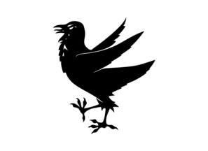
On 30 January 1976 a Royal resolution decided that "The arms of Ramnes municipality will be:
In silver a black raven. The flag of the municipality of Ramnes will be: In white a black raven."
The raven was chosen because of the etymology of the name of the municipality, the first part meaning raven.
In the drawing used, the raven is shown with its wings lifted. Re
kommune used both its arms and its flag. Again I used proportions 8:11 (national flag proportions) for my drawing of the flag.
Jan Oskar Engene, 21 April 2002
Official blazon in Norwegian: [Not yet presented]
Blazoned in English: [No translation made]
The flag of former municipality of Ramnes is already reported, so here is
coat of arms.
Source:
https://lovdata.no/dokument/OV/forskrift/1976-01-30-4?q=flagg
Tomislav Šipek, 05 February 2016
Coat of Arms
0716r.gif)
image by Tomislav Šipek, 05 February 2016
Blazon: I sølv en svart ravn.
In English: Argent a raven passant wings elevated sable.
Approved by thwe royal resolution of 30 January 1976 after a drawing by Sven
SkÖld.
The design is canting, as the name comes from "ravn". [c2j87]
says that ravens are shown in heraldry so that the wings are elevanted. The
colours were chosen in regard to other Nordic municipal arms.
Željko Heimer, 06 February 2016
 image by Tomislav Šipek, 27 February 2017
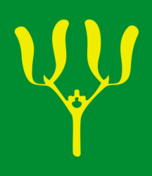
On 23 February 1990 arms were approved for Våle commune. The Royal resolution states that
"The arms of Våle municipality will be: In green a gold mistletoe. The flag of Våle
municipality will be: In green a yellow mistletoe." Mistletoe is a rare plant in Norway and
Våle is one of the few places where it grows. Whereas the arms were taken into use,
it seems that Våle commune did not use its flag. Once again I used proportions 8:11 (national
flag proportions) for my drawing of the flag.
Jan Oskar Engene, 21 April 2002
Official blazon in Norwegian: [Not yet presented]
Blazoned in English: [No translation made]
Here is better flag image and coat of arms of former municipality of Vale.
Administrative center was Sorby.
Source:
https://lovdata.no/dokument/OV/forskrift/1990-02-23-135?q=flagg
Tomislav Šipek, 16 November 2015
Coat of Arms
0716v.gif)
image by Tomislav Šipek, 16 November 2015