![[Local Committee of Qiryat Haim (Municipality of Haifa, Israel)]](../images/i/il-kihai.gif)
image by Ivan Sarajcic |


Last modified: 2018-12-15 by rob raeside
Keywords: haifa | qiryat haim | kiryat haim | va'ad qiryat haim | qiryat haim netto |
Links: FOTW homepage |
search |
disclaimer and copyright |
write us |
mirrors
![[Local Committee of Qiryat Haim (Municipality of Haifa, Israel)]](../images/i/il-kihai.gif) image by Ivan Sarajcic |    |
See also:
Blue logo and inscription of the name on white bedsheet.
Qiryat Haim (pop. 35,000) was establish in 1933 as the first
settelment in Zevulun Valley. It was named after the Zionist
leader Haim Arlozrov who was murdered the same year. In the late
40's its inhabitants decided to became part of Haifa, as it regarded until now, however
some municipal duties were kept by its local committee.
Qiryat Haim has a unique situation by being about 12 Km far from
the municipality that it belongs to, and by having that local
committee. Even though it is legally part of Haifa, it is in some
aspects considered as a separate entity, eg. it has a different
postal code series and it hosts some government institutes that
serve only the Zevulun Valley area. It is the only sub-city area
that has its own government in Israel.
Dov Gutterman (Qiryat Haim Local Committee member), 7 June
1999
Up to now, I found seven different ways how my hometown name
is written in English on road signs etc. The official way (which
nobody uses!) is Qiryat-Hayyim, and the most common way it
appears on signs is Qiryat-Haim. Concerning the emblem, when the
local committee chairman was asked about it by the local press,
responsed that the people of the community use 'Kiryat Haim' for
ages so he decided to use this form in the emblem.
Dov Gutterman, 26 September 2002

image by Dov Gutterman, 4 June 2003
This is a unification of movements in my hometown Qiryat Haim,
in order to run jointly for a seat at Haifa city council in the
elections held yesterday. Qiryat Haim, even thou placed 12 Kms.
north to Haifa is , from historical reasons, part of the big city
but suffer a lot, budgetwise, for being far from it.
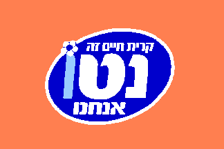
The list flag was a the list's logo (with the the sloagen
"Qiryat Haim Netto is Us") on orange background. The
reason for the background was that the orange colour is a vivid
one and represent novelty and freshness, as well that it is not
representing any of the major political forces.
The list we recieved most of the votes in Qiryat Haim and few
hundred more in other city areas and got two seats at the
council, making us the 4th largest list in the council.
The leftmost letter is light blue by purpose. The reason is that
the two first letters of the word "netto" (nun-tet) are
also the movements' letters in the elections, so those are in
white and the last letter (vav) which is not part of its letters
is in light blue.
When it was registered as a list, it was known that it won't be
able to use the desired Kuf-Het (the initials of Qiryat Haim) as
those are taken by existing lists, and therefore applied for the
letters Nun-Tet (first two letters of the word Netto=Net) and got
them. In order to made the puclic fammiliar with those two
letters, we used different colours in our logo for the Nun-Tet
and the Vav.
Dov Gutterman, 4 June 2003