image by Željko Heimer and António Martins, 26 Jul 2009 |

Last modified: 2017-12-09 by antónio martins
Keywords: variant | error |
Links: FOTW homepage |
search |
disclaimer and copyright |
write us |
mirrors
See also:

image by Željko Heimer and António Martins,
26 Jul 2009 | ![]()
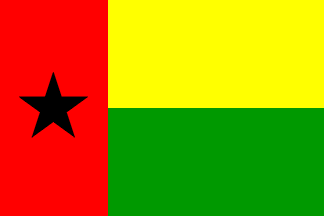
This might be not really a mistaken depiction, as I read somewhere
in the 1st constitution of Guinea Bissau (or maybe in the Statutes of
P.A.I.G.C.) that the three areas of the flag
are to have the same area, saying nothing about the
final ratio of the flag.
António Martins, 26 Jul 2009
In 1978, the East German Post issued a 20
Pf. stamp marking the 5th death anniversary of Amílcar Cabral
(1924-1973), showing e.g. a 2:3 depiction of the flag, flat on the
background.
António Martins, 26 Jul 2009

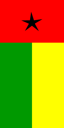
image by Francisco Santos, 12 Jan 2004
In the book História da Guiné e Ilhas de Cabo Verde,
by PAIGC, 1974, the
image on the cover is a
vertical Guinean-Bissau flag, with a
“leaner” star. The book does have only one image on the cover
page, which is like the national flag in vertical
position (top to the right), with the difference that it has an
irregular star, pointed to the top (of the
image/book).
Francisco Santos, 29 and 30 Apr 2003
![[flag]](../images/g/gw!ptm.gif)
image by António Martins, 21 Mar 2017
Portimão city, in Portugal, is twinned with
four other settlements worldwide and displays their names and the flags of
the countries they are located on by means of road signs placed at several
spots arounds its street maze. Those settlements are
Guanaré, in Venezuela,
Villemomble, in France,
Vila Real, in Portugal, and
Buba, in Guinea Bissau.
Back in 2005 local vexillologist and former FotWer extraordinaire Jorge
Candeias lead me in a vexillological safari through the city and environs,
and a photo
(detail)
of this road sign is one of my trophies: The flag of Guinea
Bissau as painted on it is something to behold: An approximately 2:3
horizontal bicolor of yellow over green, charged on its middle with a
vertical red stripe (C.A.R. style), itself sporting
a black star roughly centered on its upper half: In short, all elements
are there, but rearranged in a totally different pattern!
António Martins, 21 Mar 2017
The width of the red stripe seems to be 3/8ths of the flag’s
height. This suggests that this weird variation was created by mismatching
the four elements of a flag image that was otherwise
correct but which had been squeezed from 1:2 (where the red stripe has a
width of 1/3rd of the flag’s width) to 2:3 (keeping said 1/3rd but
reducing the red area) — i.e. without keeping with the legal
prescription for three equal areas. I can imagine
a scenario where the people in charge of creating the panel (seems to have
been stencil painted on metal, 1990s technology for durable outdoor items
to be made in only a few copies) accidentally scrambled the original
artwork and reassembled without a re-check — cp. the incorrect on
the same panel the Portuguese flag with equal
areas.
António Martins, 22 Mar 2017
Anything below this line was not added by the editor of this page.