 klaus-michael schneider
Keywords: boyaca | san miguel de sema | sema |
Links: FOTW homepage | search | disclaimer and copyright | write us | mirrors

Last modified: 2021-08-26 by  klaus-michael schneider
Keywords: boyaca | san miguel de sema | sema |
Links: FOTW homepage |
search |
disclaimer and copyright |
write us |
mirrors

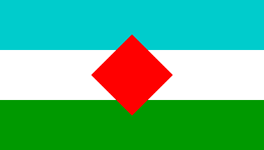
Actually used flag
image by António Martins-Tuválkin, 18 February 2016

Flag by law
image by Peter Hans van den Muijzenberg, 16 September
2008
See also:
San Miguel de Sema is a municipality in the Colombian
Department of Boyacá, part of the the subregion of the Western
Boyacá Province. It was founded on 8 November 1915 and became a
municipality by ordinance No. 40 of 29 November 1960.
The flag is
horizontally divided blue-white-green and charged with a red
lozenge in its center.
Source: municipal
web site.
Dov Gutterman, 10 September 2008
Approximated as 4:7, based on the image from the website. I
wouldn't assign any particular shade to Azul, as mentioned in the
description, but I've used a browser-safe colour close to the
bright shade in the image. Since the text gives two equal
dimensions for the rhombus, counter to the image I've interpreted
it as a square.
Peter Hans van den Muijzenberg, 16 September 2008
Translated from municipal
web site:
"The flag of the municipality of San Miguel de la Sema was
selected following a competition opened by the governing assembly
to all inhabitants of the municipality in May 1985.
The flag was subsequently designed incorporating elements of the
proposals made by the Cooperative College El Charco and Mr Sixto
Evelio Rodríguez ávila.
The flag was eventually adopted by the governing assembly in a
plenum, accordingto Decree No 009 of 26 September 1985:
[...]
Article 2. The flag of the municipality of San Miguel de la Sema
shall have the following characteristics.
Legal dimensions:
- Blue stripe: 42 cm:
- White stripe: 42 cm;
- Green stripe: 42 cm;
- Red lozenge: 50 x 50 cm.
The stripe colours shall have the following meaning:
- (Ultra) Blue stripe: Represents the abunance of waters of the
sources and rivers, and the majestuosity of laguna Fúquene, a
site of incomparable beauty;
- White stripe: Represents the colour of milk, the base of the
municipal economy, and peace, characteristic of our people;
- Green stripe: Represents the fertility of the lands and valleys
and the greennness of the grasslands forming our municipality;
- Red lozenge: Represents the vitality of the people and their
constant fight for work."
The description states that the lozenge must have equals
diagonals but there is no hint on the overall proportions of the
flag.
Ivan Sache, 25 September 2008
A new image created with a lozenge instead of a rhombus, in spite of the
legal text. I presume that the prescription of «equal diagonals» is either
largely ignored in practice, or that it is merely the result of lawyers trying
to sound clever in their wording and botching geometry thusly (which happens a
lot in vexillological legislation).
António Martins-Tuválkin, 18 February 2016
bywsm.jpg)
image from municipal
web site